CSS (Cascading Style Sheets) is a language used to describe the presentation of a web page. It controls how HTML elements appear on screen, including their layout, colors, fonts, and spacing. CSS separates content from design, allowing developers to style websites more efficiently and consistently.
CSS is essential in web development because it brings structure to life. Without it, web pages would be plain and difficult to navigate. CSS enables responsive designs for different screen sizes, improves user experience, supports accessibility, and helps maintain visual consistency across a site. In short, it transforms a functional layout into an attractive, user-friendly interface.
CSS properties are the individual style rules used to define how elements should look. Each property targets a specific aspect of an element’s appearance, like color for text color, margin for spacing, or font-size for text size. These properties are combined in style rules to create customized and dynamic web designs.
What Are CSS Properties?
CSS properties are the building blocks of styling in web development. A property is a specific feature you want to style on an HTML element, such as color, size, spacing, or position. Each property affects one aspect of how the element is displayed in the browser.
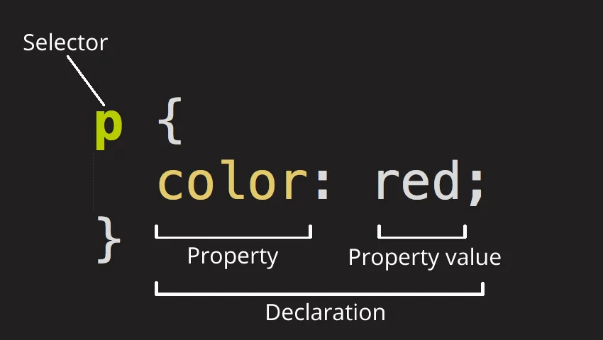
Syntax Structure: property: value;
CSS properties follow a simple syntax:
property: value;
- property is the style you want to change (e.g., color, margin, font-size)
- value is the setting you want to apply (e.g., red, 20px, bold)
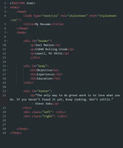
Here’s a quick example:
h1 {

  color: blue;

  font-size: 32px;

}
In this example, the h1 element is styled to have blue text and a font size of 32 pixels.
How Properties Are Used in Style Rules
CSS properties are placed inside style rules, which are made up of a selector and a set of property-value pairs.
Here’s the breakdown:
selector {

  property: value;

  property: value;

}

For example:

p {

  margin: 20px;

  color: #333;

}
This rule targets all <p> (paragraph) elements and applies a margin of 20 pixels and a text color of dark gray.
Examples of Common CSS Properties
color: Sets the color of text
color: red;
font-size: Changes the size of text
font-size: 16px;
margin: Adds space around elements
margin: 10px;
background-color: Sets the background color
background-color: yellow;
text-align: Aligns text inside an element
text-align: center;
CSS properties are the heart of styling. Once you understand how to use them, you can customize and control the appearance of almost any element on a webpage. For a breakdown of how properties and values form the foundation of CSS rule sets, see Kansas State’s Web Page Development guide.
Categories of CSS Properties
CSS properties can be grouped into categories based on what aspect of an element they control. Understanding these categories helps you organize your styles more effectively and build cleaner, more manageable CSS.
A. Text and Font Properties
These properties control the appearance of text on your webpage.
color – Sets the color of the text
color: #333;
font-family – Specifies the typeface
font-family: Arial, sans-serif;
font-size – Sets the size of the text
font-size: 16px;
font-weight – Defines the boldness of text
font-weight: bold;
line-height – Controls the spacing between lines of text
line-height: 1.5;
text-align – Aligns text horizontally
text-align: center;
B. Box Model Properties
These properties deal with the spacing and dimensions around and within elements.
margin – Space outside the element’s border
margin: 20px;
padding – Space inside the element, around content
padding: 10px;
border – Adds a border around the element
border: 1px solid #000;
width – Sets the element’s width
width: 300px;
height – Sets the element’s height
height: 150px;
C. Layout and Positioning Properties
Used to control how elements are positioned and displayed on the page.
display – Specifies the display behavior of an element
display: block;
position – Defines positioning method (static, relative, absolute, fixed, sticky)
position: absolute;
top, left, right, bottom – Offsets for positioned elements
top: 20px;
z-index – Controls stacking order
z-index: 10;
float – Aligns elements left or right within a container
float: left;
clear – Prevents elements from wrapping around floated elements
clear: both;
D. Background and Border Properties
These properties define how the background and borders of an element appear.
background-color – Sets background color
background-color: lightblue;
background-image – Adds an image as the background
background-image: url(‘image.jpg’);
background-size – Controls the size of background images
background-size: cover;
border-style – Defines the border’s appearance (solid, dashed, dotted, etc.)
border-style: dotted;
border-radius – Rounds the corners of an element
border-radius: 8px;
E. Flexbox and Grid Properties
These modern layout systems offer advanced control over alignment and spacing.
display: flex / grid – Turns a container into a flexbox or grid
display: flex;
flex-direction – Sets the direction of flex items
flex-direction: row;
justify-content – Aligns items along the main axis
justify-content: space-between;
align-items – Aligns items along the cross axis
align-items: center;
grid-template-columns – Defines columns in a grid layout
grid-template-columns: repeat(3, 1fr);
F. Animation and Transition Properties
These properties bring elements to life with motion and interactivity.
transition – Smoothly animates changes in property values
transition: background-color 0.3s ease;
animation – Creates complex animations using keyframes
animation: slideIn 1s ease-in-out;
transform – Applies transformations like rotate, scale, skew
transform: rotate(45deg);
@keyframes – Defines the steps of an animation
@keyframes slideIn {

  from { transform: translateX(-100%); }

  to { transform: translateX(0); }

}
How CSS Properties Work Together
CSS isn’t just about individual properties; it’s about how they interact, override, and complement each other. Understanding how CSS properties work together is key to writing efficient, predictable styles.
The Cascading Nature of CSS
The “C” in CSS stands for Cascading. This means that when multiple styles apply to the same element, the browser uses a set of rules to decide which one wins. This hierarchy is based on:
- Source order (later styles override earlier ones)
- Specificity (more specific selectors take priority)
- Importance (e.g., !important overrides most other rules)
This cascading behavior allows developers to layer styles, reuse rules, and apply general styles with the option to override them when needed.
Specificity and Inheritance
Specificity determines which styles are applied when there’s a conflict. It depends on the type of selector used:
- Inline styles (most specific)
- IDs (#header)
- Classes, attributes, pseudo-classes (.nav, [type=”text”], :hover)
- Elements (p, div, h1)
For example:
p {

  color: blue;

}

.content p {

  color: red;

}
In this case, the paragraph inside .content will be red because the second selector is more specific.
A property is a characteristic of an element you want to change or style. Properties define aspects like colour, font, size, position, and more. To understand how properties fit into the bigger picture, check out our CSS basics guide.
Shorthand vs Longhand Properties
Many CSS properties can be written in both longhand and shorthand formats:
Longhand example:
margin-top: 10px;
margin-right: 15px;
margin-bottom: 10px;
margin-left: 15px;
Shorthand equivalent:
margin: 10px 15px;
Shorthand saves time, reduces code clutter, and is easier to maintain as long as you understand the order of values.
Combining Multiple Properties in a Rule
You can apply multiple CSS properties to an element within a single rule block:
button {

  background-color: #3498db;

  color: #fff;

  padding: 10px 20px;

  border: none;

  border-radius: 5px;

}
This makes it easy to organize and manage the styles of an element all in one place. Grouping properties together this way also helps avoid unnecessary duplication and keeps your code clean and readable.
Best Practices for Using CSS Properties
Using CSS effectively isn’t just about knowing the properties, it’s also about writing clean, maintainable and scalable code. Here are some best practices to follow when working with CSS properties:
1. Use Semantic and Maintainable Code
Write CSS that is meaningful and easy to understand. Use clear class names that describe the purpose of the element, not just how it looks.
Not semantic:
.red-box {

  background-color: red;

}
Semantic:
.alert-message {

  background-color: red;

}
This makes your code more readable, reusable, and easier to maintain over time.
2. Avoid Inline Styles When Possible
Inline styles (written directly in the HTML element using the style attribute) can make your code harder to maintain and override.
Inline style:
<div style="color: green; font-size: 20px;">Hello</div>Better approach using CSS:
.greeting {

  color: green;

  font-size: 20px;

}
<div class="greeting">Hello</div>Keeping styles in a separate CSS file or stylesheet allows for cleaner HTML and better separation of concerns.
3. Group Related Properties
Grouping related CSS properties together improves readability and helps you stay organized:
.card {

  padding: 20px;

  margin: 15px;

  border: 1px solid #ccc;

  background-color: #fff;

}
Organize your CSS logically, for example, group box model properties together (margin, padding, border), followed by typography, background, and layout. Clean, well-structured code is a hallmark of professional developers, and it’s one of the many skills you’ll master in our hands-on web development course.
4. Use Custom Properties (CSS Variables)
CSS variables make it easier to manage and reuse values across your styles. They also improve flexibility and help maintain consistency in design.
Define variables:
:root {

  --primary-color: #007bff;

  --font-base: 16px;

}
Use them:
.button {

  background-color: var(--primary-color);

  font-size: var(--font-base);

}
If you ever need to update a color or font size, you only have to change it in one place.
Common Mistakes and How to Avoid Them
CSS can be tricky, especially when you’re just getting started. Even experienced developers can fall into certain traps. Here are some of the most common mistakes and tips on how to avoid them:
1. Overusing !important
Using !important forces a property to override all other declarations, regardless of specificity. While it can be tempting for quick fixes, it often leads to problems with maintainability and debugging.
Overusing !important:
.button {

  color: red !important;

  background-color: blue !important;

}
Why it’s a problem:
Overusing !important can make your CSS difficult to override in the future. It also breaks the natural cascading rules of CSS, making the code harder to manage.
How to avoid it:
Use !important sparingly, only when absolutely necessary (e.g., overriding inline styles in third-party libraries). Instead, try to work with CSS specificity to ensure your styles apply correctly.
2. Confusing Padding vs Margin
Both padding and margin control space around elements, but they serve different purposes.
- Padding is the space inside an element, between the content and the border.
- Margin is the space outside an element, between the element and other surrounding elements.
Confusing padding and margin:
div {

  padding: 10px;

  margin: 10px;

}
How to avoid it:
Understand the difference between padding and margin so you can use them appropriately:
- Use padding to control space between content and its border.
- Use margin to control space between elements.
3. Not Understanding Specificity
CSS specificity determines which rules apply when there are conflicting styles. If you’re not careful, you might accidentally apply a rule that doesn’t have the desired effect because a more specific selector is overriding it.
Overly specific selectors:
html body .container .content h2 {

  color: red;

}
How to avoid it:
Use specificity to your advantage, but avoid overly complex selectors. Focus on using the appropriate level of specificity for your selectors and keep them simple to avoid unintentional overrides.
- Inline styles have the highest specificity.
- ID selectors (#header) are more specific than class selectors (.nav).
- Class selectors are more specific than element selectors.
4. Ignoring Mobile Responsiveness
In today’s world, web pages need to be responsive and look great on devices of all sizes. Failing to consider mobile responsiveness can lead to poor user experiences.
Ignoring mobile styles:
.container {

  width: 960px;

  margin: 0 auto;

}
How to avoid it:
Ensure your CSS is responsive by using flexible layouts, media queries, and relative units like em, rem, %, and vw.
Example of a media query for responsiveness:
@media (max-width: 768px) {

  .container {

    width: 100%;

    padding: 10px;

  }

}
This approach ensures that your design adjusts appropriately on smaller screens, like smartphones and tablets.
By being mindful of these common mistakes, you can write cleaner, more effective CSS that’s easier to maintain and troubleshoot in the long run.
To summarise, CSS properties are the foundation of web design and play a crucial role in creating visually appealing and functional websites. By understanding the basics, from text styling to layout techniques and advanced properties like Flexbox and Grid, you’ll be able to create dynamic, responsive designs that meet modern web standards.