CSS text-shadow is a property used to add shadow effects to text in web design. With just a few lines of code, you can create subtle or dramatic visual effects that make your typography stand out.
In modern web design, CSS text shadow plays an important role in improving aesthetics and user experience. It’s commonly used to add depth to headlines, create glowing or neon effects, and increase contrast when text is placed over images or complex backgrounds.
Beyond just style, text-shadow can enhance readability and visual appeal, making content easier to read and more engaging to look at. Whether you’re designing a landing page, banner, or call-to-action, mastering text-shadow can add that extra layer of polish to your work.
To begin your journey as a software developer, enrol in one of our software engineering courses in Kenya. Our programs are designed as bootcamps and broken down into front-end, back-end, and databases. You will be ready to apply for high-paying jobs in 8 -12 months.
What is CSS Text Shadow?
The CSS text-shadow property is used to apply shadow effects to text, giving it depth and emphasis. It allows designers to make text stand out visually, create glowing or 3D effects, and enhance readability against different backgrounds. You can also learn about box shadows by reading this CSS box shadow article.
Basic Syntax
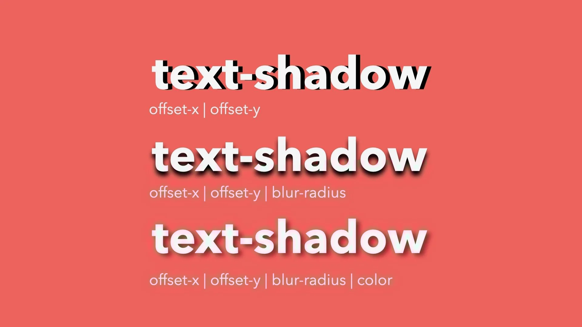
text-shadow: h-shadow v-shadow blur-radius color;
- h-shadow – Required. The horizontal offset of the shadow (positive for right, negative for left).
- v-shadow – Required. The vertical offset of the shadow (positive for down, negative for up).
- blur-radius – Optional. The blur distance; higher values create a softer shadow.
- color – Optional. The color of the shadow. Accepts standard CSS color values.
Example
text-shadow: 2px 2px 5px rgba(0, 0, 0, 0.3);
In this example:
- The shadow is offset 2px to the right and 2px down,
- It has a blur radius of 5px,
- The color is a semi-transparent black.
This simple line of code can dramatically improve the look and feel of your text on a webpage.
Understanding the Syntax in Detail
To use the text-shadow property effectively, it’s important to understand what each value in the syntax represents:
text-shadow: h-shadow v-shadow blur-radius color;
Let’s break it down:
1. Horizontal Shadow (h-shadow)
- This sets the horizontal position of the shadow.
- A positive value moves the shadow to the right of the text.
- A negative value moves it to the left.
Example:
text-shadow: 4px 0px 0px black;
The shadow appears 4 pixels to the right of the text.
2. Vertical Shadow (v-shadow)
- This controls the vertical position of the shadow.
- A positive value moves it below the text.
- A negative value moves it above the text.
Example:
text-shadow: 0px 4px 0px black;
The shadow appears 4 pixels below the text.
3. Blur Radius (Optional)
- Determines how much the shadow is blurred.
- A value of 0px means a sharp shadow.
- Higher values create a softer, more diffused shadow.
Example:
text-shadow: 2px 2px 6px black;
The shadow appears soft and spreads outward.
4. Color
- Sets the color of the shadow.
- Can be a named color (black), hex code (#000), or RGBA (rgba(0, 0, 0, 0.5)).
- Using RGBA allows you to control transparency, which is useful for subtle effects.
Example:
text-shadow: 2px 2px 5px rgba(0, 0, 0, 0.4);
Real-World Comparison
Think of a shadow under a lamp:
- If the lamp is slightly to the right, the shadow moves left (like -h-shadow).
- The further the object is from the light, the longer and softer the shadow (larger blur-radius).
- The darkness of the room affects how visible the shadow appears (like the color or opacity).
By adjusting these values, you control how realistic, bold, or subtle the shadow effect looks.
CSS Text Shadow Examples
1. Simple Shadow
A basic text shadow that adds slight depth.
text-shadow: 2px 2px 4px rgba(0, 0, 0, 0.3);
Good for improving readability on light backgrounds.
2. Colored Shadow
Use a colored shadow to add creative flair or match your brand palette.
text-shadow: 2px 2px 5px red;
Works well for headings, logos, or themed designs.
3. Multiple Shadows
You can apply more than one shadow for layered effects.
text-shadow: 1px 1px 2px black, 2px 2px 5px gray;
Creates a more complex or realistic depth effect.
4. Glowing Text Effect
Make text look like it’s glowing softly.
text-shadow: 0 0 8px #00f, 0 0 16px #00f;
Popular for buttons, headers, or dark mode UIs.
5. Neon Light Effect
Brighter and more intense than a glow, mimicking neon lights.
color: #0ff;
text-shadow:
0 0 5px #0ff,
0 0 10px #0ff,
0 0 20px #0ff,
0 0 40px #0ff;
Eye-catching for landing pages or futuristic themes.
6. Embossed Text
Gives the illusion that the text is raised or pushed out of the background.
text-shadow: 1px 1px 0 #fff, -1px -1px 0 #000;
Great for creating tactile or vintage design effects.
7. Engraved Text
Creates the opposite effect text that looks pressed into the surface.
text-shadow: -1px -1px 1px #aaa, 1px 1px 1px #fff;
Subtle and elegant for luxury or formal designs.
Creative Uses of CSS Text Shadow
CSS text-shadow isn’t just for decoration, it’s a versatile design tool that can bring your text to life. Here are some clever and practical ways to use it in real-world web design:
1. Enhancing Headings
Adding a subtle shadow to headings helps them stand out, especially on flat or minimal backgrounds.
h1 {

  text-shadow: 2px 2px 4px rgba(0, 0, 0, 0.2);

}
Use light shadows for a clean, modern look.
Works great for landing pages and hero sections.
2. Creating 3D Effects
Layered or offset shadows can make text appear 3-dimensional or extruded.
h2 {

  text-shadow: 1px 1px 0 #555, 2px 2px 0 #333;

}
Adds depth and structure, especially when paired with bold fonts.
Ideal for retro or graphic-style design themes.
3. Designing Buttons
Text shadows can make button labels pop, improving contrast and making them feel more clickable.
.button {

  text-shadow: 1px 1px 2px rgba(0, 0, 0, 0.3);

}
Combine with hover effects for interactive feedback.
Helps call-to-action buttons grab attention.
4. Improving Text Visibility on Images
Use shadows to separate text from busy backgrounds, such as when placing text over images.
.hero-text {

  color: white;

  text-shadow: 2px 2px 5px rgba(0, 0, 0, 0.6);

}
Increases legibility without needing a background overlay.
Especially useful for banners, sliders, and cover sections.
These creative uses show how powerful the text-shadow property can be when applied thoughtfully. It’s not just about making text pretty, it’s about improving readability, emphasis, and user experience.
CSS Text Shadow vs Box Shadow
While both text-shadow and box-shadow are used to create shadow effects in CSS, they serve different purposes and apply to different elements. For a deeper understanding of CSS shadow properties, refer to CSU Fullerton’s web design course notes on CSS shadows.
Key Differences:
- What do they affect:
- text-shadow only applies to text (e.g., headings, paragraphs, buttons).
- box-shadow applies to the entire element’s box, including divs, images, buttons, and containers.
- Syntax and behavior:
- text-shadow works by offsetting and optionally blurring a copy of the text.
- box-shadow adds a shadow around the border or frame of an element (and can include spread and inset options).
- Visual result:
- text-shadow makes the letters appear to float or glow.
- box-shadow makes the element appear raised, sunken, or glowing.
When to Use Each:
- Use text-shadow when you want to:
- Make text more readable on complex backgrounds
- Add stylish or glowing effects to headlines
- Simulate embossed or neon effects on text
- Use box-shadow when you want to:
- Add depth to cards, containers, buttons, modals, or input fields
- Create soft elevation and visual hierarchy
- Simulate lighting or focus effects on UI components
Can They Be Combined?
Yes you can absolutely combine both text-shadow and box-shadow on the same element if it contains text and also needs a visual container effect.
Example:
.button {

  background: #333;

  color: white;

  padding: 12px 24px;

  text-shadow: 1px 1px 3px rgba(0, 0, 0, 0.4);

  box-shadow: 2px 4px 10px rgba(0, 0, 0, 0.3);

}
In this example:
- The text-shadow gives the button text depth and clarity.
- The box-shadow gives the button itself a lifted, clickable appearance.
Using both together can create rich, polished designs that are more engaging to users. Just remember less is more when it comes to shadows. Keep them subtle for the best results.
Cross-Browser Compatibility and Best Practices
The text-shadow property is widely supported and easy to implement, but there are still a few things to keep in mind to ensure your designs are reliable, fast, and accessible across all platforms.
Supported Browsers
CSS text-shadow is supported by all major modern browsers, including:
- Chrome
- Firefox
- Safari
- Edge
- Opera
- Mobile browsers (iOS Safari, Android Chrome, etc.)
Even older versions of Internet Explorer (from IE10 onward) support text-shadow.
Performance Considerations
- Keep it simple: Adding too many shadows or layers (especially glowing/neon effects) can impact rendering performance on slower devices or older browsers.
- Avoid excessive blur or stacking: Large blur values and multiple shadows can make your page feel sluggish, especially on mobile.
- Use only where needed: Applying text shadows to body text or large content blocks isn’t recommended—save it for headlines, buttons, or UI elements.
Accessibility Tips
- Ensure contrast: Text-shadow should enhance readability, not reduce it. Always check your contrast ratio, especially when placing light text on images.
- Avoid shadow-only emphasis: Never rely on shadows alone to convey meaning or interaction. Use color, font weight, or underline alongside shadows for clarity.
- Test with screen readers and zoom: Make sure that your shadow effects don’t interfere with accessibility tools or responsive design behaviour.
By following these best practices, you can use text-shadow to create beautiful, readable, and accessible designs that work well on any browser or device.
Common Mistakes to Avoid when Making CSS Text-Shadows
While CSS text-shadow is a powerful tool, there are a few common mistakes that can detract from your design or even negatively impact the user experience. Here are some pitfalls to watch out for:
1. Overusing Shadows
While shadows can add style and depth, too many shadows can overwhelm the design and make your text look cluttered.
- Mistake: Applying heavy shadows to every piece of text on a page.
- Why it’s a problem: Too much shadow can make the text difficult to read and create a chaotic visual experience.
- Solution: Use shadows sparingly, and reserve them for important elements like headings, buttons, or calls to action.
Example:
/* Overusing shadows: */

p {

  text-shadow: 1px 1px 3px rgba(0, 0, 0, 0.5);

}
Better approach:
h1 {

  text-shadow: 2px 2px 4px rgba(0, 0, 0, 0.3);

}
2. Poor Contrast Choices
Choosing a shadow color that doesn’t contrast well with the text or background can reduce readability and even make your design look washed out.
- Mistake: Using a shadow color that’s too close to the text color or background.
- Why it’s a problem: Low contrast can make the shadow less effective and make the text harder to read.
- Solution: Always ensure that the shadow has enough contrast against the text and background. You can also use RGBA values to adjust transparency for a subtler effect.
Example:
/* Poor contrast: */

h2 {

  color: white;

  text-shadow: 1px 1px 3px #fff; /* No contrast */

}
Better approach:
h2 {

  color: white;

  text-shadow: 2px 2px 5px rgba(0, 0, 0, 0.4); /* High contrast */

}
3. Using Text-Shadow on Small Fonts
Using text shadows on small text can make it harder to read and cause visual noise.
- Mistake: Applying shadows to small text or body copy.
- Why it’s a problem: Small text with a shadow can look blurry or fuzzy, making it difficult to read, especially on mobile devices or low-resolution screens.
- Solution: Limit the use of text-shadow to larger text like headings or buttons. If you need shadows on small text, use very subtle, non-blurred shadows.
Example:
/* Avoid on small text: */

p {

  text-shadow: 1px 1px 2px rgba(0, 0, 0, 0.5);

}
Better approach:
h1 {

  text-shadow: 2px 2px 4px rgba(0, 0, 0, 0.3);

}
In conclusion, the CSS text-shadow property is a versatile and creative tool that adds depth, emphasis, and style to text elements. Whether you’re aiming for a soft glow, a dramatic 3D effect, or subtle emphasis, text-shadow allows you to enhance typography without using images or extra markup.
By understanding how to control offset, blur, and color, and applying it thoughtfully, you can make text stand out while maintaining readability and design consistency. When used sparingly and with purpose, text-shadow can elevate your typography and contribute to a more engaging and polished web experience.