When it comes to web design, every visual element plays a role in how users perceive and interact with a website. One of the most impactful yet often overlooked elements is typography, and at the core of typography in CSS lies the font-family property.
CSS font-family is used to specify the typeface for text content on a webpage. It allows web designers to choose from a wide range of fonts, from classic system fonts to custom web fonts, and ensures that text appears consistently across different browsers and devices.
Typography is more than just aesthetics. It affects readability, user experience, branding, and even conversion rates. Choosing the right font family can make a website look professional, fun, modern, or trustworthy, depending on the message you want to convey.
In this article, we’ll take a deep dive into the CSS font-family property. You’ll learn how it works, how to use it effectively, the difference between web-safe and custom fonts, and how to integrate Google Fonts.
You will also learn best practices for styling text in a responsive and accessible way. Whether you’re a beginner or looking to improve your styling skills, this guide has you covered.
Enroll in one of our software engineering course in Kenya and become a software developer in less than 10 – 12 months. Our bootcamps are divided into three main modules: web development, APIs and databases, and backend.
What is CSS Font-Family?
The font-family property in CSS is used to define the font of the text content on a web page. It tells the browser which font(s) to use when rendering text inside an HTML element.
The purpose of font-family is to ensure a consistent look and feel for your typography. By specifying one or more fonts, you give the browser options starting with your preferred font and then listing fallback fonts in case the primary one isn’t available on the user’s device.
Syntax Overview
The basic syntax of the font-family property includes a comma-separated list of font names. If a font name contains spaces, it must be enclosed in quotes.
selector {

  font-family: "Preferred Font", "Fallback Font", generic-family;

}- Preferred Font: The first choice.
- Fallback Font(s): Alternatives if the preferred font is not available.
- Generic Family: A broad category like serif, sans-serif, or monospace as the last fallback.
Example
Here’s a simple CSS rule that applies a common sans-serif font to all <p> elements:
p {

  font-family: Arial, sans-serif;

}
In this example:
- The browser will first try to use Arial.
- If Arial isn’t available, it will use any sans-serif font installed on the user’s device.
Font-Family Syntax Explained
Primary Font vs Fallback Fonts
When you define a font-family in CSS, it’s best practice to list multiple fonts in order of preference. The primary font is the one you want the browser to use first. If that font isn’t available on the user’s system, the browser will try the next font in the list, these are known as fallback fonts.
This fallback system ensures your text remains readable and styled appropriately, even if the preferred font fails to load or isn’t supported.
Importance of Comma-Separated List
Each font in the font-family list should be separated by a comma. This tells the browser to move through the list in order, picking the first available font.
If a font name has spaces (like Times New Roman), you must wrap it in quotes:
body {

  font-family: "Times New Roman", Georgia, serif;

}
The list should always end with a generic font family as the ultimate fallback.
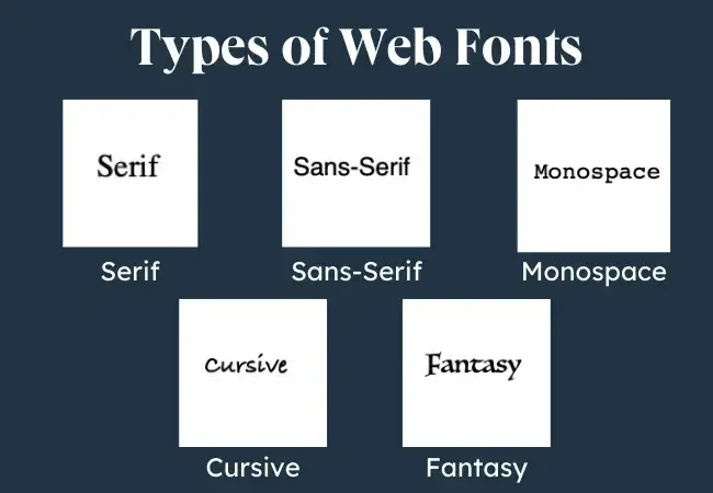
Generic Family Types
Generic families are broad font categories that help the browser choose a suitable alternative when all specified fonts are unavailable. Here are the most common ones:
- serif – Fonts with decorative strokes (e.g., Times New Roman, Georgia)
- sans-serif – Clean, modern fonts without strokes (e.g., Arial, Helvetica)
- monospace – Each character takes up equal space (e.g., Courier New, Consolas)
- cursive – Handwritten or flowing styles (e.g., Brush Script)
- fantasy – Decorative or playful fonts (e.g., Impact)
- system-ui – Uses the default UI font of the user’s operating system
Example:
h1 {

  font-family: "Open Sans", Helvetica, Arial, sans-serif;

}
This rule tells the browser:
Try Open Sans → if not available, use Helvetica → then Arial → and finally fall back to any sans-serif font.
Using Web-Safe Fonts
What Are Web-Safe Fonts?
Web-safe fonts are fonts that are pre-installed on most operating systems and devices. Because they’re so widely supported, web-safe fonts are a reliable choice when you want your text to display consistently across different platforms without needing to load external fonts.
Using web-safe fonts means you can style your text confidently without worrying whether the user has access to a particular font.
Popular Web-Safe Fonts for CSS Font-Family
There are several widely supported fonts you can confidently use in your CSS font-family declarations. Some of the most commonly used include:
- Arial – A clean, modern sans-serif font available on nearly all devices.
- Verdana – Another sans-serif font known for its wide spacing and readability on screens.
- Helvetica – A crisp, neutral sans-serif font popular in modern design.
- Times New Roman – A classic serif font that brings a traditional and formal tone.
- Georgia – A serif font designed for on-screen readability with a touch of elegance.
- Courier New – A monospace font with a typewriter-style appearance, great for code or technical content.
- Trebuchet MS – A sans-serif font with a slightly playful, modern look.
- Lucida Console – A compact monospace font that’s easy to read, especially in coding contexts.
- Impact – A bold, dramatic fantasy font used for making statements or headlines.
- Comic Sans MS – A cursive-style, informal font that mimics handwriting (use sparingly!).
These fonts are “web-safe” because they are installed by default on most operating systems, ensuring consistent display across different devices and browsers.
Pros and Cons of Using Web-Safe Fonts
Pros
- Fast loading – No need to download external font files.
- Cross-browser consistency – Displayed the same across most devices.
- No extra configuration – Easy to implement and manage.
Cons
- Limited design variety – Less creative freedom for designers.
- Overused and generic – May lack uniqueness or brand personality.
- May not match branding – Hard to align with modern visual identity needs.
Example Using Web-Safe Fonts:
body {

  font-family: Verdana, Geneva, sans-serif;

}
This example ensures that if Verdana isn’t available, the browser tries Geneva, and then defaults to a sans-serif font.
Using Custom Fonts with @font-face
Introduction to @font-face
The @font-face rule in CSS allows you to use custom fonts that are not installed on the user’s device. With it, you can embed fonts from your server or a font provider so that the browser downloads and displays them as needed.
This gives you full control over the typography of your website, making it easier to match your brand’s visual identity or achieve a unique design style.
Hosting Fonts Locally or Using Font CDNs
There are two main ways to use custom fonts with @font-face:
1. Hosting Fonts Locally
- You download the font files (e.g., .woff, .woff2, .ttf) and host them on your web server.
- More control, but adds responsibility for performance and licensing compliance.
2. Using a Font CDN (Content Delivery Network)
- Services like Google Fonts, Adobe Fonts, or Fontshare host the fonts.
- Easier to manage, optimized for performance, and often free to use.
Example of Implementing @font-face
Here’s a basic example of how to use @font-face with a locally hosted font:
@font-face {

  font-family: "MyCustomFont";

  src: url("fonts/MyCustomFont.woff2") format("woff2"),

       url("fonts/MyCustomFont.woff") format("woff");

  font-weight: normal;

  font-style: normal;

}

body {

  font-family: "MyCustomFont", Arial, sans-serif;

}
Explanation:
- font-family: A name you assign to the custom font.
- src: The path to the font files, including fallback formats.
- You can then use “MyCustomFont” like any regular font in your CSS.
Performance Considerations
While custom fonts boost your design, they can also affect page speed. Here are a few tips to optimize performance:
- Use woff2 format: It’s the most efficient and compressed format supported by modern browsers.
- Limit font weights and styles: Only load the styles (e.g., bold, italic) you actually use.
- Preload fonts: Use <link rel=”preload”> in your HTML to load fonts early.
Font-display property: Control how fonts render while loading:
font-display: swap;
This allows text to use a fallback font until the custom font is fully loaded, improving perceived speed and user experience.
Google Fonts and CSS Font-Family
How to Use Google Fonts in Your Project
Google Fonts is one of the easiest and most popular ways to add custom fonts to your website. It’s free, fast, and offers hundreds of open-source fonts with various styles and weights.
With just a few lines of code, you can include beautiful, high-quality fonts in your project without having to host them yourself.
Linking Google Fonts in HTML
You can include a Google Font by adding a <link> tag inside your HTML <head>:
<link href="https://fonts.googleapis.com/css2?family=Roboto&display=swap" rel="stylesheet">This loads the Roboto font from Google’s servers.
Importing Google Fonts in CSS
Alternatively, you can import the font directly in your CSS using @import:
@import url(‘https://fonts.googleapis.com/css2?family=Roboto&display=swap’);
Place this at the top of your CSS file before any other styles.
Applying Selected Google Fonts Using Font-Family
Once the font is loaded, you can use it like any other font in your CSS:
body {

  font-family: 'Roboto', sans-serif;

}
Here, ‘Roboto’ is the custom font, and sans-serif is the fallback in case the font fails to load.
Choosing Font Weights and Styles
Google Fonts lets you choose different font weights (like 400 for regular or 700 for bold). For example:
<link href="https://fonts.googleapis.com/css2?family=Roboto:wght@400;700&display=swap" rel="stylesheet">This loads both the regular (400) and bold (700) weights of Roboto, allowing you to style elements more flexibly.
Best Practices for Choosing Font-Families
Choosing the right font-family in CSS is about more than just aesthetics. It affects how easily users can read your content, how fast your website loads, and how your brand is perceived. Below are some best practices to guide your font choices.
1. Readability and Accessibility
- Prioritize clarity: Choose fonts that are easy to read across devices and screen sizes.
- Avoid overly decorative fonts for body text: Use them sparingly, like in headings or logos.
- Check contrast and size: Ensure your font size, weight, and color contrast meet accessibility standards (WCAG).
- Test with real users: What looks good to you might not be comfortable for everyone especially users with dyslexia or visual impairments.
2. Performance Impact
- Limit custom fonts: Each custom font adds to your page load time.
- Use only the weights and styles you need: Loading five weights of one font can slow down performance.
- Use font-display: swap;: This helps avoid invisible text while fonts are loading.
Example:
@font-face {

  font-family: 'Lora';

  src: url('Lora.woff2') format('woff2');

  font-display: swap;

}
3. Font Pairing Tips
- Contrast but complement: Pair a serif heading with a sans-serif body, or vice versa, for visual interest and balance.
- Keep it simple: Stick to 2–3 font-families max. Too many fonts can look chaotic.
- Use font families from the same foundry: They often pair better stylistically.
Popular combinations:
- Montserrat + Roboto
- Playfair Display + Open Sans
- Lora + Nunito
4. Fallback Strategy Tips
- Always list multiple fonts: Start with your preferred font, then fallback fonts, and end with a generic family.
- Use generic families wisely: These ensure something always displays, even if all else fails.
- Check spacing and layout with fallbacks: Font dimensions can vary and affect your layout.
Example fallback strategy:
body {

  font-family: "Open Sans", Arial, Helvetica, sans-serif;

}
This way, your design stays functional and consistent even if the main font doesn’t load.
Common Mistakes to Avoid
Even though working with fonts in CSS is pretty straightforward, small oversights can lead to big problems in how your website looks and performs. You can learn more about web development and how to avoid these mistakes by enrolling in our web development full course.
Here are some common mistakes to watch out for when using the font-family property:
1. Not Specifying Fallback Fonts
One of the most common (and risky) mistakes is listing only one font without any fallbacks.
Why it’s a problem:
- If the user’s device doesn’t have that font or if it fails to load, the browser will apply its default font possibly breaking your design.
What to do instead: Always list alternative fonts and end with a generic family.
Example:
body {

  font-family: "Lato", "Helvetica Neue", Helvetica, sans-serif;

}
2. Using Too Many Font-Families
It’s tempting to use different fonts for headings, paragraphs, buttons, and so on but too many font styles can overwhelm your users and slow down your site.
Why it’s a problem:
- Inconsistent visual identity
- Longer load times (especially with multiple web fonts)
- Messy and confusing UI
Best practice: Stick to 2–3 font-families max: one for headings, one for body text, and optionally one for accents or logos.
3. Failing to Test Fonts Across Browsers and Devices
Fonts can render slightly differently depending on the browser, operating system, or screen resolution.
Why it’s a problem:
- What looks good on Chrome might look off in Firefox or Safari.
- Font rendering issues can impact readability and layout.
Tips to avoid this:
- Test your typography on multiple browsers (Chrome, Firefox, Safari, Edge) and devices (desktop, tablet, mobile).
- Use tools like BrowserStack or real device testing.
- Review how fallback fonts look as they may shift the layout unexpectedly.
Avoiding these common mistakes ensures your website looks polished, performs well, and delivers a great user experience across all platforms.
To conclude, the font-family property in CSS is a powerful tool that shapes how your content looks and feels. It allows you to control typography, enhance readability, and build a visual identity that aligns with your brand or design goals. For a university‑level introduction to font stacks, fallback fonts, and best practices in typography, see the University of Washington’s lecture on CSS font‑family and typography, which covers using specific font families with generic fallbacks and similar font-style considerations.
Small changes in typography can make a big difference in user experience and overall design appeal.
By mastering the font-family property, you’re taking one more step toward crafting beautiful, user-friendly websites. So go ahead, explore, experiment, and elevate your design!