
A modal box in HTML is a user interface element that appears on top of the main content of a webpage to grab the user’s attention. It is commonly used to display important information or prompt user actions without navigating away from the current page. The modal box disables interaction with the rest of the page until the user engages with it either by completing an action or closing the box.
The importance of a modal box lies in its ability to focus user attention on a specific task. It enhances user experience by presenting content in a clean, distraction-free space. Common use cases include login forms, sign-up prompts, alerts, confirmations, pop-up notifications, promotions, and multimedia previews.
Whether you’re collecting data, confirming actions, or delivering urgent messages, implementing a modal box in HTML allows for a smooth and modern user experience.
Feeling stuck in your career or unsure how to get started in tech? Our software engineering course in Kenya is built to help beginners like you gain the practical, job-ready skills employers want fast. Through our intensive, hands-on bootcamp, you can go from zero experience to a high-paying developer role in just 10 to 12 months. Don’t wait, secure your spot today and take control of your future.
What is a Modal Box?
A modal box is a layered UI element that appears in front of a webpage’s main content, typically dimming the background to focus the user’s attention on a specific message or interaction. The user must engage with the modal by clicking a button, submitting a form, or closing it before they can return to the main interface.
Definition and Purpose
The main purpose of a modal box is to interrupt the normal flow of a webpage in order to require user interaction. It is used to:
- Display critical information
- Gather user input (e.g., login or signup forms)
- Confirm user actions (like deletions or payments)
- Present media content (videos, images, etc.)
A modal box in HTML is typically created using a combination of HTML, CSS, and JavaScript to control its display, positioning, and behavior.
Modal Box vs. Other UI Elements
While often confused with similar components, a modal box differs from:
- Popups/Popunders: These are separate browser windows or tabs, not part of the webpage’s DOM.
- Tooltips: Small hints or labels that appear when hovering over elements; they don’t block user interaction.
- JavaScript Alerts/Prompts: These are system-level dialogs that lack custom styling and don’t allow for complex content.
The modal box is a more versatile and visually integrated solution within the webpage itself.
Brief History and Evolution
The concept of the modal box emerged alongside richer front-end development tools in the early 2000s. Originally mimicked through table-based layouts and jQuery plugins, modal boxes evolved with the rise of CSS3, JavaScript frameworks, and responsive design. Today, modern approaches use semantic HTML, custom CSS, and accessibility features, or leverage UI libraries like Bootstrap or Tailwind CSS for polished, interactive modal components.
Basic Structure of a Modal Box in HTML
To create a modal box in HTML, you typically need a few key elements: a container for the modal content, an overlay to dim the background, and a trigger element like a button to open it. These elements are usually built using <div> tags, given unique IDs or classes for targeting with CSS and JavaScript.
Key HTML Elements Involved:
- Trigger Element: A button or link that, when clicked, opens the modal box.
- Modal Container (<div>): The main content area of the modal.
- Overlay (<div>): A semi-transparent background that covers the rest of the page.
These are organized in a way that allows for styling and interaction.
Explanation:
- <div> containers group the modal and overlay elements.
- IDs (e.g., id=”myModal”) are used to identify the modal for CSS styling and JavaScript control.
- The overlay creates the visual effect of dimming the background, enhancing focus on the modal.
Sample Basic HTML Code:
<!-- Trigger Button -->
<button id="openModalBtn">Open Modal</button>
<!-- Modal Overlay and Box -->
<div id="myModal" class="modal">
<div class="modal-content">
<span class="close-btn">×</span>
<h2>Modal Box Title</h2>
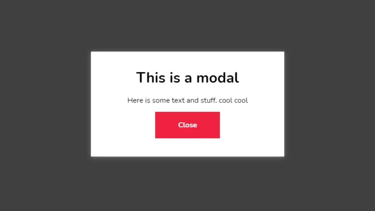
<p>This is a simple modal box in HTML.</p>
</div>
</div>This basic structure lays the foundation for applying CSS for styling and JavaScript for interactivity.
Styling the Modal Box with CSS
To make a modal box in HTML visually appealing, CSS is used to style the modal container, overlay background, and modal content. Styling includes positioning the modal in the center of the screen, dimming the background with an overlay, and adding smooth animations for a polished effect.
Key Styling Aspects:
- Overlay: A semi-transparent background that covers the entire screen.
- Modal Box: A fixed-position element, typically centered with padding, border radius, and a background color.
- Animations: Optional transitions or fade-in effects for a smooth appearance.
CSS Code Example:
/* The Modal (background overlay) */

.modal {

  display: none; /* Hidden by default */

  position: fixed; /* Stay in place */

  z-index: 1000; /* Sit on top */

  left: 0;

  top: 0;

  width: 100%; /* Full width */

  height: 100%; /* Full height */

  overflow: auto; /* Enable scroll if needed */

  background-color: rgba(0, 0, 0, 0.5); /* Black w/ opacity */

}

/* Modal Content Box */

.modal-content {

  background-color: #fff;

  margin: 10% auto; /* 10% from the top and centered */

  padding: 20px;

  border-radius: 10px;

  width: 80%;

  max-width: 500px;

  position: relative;

  animation: fadeIn 0.3s ease-in-out;

}

/* Close Button (X) */

.close-btn {

  color: #aaa;

  float: right;

  font-size: 28px;

  font-weight: bold;

  cursor: pointer;

}

.close-btn:hover {

  color: #000;

}

/* Fade-in animation */

@keyframes fadeIn {

  from { opacity: 0; transform: translateY(-20px); }

  to { opacity: 1; transform: translateY(0); }

}
Styling Breakdown:
- .modal: Covers the whole viewport with a dark translucent background.
- .modal-content: Centers the box, gives it padding, rounded corners, and a smooth animation.
- .close-btn: A styled “×” icon users can click to close the modal.
- @keyframes fadeIn: A simple animation to make the modal appear smoothly.
Making the Modal Box Functional with JavaScript
To make a modal box in HTML interactive, JavaScript is used to handle actions like opening and closing it when users click buttons or areas outside the box. This involves adding event listeners that respond to user actions such as clicking the open button, the close button (×), or the dimmed overlay area.
Key Concepts:
- Event listeners detect when the user clicks the “Open” or “Close” button.
- DOM manipulation shows or hides the modal using the style.display property.
- Interaction outside the modal closes it by clicking the overlay.
JavaScript Code Example:
<script>

  // Get elements

  const openModalBtn = document.getElementById("openModalBtn");

  const modal = document.getElementById("myModal");

  const closeBtn = document.querySelector(".close-btn");

  // Open modal when button is clicked

  openModalBtn.addEventListener("click", () => {

    modal.style.display = "block";

  });

  // Close modal when (x) is clicked

  closeBtn.addEventListener("click", () => {

    modal.style.display = "none";

  });

  // Close modal when clicking outside the modal content

  window.addEventListener("click", (event) => {

    if (event.target === modal) {

      modal.style.display = "none";

    }

  });

</script>
How It Works:
- openModalBtn triggers the modal to appear by setting display: block.
- closeBtn (the “×”) hides the modal by setting display: none.
- An event on window checks if the user clicked on the overlay (modal itself) and closes the modal if so.
This basic setup ensures a responsive, user-friendly modal interaction without relying on external libraries.
Best Practices for Using Modal Boxes
While a modal box in HTML can greatly enhance user experience, poor implementation can lead to usability or accessibility issues. Following best practices ensures your modal is effective, accessible, and user-friendly on all devices.
1. Accessibility Considerations
To ensure everyone can use your modal box, including those using screen readers or keyboard navigation, follow these tips:
- Focus Trapping: Keep keyboard focus inside the modal when it’s open. Use JavaScript to cycle through focusable elements and prevent focus from escaping.
- Initial Focus: Automatically set focus to the first interactive element in the modal when it opens (like a close button or input field).
- ARIA Attributes:
- Use role=”dialog” or role=”alertdialog” for screen readers.
- Use aria-labelledby and aria-describedby to connect the modal to its heading and description.
- Keyboard Support: Allow users to close the modal using the Esc key.
2. Mobile Responsiveness
A good modal box should adapt seamlessly across screen sizes:
- Responsive Widths: Use percentages (width: 80%, max-width: 500px) so the modal scales on different devices.
- Scrollable Content: If the modal content is tall, allow vertical scrolling within the modal, not the whole page.
- Touch Targets: Ensure buttons (like close icons) are large enough for mobile users to tap easily.
3. When Not to Use a Modal Box
Although modals are useful, they can be disruptive if overused or used in the wrong context. Avoid using modal boxes when:
- The action isn’t critical (e.g., showing minor messages that could appear inline).
- Users are mid-task and the modal interrupts them unnecessarily.
- For navigation avoid using modal boxes as the main way to navigate content.
- For displaying long or complex content large text blocks or forms can be hard to manage in a modal.
By keeping accessibility and user experience at the forefront, your modal box in HTML will enhance rather than hinder user interaction.
Advanced Tips for Modal Boxes
Once you’ve built a basic modal box in HTML, you can enhance its functionality and polish by adding animation, using frameworks, or making it dynamic. These advanced techniques improve the user experience and integrate better with real-world web applications.
1. Adding Animations or Transitions
Smooth animations make modal boxes feel more professional and less abrupt. You can use CSS transitions or keyframe animations to fade, slide, or zoom the modal in and out.
Example (Fade and Slide Animation in CSS):
.modal-content {

  animation: fadeSlideIn 0.3s ease;

}

@keyframes fadeSlideIn {

  from {

    opacity: 0;

    transform: translateY(-30px);

  }

  to {

    opacity: 1;

    transform: translateY(0);

  }

}
You can also use JavaScript or libraries like GSAP for more complex effects.
2. Integrating with Frameworks (e.g., Bootstrap Modal Box)
Frameworks like Bootstrap provide pre-built, responsive, and accessible modal components. They’re ideal for faster development.
Example (Bootstrap 5 Modal):
<!-- Trigger Button -->

<button type="button" class="btn btn-primary" data-bs-toggle="modal" data-bs-target="#myBootstrapModal">

  Launch Modal

</button>

<!-- Modal -->

<div class="modal fade" id="myBootstrapModal" tabindex="-1">

  <div class="modal-dialog">

    <div class="modal-content">

      <div class="modal-header">

        <h5 class="modal-title">Bootstrap Modal</h5>

        <button type="button" class="btn-close" data-bs-dismiss="modal"></button>

      </div>

      <div class="modal-body">

        This is a Bootstrap modal box in HTML.

      </div>

    </div>

  </div>

</div>
Bootstrap handles animations, accessibility, and JavaScript automatically.
3. Making the Modal Dynamic (Using AJAX or APIs)
You can load content into a modal dynamically using JavaScript and AJAX (or fetch()):
Example (Load content via fetch):
document.getElementById("openModalBtn").addEventListener("click", () => {

  fetch("modal-content.html")

    .then(response => response.text())

    .then(data => {

      document.querySelector(".modal-content").innerHTML = data;

      document.getElementById("myModal").style.display = "block";

    });

});
This is useful for:
- Loading forms
- Showing dynamic messages
- Reducing page load time
These advanced enhancements make your modal box in HTML more engaging, flexible, and scalable for real-world web applications.
Common Issues and How to Fix Them
Even a well-coded modal box in HTML can run into problems, especially as your page layout becomes more complex. Here are some of the most common issues and how to fix them quickly.
1. Modal Not Centering or Not Appearing
Symptoms:
The modal box appears in the wrong place or not at all.
Fixes:
Check your CSS positioning:
.modal-content {

  margin: 10% auto; /* Center horizontally */

  position: relative;

}
Ensure the modal is not hidden:
.modal {

  display: none; /* Should be set to block via JavaScript when opening */

}- Make sure JavaScript is correctly toggling the display or adding a show class.
- Verify you don’t have conflicting styles from other components or frameworks.
2. Overlap Issues with Other Content
Symptoms:
- Modal appears behind headers, navbars, or other elements.
Fixes:
Use a high z-index on the modal container:
.modal {

  z-index: 1000;

}- Ensure no other element on the page has a higher or conflicting z-index with position: relative or absolute.
Add position: fixed to your modal for it to always appear on top:
.modal {

  position: fixed;

}
3. JavaScript Errors Preventing Modal Box Functionality
Symptoms:
- Clicking the button does nothing.
- Modal won’t close.
- Console shows JavaScript errors.
Fixes:
Check if your element selectors match your HTML:
const modal = document.getElementById("myModal"); // ID must match- Ensure your script runs after the DOM is loaded (place <script> tags before the </body> tag or wrap in DOMContentLoaded event).
Add error handling in JavaScript to catch silent failures:
if (modal) {

  modal.style.display = "block";

} else {

  console.error("Modal element not found");

}
By addressing these issues early, your modal box in HTML will be more reliable, functional, and user-friendly across browsers and devices.
To conclude, a modal box in HTML is a powerful and flexible tool for displaying content without navigating away from the current page. Whether you’re using it for login forms, alerts, or promotional messages, modals enhance the user experience when used thoughtfully.
By understanding the basic structure, applying proper styling with CSS, and making it interactive with JavaScript, you can create clean, accessible modal boxes that work across devices. For more advanced needs, integrating with frameworks like Bootstrap or dynamically loading content through APIs can take your implementation even further.
Just remember to follow best practices, especially with accessibility and responsiveness, and watch out for common issues like overlapping content or JavaScript errors. When used correctly, a modal box in HTML can be a seamless, user-friendly component in any modern web interface.
Feeling stuck or unsure how to start your tech career? Our web development course is designed to get you building real websites in under 3 months, even with zero experience. Learn the skills employers are looking for and take the first step toward a future-proof career. Ready to begin? Reach out through our contact form or tap the WhatsApp icon to chat with us now.


