HTML form elements are the building blocks of user interaction on websites, enabling the collection of data through fields like text inputs, checkboxes, radio buttons, dropdowns, and input date fields. These elements play a crucial role in tasks ranging from signing up for services to submitting orders, selecting dates for appointments, and collecting feedback.
Among these elements, date inputs have become increasingly important in modern web forms. Whether users are booking appointments, selecting their date of birth, or scheduling deliveries, having a seamless and intuitive way to choose a date significantly enhances the user experience.
To meet this need, HTML5 introduced a specialized form control: the <input type=”date”>, commonly referred to as the input date element. This input type provides users with a native date picker in supported browsers, streamlining the process of selecting a date and reducing input errors.
Using the input date element brings several advantages, including cleaner data collection, improved accessibility, and reduced reliance on external date-picker libraries. It’s a simple yet powerful feature for creating more dynamic, user-friendly forms.
Stuck in a job with no growth or struggling to break into tech? Our software engineering course in Kenya is built for beginners who want real, marketable skills, not just theory. Through our hands-on, intensive bootcamps, you’ll gain the experience employers are actively looking for. In just 10 to 12 months, you could be on your way to a high-paying career as a software developer. Enroll now, your future won’t wait.
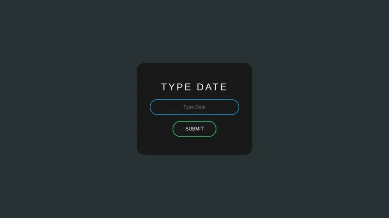
What Is the HTML Input Date Element?
The HTML input date element is a form control that allows users to select a date from a calendar interface, rather than typing it manually. This element is created using the <input> tag with the type=”date” attribute.
Definition and Syntax
The basic syntax looks like this:
<input type="date" name="appointment-date">- type=”date” tells the browser to render a date picker.
- name is the form field identifier used when submitting the form data.
When and Why to Use It
You should use <input type=”date”> whenever you want users to provide a calendar-based date input, such as:
- Booking systems (e.g., flights, hotels)
- Scheduling appointments
- Setting due dates or deadlines
- Filling in personal information like date of birth
Using the input date element improves:
- User experience: Offers a familiar and visual calendar interface
- Data accuracy: Prevents formatting errors and manual typos
- Consistency: Ensures uniform data formats when supported by browsers
Browser Compatibility
The input date element is supported by most modern browsers, including:
- Google Chrome
- Microsoft Edge
- Opera
- Safari (desktop only, with limited support)
Notably, Firefox (as of early 2025) does not natively support the calendar interface and renders it as a plain text box instead. In such cases, developers often use JavaScript-based polyfills or third-party date picker libraries as fallbacks.
Example Code Snippet with Explanation
<form>

  <label for="dob">Date of Birth:</label>

  <input type="date" id="dob" name="dob" min="1900-01-01" max="2025-12-31">

</form>Explanation:
- id=”dob” links the input with the label for accessibility.
- min and max restrict the range of selectable dates.
- name=”dob” is used to reference the value when submitting the form.
Attributes You Can Use with Input Date
The input date element comes with several useful attributes that allow developers to control its behavior and constraints. These attributes help define the range of acceptable dates, whether the field is required, and how it appears to users.
min, max, and value
- min: Sets the earliest selectable date.
- max: Sets the latest selectable date.
- value: Sets the default date that appears when the page loads.
<input type="date" min="2020-01-01" max="2030-12-31" value="2025-01-01">This ensures users can only select dates between January 1, 2020, and December 31, 2030, with a pre-filled default of January 1, 2025.
required, readonly, and disabled
- required: Forces the user to choose a date before submitting the form.
- readonly: Prevents users from manually typing a date but still allows selection via the date picker.
- disabled: Grays out the field and prevents any interaction.
<input type="date" required>

<input type="date" readonly>

<input type="date" disabled>
Each of these controls helps manage form input in different contexts, such as mandatory fields, view-only forms, or temporarily unavailable options.
Default Behavior and Customization
By default, the input date field displays a calendar picker based on the user’s device and browser. While it provides a clean, minimal interface, its appearance is not fully styleable with standard CSS. You can:
- Style borders, padding, and general layout
- Use JavaScript to enhance or replace the native picker (e.g., with libraries like Flatpickr or Pikaday)
For more extensive customization (like changing calendar layout or icons), developers often turn to JavaScript-based solutions.
Accessibility Considerations
To make input date fields accessible:
- Always use <label> tags with for attributes that match the input’s id.
- Provide clear instructions or placeholders if a specific date format is expected.
- Ensure proper contrast and keyboard accessibility.
<label for="appointment">Choose an appointment date:</label>

<input type="date" id="appointment" name="appointment" required>
Assistive technologies will recognize this combination and communicate it correctly to screen readers.
Styling the Input Date Field
The input date field brings native browser functionality, but that comes with styling limitations. While basic styling is possible, customizing the calendar UI itself is restricted due to how browsers render native date pickers.
Custom CSS Styling Limitations and Workarounds
You can style the outer wrapper of the input date element like so:
input[type="date"] {

  padding: 10px;

  border: 1px solid #ccc;

  border-radius: 6px;

  font-family: Arial, sans-serif;

}
However, native elements like the calendar dropdown and the calendar icon cannot be fully customized across browsers with just CSS. For instance:
- You cannot change the calendar icon in Chrome or Safari.
- You cannot access the dropdown popup via CSS to restyle the calendar itself.
Workaround:
To bypass these restrictions:
- Hide the default date input using opacity: 0 or display: none.
- Overlay a custom-designed input and trigger a JavaScript-based date picker for full control.
Using JavaScript or Libraries to Enhance the Appearance
If you need full customization of the date picker (icons, format, styling, animations), JavaScript libraries offer far more flexibility. Popular libraries include:
Flatpickr
Lightweight, customizable, supports themes, date ranges, and more.
<input id="datepicker">

<script>

  flatpickr("#datepicker", {

    dateFormat: "Y-m-d",

  });

</script>- Pikaday
Simple, lightweight, and compatible with Moment.js. - jQuery UI Datepicker
Heavier, but still widely used and well-supported.
These libraries allow complete control over styling, layout, and behavior while maintaining form functionality.
Mobile Responsiveness of the Input Date Field
One of the key advantages of the native input date element is its built-in mobile responsiveness. On most modern smartphones:
- iOS and Android browsers show platform-native date pickers.
- These are touch-optimized and automatically formatted.
However, if you’re using custom JavaScript libraries, ensure:
- The picker is touch-friendly
- The layout doesn’t break on small screens
- You test across devices and orientations
Using JavaScript with Input Date
While the native input date element offers basic functionality, JavaScript greatly enhances its power by enabling dynamic interactions, validations, and comparisons. This allows you to build smarter forms and provide real-time feedback to users.
How to Get and Set Values Dynamically
To get the selected date from an input:
const dateInput = document.getElementById("event-date");

const selectedDate = dateInput.value;

console.log("User selected:", selectedDate);
To set a date programmatically:
dateInput.value = "2025-12-25"; // YYYY-MM-DD formatMake sure the format follows the correct ISO standard (YYYY-MM-DD), or it won’t display properly.
Validation Examples
You can use JavaScript to ensure users select a valid date range:
const input = document.getElementById("booking-date");

input.addEventListener("change", () => {

  const today = new Date().toISOString().split("T")[0];

  if (input.value < today) {

    alert("Please choose a future date.");

    input.value = "";

  }

});
This script checks if the chosen date is earlier than today and prompts the user to select again.
Date Comparison and Manipulation
To compare dates, convert strings to Date objects:
const start = new Date("2025-01-01");

const end = new Date("2025-12-31");

const selected = new Date(document.getElementById("date").value);

if (selected >= start && selected <= end) {

  console.log("Valid date within range.");

} else {

  console.log("Date out of range.");

}
For more advanced manipulation (e.g., adding days or formatting), consider using libraries like date-fns or Moment.js.
Sample Script for Validating an Input Date
Here’s a full example that validates a birthday to ensure the user is at least 18 years old:
<input type="date" id="dob">

<button onclick="validateDOB()">Submit</button>
<script>
function validateDOB() {
const dobInput = document.getElementById("dob").value;
const dob = new Date(dobInput);
const today = new Date();
const age = today.getFullYear() - dob.getFullYear();
const m = today.getMonth() - dob.getMonth();
if (m < 0 || (m === 0 && today.getDate() < dob.getDate())) {
age--;
}
if (age >= 18) {
alert("Age verified.");
} else {
alert("You must be at least 18 years old.");
}
}
</script>This script ensures age eligibility by comparing the date of birth with the current date.
Common Issues and How to Fix Them
While the input date element is helpful for streamlining date entry, it comes with a few quirks especially around browser support, formatting, and customization. Knowing how to handle these issues ensures your forms stay user-friendly and functional across devices.
Cross-Browser Inconsistencies
One of the biggest challenges is inconsistent support for <input type=”date”> across browsers.
- Fully supported: Chrome, Edge, Opera, most Android browsers.
- Limited or no support: Firefox and some Safari versions render the field as a plain text input without a calendar picker.
- Appearance varies: The style and icons for the date picker are rendered differently in each browser and can’t be standardized with CSS.
Fix:
Use JavaScript feature detection to determine if the browser supports the native picker:
const testInput = document.createElement("input");

testInput.setAttribute("type", "date");

if (testInput.type !== "date") {

  // Load a custom date picker library as a fallback

}
Formatting Challenges
The input date field uses the ISO format (YYYY-MM-DD) regardless of the user’s locale. This can cause confusion if:
- Users expect different formats (e.g., MM/DD/YYYY or DD-MM-YYYY)
- You’re processing the date string server-side in another format
Fix:
- Use placeholder text or inline instructions to clarify the format.
- Convert the value using JavaScript or server-side scripts before processing or displaying it.
const date = new Date(document.getElementById("event-date").value);

// Format for display: MM/DD/YYYY

const formatted = `${date.getMonth() + 1}/${date.getDate()}/${date.getFullYear()}`;
Fallback Strategies for Unsupported Browsers
In browsers that don’t support the native input date:
- Users won’t see a calendar picker
- Manual input increases chances of formatting errors
Fixes:
- Add a fallback using a JavaScript-based date picker
- Use pattern matching and error messages to guide the user if you stick with a text input
<input type="text" pattern="\d{4}-\d{2}-\d{2}" placeholder="YYYY-MM-DD" required>Third-Party Date Picker Alternatives
To achieve consistent appearance and better control across all browsers, consider these well-established libraries:
- Flatpickr
Lightweight, customizable, supports time and date ranges
https://flatpickr.js.org - Pikaday
Simple, minimal UI, and easy to integrate
https://pikaday.com - jQuery UI Datepicker
Older but stable and highly configurable
https://jqueryui.com/datepicker
These tools give you:
- Full styling control
- Locale support
- Consistent behavior across browsers
Real-World Use Cases for Input Date
The input date element isn’t just a technical feature, it’s a practical tool that streamlines data collection in many common web scenarios. Here are some real-world use cases where this input type shines:
1. Booking Systems (Hotels, Flights, Rentals)
In travel and hospitality platforms, users often need to specify start and end dates for:
- Hotel check-ins and check-outs
- Flight departures and returns
- Car or vacation rentals
Using an input date field makes it easy to:
- Restrict selectable dates (e.g., no past dates)
- Dynamically calculate duration or cost
- Prevent invalid entries like check-out before check-in
<input type="date" id="checkin" min="2025-05-07">

<input type="date" id="checkout" min="2025-05-08">
2. Event Planning Forms
Whether users are creating an event, RSVP-ing, or choosing a session time, date selection is key. The input date element simplifies:
- Choosing event dates
- Filtering availability
- Scheduling reminders
Pairing it with JavaScript can automate date validation or time slot filtering based on user selection.
3. Survey Forms with Date of Birth Fields
Surveys and applications often request a date of birth (DOB) to:
- Calculate age (e.g., for age restrictions)
- Segment demographic data
- Pre-fill age-based recommendations
Example:
<label for="dob">Date of Birth:</label>

<input type="date" id="dob" name="dob" required>
You can then use JavaScript to verify if a user is over a certain age, as shown in a previous example.
4. User Account Creation or Verification Forms
Some websites ask users to provide their birthdate or account setup date for:
- Personalization
- Legal compliance (e.g., age restrictions for adult users)
- Password recovery validation
Here, the input date makes the process fast, reliable, and less prone to formatting errors compared to text inputs.
These use cases highlight how the input date element improves usability, accuracy, and form efficiency in real-world applications. It’s a simple yet essential tool for building intuitive user experiences.
In conclusion, the HTML input date element is a powerful yet simple tool that streamlines date entry in web forms. Introduced with HTML5, it enhances user experience by providing a native calendar picker, ensuring better accuracy, and reducing formatting errors.
Despite some styling limitations and cross-browser inconsistencies, its benefits, like built-in validation, mobile responsiveness, and accessibility, make it a practical choice for modern websites. Whether you’re building booking forms, event schedulers, surveys, or user registration flows, the input date element helps deliver a smoother, more reliable user experience.
For full customization or fallback support, integrating JavaScript libraries is a smart move. By understanding its capabilities and limitations, developers can effectively use the input date element to create more intuitive, user-friendly web forms.
Feeling stuck or overwhelmed about how to break into tech? Our web development course is your shortcut to real results—learn to build professional websites in under 3 months, even if you’re starting from scratch. Master the skills top employers need and kick-start a future-proof career today. Don’t wait! Use the contact form or tap the WhatsApp icon to talk to us now.