Modern web design demands layouts that are not only visually appealing but also adaptable across a wide range of devices and screen sizes. Gone are the days when static, fixed-width websites were the norm, today users access websites from desktops, tablets, and smartphones, all with different screen dimensions. This shift has made responsive design a necessity.
A responsive layout ensures that content adjusts smoothly to the size and orientation of any device, offering a better user experience and improved accessibility.
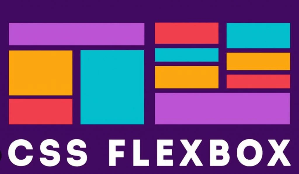
One of the most powerful tools for creating flexible and responsive layouts is CSS Flexbox. Short for Flexible Box Layout, Flexbox is a CSS module designed to distribute space and align items within a container even when their size is unknown or dynamic.
In this guide, we’ll walk you through the fundamentals of CSS Flexbox, explain key properties in simple terms, and demonstrate how to use them through real-life examples. By the end, you’ll understand how Flexbox works and how to apply it to build clean, responsive layouts with ease.
To begin your journey as a software developer, enroll in one of our software development courses in Kenya. We offer practical, project-based training that takes you from beginner to job-ready in 10-12 months. Don’t wait for the perfect time, start now and build the tech career you’ve always wanted.
What is CSS Flexbox?
Definition of CSS Flexbox
CSS Flexbox (short for Flexible Box Layout) is a modern layout model in CSS designed to make it easier to build flexible and responsive layout structures. It allows you to arrange and align elements within a container even when the size of the elements is unknown or varies dynamically.
When you set a parent container’s display property to flex, its direct children become flex items, and you gain powerful control over their positioning, spacing, and alignment.
.container {

  display: flex;

}
Flexbox focuses on one-dimensional layouts, either in a row or a column making it ideal for aligning items along a single axis.
When and Why to Use Flexbox
You should use CSS Flexbox when:
- You want to align items horizontally or vertically with ease.
- You need to distribute space dynamically (e.g., spacing between items, centering).
- You’re building responsive UI elements that adapt to various screen sizes.
- You want equal-height columns, regardless of content length.
- You need elements to grow, shrink, or wrap automatically based on available space.
Flexbox is best used when your layout involves a simple one-dimensional flow, for example:
- Navigation bars
- Card grids
- Sidebars
- Centered content blocks
- Form fields in a row
Comparison with Traditional Layout Methods
| Feature | Floats / Inline-blocks | CSS Flexbox |
| Primary Axis Support | No | One-dimensional (row or column) |
| Vertical Alignment | Hard to achieve | Easy with align-items / align-self |
| Equal Height Columns | Requires hacks (e.g., JS) | Simple with align-stretch |
| Spacing Between Elements | Requires margins | Built-in with gap, justify-content |
| Order Control | Not possible without DOM change | Easily changed with order |
| Flexibility & Responsiveness | Limited | Very responsive by design |
Traditional methods like floats were initially intended for wrapping text around images, not for complex layouts. Inline-block elements solve some alignment issues but introduce spacing quirks (like whitespace nodes). Flexbox was designed specifically to handle modern layout needs cleanly, efficiently, and responsively.
Understanding Flex Container and Flex Items
To fully grasp how CSS Flexbox works, it’s essential to understand the two main building blocks: the flex container and the flex items.
What is a Flex Container?
A flex container is any HTML element with the display: flex or display: inline-flex property applied. This element acts as the parent container and defines a flex formatting context for its direct children (the flex items).
When an element becomes a flex container:
- All of its direct child elements automatically become flex items.
- It enables control over how the items are positioned and spaced along a single axis (horizontal or vertical).
.container {

  display: flex;

}
What are Flex Items?
Flex items are the immediate children of a flex container. These items respond to the flex container’s rules and properties, such as direction, wrapping, spacing, and alignment.
They can:
- Grow or shrink depending on available space.
- Align independently or in groups.
- Be reordered without changing the actual HTML structure.
For example:
<div class="container">

  <div class="item">Item 1</div>

  <div class="item">Item 2</div>

  <div class="item">Item 3</div>

</div>
.container {
display: flex;
}
.item {
background: #e3e3e3;
padding: 10px;
margin: 5px;
}In this example:
- .container is the flex container.
- Each .item is a flex item that will be laid out according to Flexbox rules.
This foundational structure allows you to start applying Flexbox properties to create dynamic, responsive layouts with ease.
Main Axis vs Cross Axis
One of the most important concepts in CSS Flexbox is understanding the difference between the main axis and the cross axis. These two axes determine how your flex items are laid out and aligned inside a flex container.
Explanation of Axes
- Main Axis:
The main axis is the primary direction in which flex items are laid out. It is defined by the flex-direction property.- If flex-direction: row (default), the main axis is horizontal, and items are placed from left to right.
- If flex-direction: column, the main axis is vertical, and items are stacked from top to bottom.
- Cross Axis:
The cross axis is perpendicular to the main axis. It is used for aligning items across the other direction.- If the main axis is horizontal, the cross axis is vertical.
- If the main axis is vertical, the cross axis is horizontal.
Visual Representation (Diagram Description)
Since I can’t render diagrams here directly, here’s a simplified text diagram to help visualize:
When flex-direction: row (default)
———————————–
Main Axis (→ → →)
[Item 1] [Item 2] [Item 3]
Cross Axis
↓
↓
↓
When flex-direction: column
—————————-
Main Axis
↓
↓
↓
[Item 1]
[Item 2]
[Item 3]
Cross Axis (→)
→
→
→
Why Axes Matter in Layout Control
Understanding the axes is crucial because several Flexbox properties behave differently depending on the axis:
| Property | Works on Which Axis? | Purpose |
| justify-content | Main Axis | Distributes space along the main axis |
| align-items | Cross Axis | Aligns items along the cross axis |
| flex-direction | Main Axis definition | Sets the direction of the main axis |
| align-self | Cross Axis | Aligns a single item on the cross axis |
By mastering the concept of main and cross axes, you’ll have full control over how elements are positioned whether you’re building navbars, forms, card layouts, or sidebars.
CSS Flexbox Properties for Containers
Once you’ve defined a container as a flex container using display: flex, you unlock a powerful set of properties that control how the flex items inside behave. These properties help align, distribute, and wrap content along the main and cross axes.
1. display: flex
This is the foundational property. It turns a container into a flex container, enabling all Flexbox behavior.
.container {

  display: flex;

}Output: The child elements are laid out in a row by default.
2. flex-direction
This property defines the direction of the main axis i.e., the direction in which flex items are laid out.
Options:
- row (default): left to right
- row-reverse: right to left
- column: top to bottom
- column-reverse: bottom to top
.container {

  display: flex;

  flex-direction: row; /* Try column or row-reverse too */

}Output:
- row: Items are aligned horizontally from left to right.
- column: Items are stacked vertically.
3. justify-content
This property aligns items horizontally along the main axis.
Options:
- flex-start: items align to the left
- center: items are centered
- flex-end: items align to the right
- space-between: equal space between items
- space-around: equal space around items
- space-evenly: equal space between and around
.container {

  display: flex;

  justify-content: center; /* Try other values */

}Output: Items are distributed according to the chosen value along the main axis.
4. align-items
Aligns items vertically along the cross axis (when flex-direction: row).
Options:
- stretch (default): items stretch to fill
- flex-start: align to the top
- center: vertically centered
- flex-end: align to the bottom
- baseline: align based on text baseline
.container {

  display: flex;

  align-items: center;

}Output: Items are centered vertically within the container.
5. align-content
This property aligns multiple lines of flex items (only works when items wrap to multiple rows).
Use it when:
- You have flex-wrap: wrap enabled.
- There is more than one line of items.
Options:
- flex-start
- center
- flex-end
- space-between
- space-around
- stretch (default)
.container {

  display: flex;

  flex-wrap: wrap;

  align-content: space-between;

}Output: Controls vertical spacing between rows of items.
Example Output (HTML + CSS Demo)
<div class="container">

  <div class="item">1</div>

  <div class="item">2</div>

  <div class="item">3</div>

</div>
.container {
display: flex;
flex-direction: row;
justify-content: space-around;
align-items: center;
height: 200px;
background: #f0f0f0;
}
.item {
background: #3498db;
color: white;
padding: 20px;
border-radius: 8px;
}Visual Output:
- Items 1, 2, and 3 are spaced evenly across the row.
- Centered vertically in a 200px tall container.
CSS Flexbox Properties for Items
While container properties control how items are placed, Flexbox also gives you control over how individual items behave inside a Flex container. These item-level properties determine how much space each item takes up and how it aligns within the layout. For a deeper academic dive into these item-level properties like flex-grow, flex-shrink, and flex-basis, refer to the Harvard CSCI E-12 lecture notes on Flexbox.
1. flex-grow
Defines how much an item will grow relative to other items when there’s extra space in the container.
.item {

  flex-grow: 1;

}- 0 (default): item does not grow.
- 1 or more: item will grow based on proportion compared to other items.
Example:
If three items have flex-grow: 1, they’ll each take up equal space.
If one item has flex-grow: 2, it will take twice the space of others.
2. flex-shrink
Defines how an item shrinks when the container is too small.
.item {

  flex-shrink: 1;

}- 0: item will not shrink.
- 1 or more: item will shrink proportionally with others.
3. flex-basis
Specifies the initial size of a flex item before growing or shrinking occurs.
.item {

  flex-basis: 200px;

}- Can be set in px, %, or auto (default).
- Works like a starting width or height (depending on flex-direction).
4. flex (Shorthand)
A shorthand for combining flex-grow, flex-shrink, and flex-basis.
.item {

  flex: 1 1 200px; /* grow, shrink, basis */

}
Or for simple cases:
.item {

  flex: 1; /* Equivalent to flex: 1 1 0 */

}
5. align-self
Overrides align-items only for a single item, aligning it independently along the cross axis.
.item.special {

  align-self: flex-end;

}Values:
- auto (default)
- flex-start
- center
- flex-end
- stretch
Example: Flexible Cards Layout
<div class="card-container">

  <div class="card">Card 1</div>

  <div class="card">Card 2</div>

  <div class="card special">Card 3</div>

</div>
.card-container {
display: flex;
gap: 20px;
align-items: stretch;
}
.card {
flex: 1 1 200px;
padding: 20px;
background: #f8f9fa;
border: 2px solid #ccc;
border-radius: 8px;
}
.special {
align-self: flex-end;
background: #d1ecf1;
}What happens:
- All cards have a base width of 200px but grow equally to fill space.
- Special card aligns to the bottom of the container (independent alignment).
- The layout is responsive, stretching and shrinking as needed.
Real-Life Examples Using CSS Flexbox
Flexbox is more than just a layout tool, it’s a practical solution for many everyday interface challenges. Need to explore more on web development course, enroll in one of our programs.
Below are some of the most common use cases, with working examples.
1. Responsive Navigation Bar
Use case: Aligning links horizontally and spacing them out.
<nav class="navbar">

  <div class="logo">Brand</div>

  <div class="nav-links">

    <a href="#">Home</a>

    <a href="#">About</a>

    <a href="#">Contact</a>

  </div>

</nav>
.navbar {
display: flex;
justify-content: space-between;
align-items: center;
padding: 15px 20px;
background: #333;
color: white;
}
.nav-links a {
color: white;
margin-left: 15px;
text-decoration: none;
}Result: The brand logo stays on the left, and the links are aligned to the right.
2. Product Grid / Card Layout
Use case: Flexible product cards that wrap and resize automatically.
<div class="product-grid">

  <div class="card">Product 1</div>

  <div class="card">Product 2</div>

  <div class="card">Product 3</div>

</div>
.product-grid {
display: flex;
flex-wrap: wrap;
gap: 20px;
}
.card {
flex: 1 1 200px;
padding: 20px;
background: #f0f0f0;
border-radius: 8px;
}Result: Cards automatically wrap and adjust size depending on the screen width.
3. Responsive Footer
Use case: Align items in a footer with spacing and stacking on small screens.
<footer class="footer">

  <div>© 2025 YourCompany</div>

  <div class="footer-links">

    <a href="#">Privacy</a>

    <a href="#">Terms</a>

  </div>

</footer>
.footer {
display: flex;
justify-content: space-between;
align-items: center;
padding: 20px;
background: #222;
color: white;
flex-wrap: wrap;
}
.footer-links a {
color: #ccc;
margin-left: 15px;
text-decoration: none;
}Result: Items align in a row on wide screens and stack neatly on smaller screens.
4. Side-by-Side Form Elements
Use case: Input fields and buttons aligned in a single row.
<form class="form-row">

  <input type="email" placeholder="Your email" />

  <button type="submit">Subscribe</button>

</form>
.form-row {
display: flex;
gap: 10px;
max-width: 400px;
}
input {
flex: 1;
padding: 10px;
}
button {
padding: 10px 15px;
}Result: Input and button are aligned on the same line, and input expands to fill space.
Common Flexbox Layout Patterns
Flexbox shines in real-world layout challenges. Here are four popular patterns that every web developer should know how to build using CSS Flexbox.
1. Centering with Flexbox (Horizontally and Vertically)
Use case: You want to center any element perfectly in both directions.
<div class="center-box">

  <p>I'm centered!</p>

</div>
.center-box {
display: flex;
justify-content: center;
align-items: center;
height: 300px;
background: #f4f4f4;
}Result: The child element is centered both horizontally and vertically in its container.
2. Holy Grail Layout
Use case: A classic web layout with a header, footer, and a three-part body (left sidebar, main content, right sidebar).
<div class="layout">

  <header>Header</header>

  <div class="main-area">

    <aside class="sidebar">Left</aside>

    <main>Main Content</main>

    <aside class="sidebar">Right</aside>

  </div>

  <footer>Footer</footer>

</div>
.layout {
display: flex;
flex-direction: column;
min-height: 100vh;
}
.main-area {
display: flex;
flex: 1;
}
.sidebar {
flex: 1;
background: #ddd;
}
main {
flex: 2;
background: #f9f9f9;
}
header, footer {
background: #333;
color: white;
padding: 10px;
}Result: A full-height layout with sidebars and content that adapt to screen width.
3. Equal-Height Columns
Use case: You want multiple boxes in a row to all have the same height, regardless of their content.
<div class="equal-columns">

  <div class="column">Short text</div>

  <div class="column">Some longer content in this box to test height consistency.</div>

  <div class="column">Medium length content.</div>

</div>
.equal-columns {
display: flex;
gap: 20px;
}
.column {
flex: 1;
background: #e0e0e0;
padding: 20px;
border-radius: 8px;
}Result: All columns have equal height even if content length varies.
4. Sticky Footer
Use case: You want the footer to always stay at the bottom of the page even if the content is short.
<div class="page">

  <main>Main Content</main>

  <footer>Sticky Footer</footer>

</div>
html, body {
height: 100%;
margin: 0;
}
.page {
display: flex;
flex-direction: column;
min-height: 100vh;
}
main {
flex: 1;
padding: 20px;
background: #f0f0f0;
}
footer {
background: #444;
color: white;
padding: 10px;
}Result: The footer stays pinned to the bottom even when content doesn’t fill the page.
These layout patterns are efficient, responsive, and clean making Flexbox an essential tool for everyday web development.
Tips and Best Practices for Using CSS Flexbox
While Flexbox is incredibly powerful, using it effectively requires a few best practices to ensure clean, responsive, and maintainable layouts.
1. Combine Flexbox with Media Queries
Flexbox is great for responsiveness, but media queries help you adapt layouts across different screen sizes. Use them together to build flexible UIs that scale smoothly.
.container {

  display: flex;

  flex-direction: row;

}

@media (max-width: 768px) {

  .container {

    flex-direction: column;

  }

}
Best Practice:
- Use flex-direction: row for desktops.
- Switch to column layout on mobile for better stacking.
2. Avoid Overusing Nested Flex Containers
It’s tempting to use Flexbox everywhere, but too many nested flex containers can complicate your layout and make debugging harder.
Best Practice:
- Use Flexbox for high-level layout structure.
- Use it for grouping or alignment within components.
- Keep nesting shallow unless truly necessary.
3. When to Use Grid vs Flexbox
| Use Case | Flexbox | CSS Grid |
| One-dimensional layouts | Best choice | Overkill |
| Two-dimensional layouts | Workable with nesting | Best choice |
| Content-based layout flow | Ideal | Works too |
| Strict row/column alignment | Harder to manage | Easier to manage |
| Equal spacing in one axis | Very effective | Also possible |
Best Practice:
- Use Flexbox when you’re working in a single direction (row or column).
- Use CSS Grid when your layout needs rows and columns at the same time (like dashboards, image galleries, full-page layouts).
Bonus Tips
- Use the gap property (instead of margins) for consistent spacing between flex items.
- Prefer flex shorthand (flex: 1) for simple growth/shrink behavior.
- Use browser developer tools to visually debug Flexbox layouts by inspecting elements.
Troubleshooting CSS Flexbox Issues
While CSS Flexbox simplifies layout creation, it’s not immune to common mistakes or quirks especially across different browsers and screen sizes. Here’s how to solve the most frequent problems developers encounter.
1. Common Bugs and Fixes
Issue: Flex items not aligning as expected
Fix: Check that the parent container has display: flex and that you’re using the correct axis (flex-direction, justify-content, align-items).
.container {

  display: flex;

  align-items: center;

  justify-content: space-between;

}
Issue: Items overflow the container
Fix: Add flex-wrap: wrap to prevent flex items from forcing the container to stretch.
.container {

  display: flex;

  flex-wrap: wrap;

}
Issue: Equal-height columns not working
Fix: Ensure you’re using Flexbox on the parent and that children have no conflicting height styles.
.parent {

  display: flex;

  align-items: stretch;

}
Issue: Unexpected spacing using inline elements
Fix: Use block-level elements or remove unwanted whitespace between inline-block flex children.
2. Browser Compatibility Notes
Flexbox is widely supported in all modern browsers, including:
- Chrome
- Firefox
- Safari
- Edge
- Opera
However, a few older browsers (like Internet Explorer 10/11) have partial support or require prefixes. For full compatibility:
- Use autoprefixer in your build process (e.g., via PostCSS or tools like Tailwind).
- Avoid outdated syntax like display: -ms-flexbox unless targeting legacy systems.
3. Developer Tools Tips (Inspect Element)
Most browser DevTools (Chrome, Firefox, Edge) offer visual tools to inspect and debug Flexbox layouts:
- Open Inspect Element.
- Look for the “Flex” badge next to a flex container.
- Click the badge to visualize the layout, see spacing, alignment, and directions.
- Use the Styles tab to tweak flex, justify-content, and align-items in real time.
Pro Tip: Enable layout overlays in Chrome’s DevTools to see flex lines, gaps, and box sizes while editing.
Troubleshooting Flexbox becomes much easier once you know what to look for and DevTools are your best friend in this process.
To conclude, CSS Flexbox is a powerful and intuitive layout model that has become a go-to tool for modern web design. Whether you’re centering elements, building responsive navigation bars, or creating flexible card layouts, Flexbox makes it easier to align and distribute content with minimal code.
By practicing with these examples and combining Flexbox with responsive design techniques like media queries, you’ll be well-equipped to build clean, responsive, and user-friendly interfaces. Flexbox is just one part of the modern CSS toolbox but mastering it will level up your front-end skills significantly.