CSS Grid Layout is a two-dimensional layout system in CSS that allows developers to design web pages by placing elements into a structured grid of rows and columns. It’s a powerful tool that simplifies complex layouts and gives precise control over spacing, alignment, and responsiveness. Unlike Flexbox, which is one-dimensional (row or column), CSS Grid handles both axes simultaneously, making it ideal for building structured layouts.
As websites become more dynamic and visually engaging, the need for flexible, responsive layouts has grown. CSS Grid Layout provides a cleaner, more efficient way to build grid-based interfaces without relying heavily on floats, positioning, or third-party frameworks. It also reduces the amount of code needed, which can improve performance and maintainability.
In this beginner’s guide, you’ll learn:
- The fundamental concepts of CSS Grid (like grid containers and items)
- How to define rows and columns
- How to place and align elements within the grid
- Responsive design techniques using Grid
- Real-life layout patterns and examples
- Best practices and common pitfalls
Whether you’re just starting with web development course or looking to modernize your layout skills, enroll in one of our programs and build projects in less than 3 months.
What is CSS Grid Layout?
Definition and History
CSS Grid Layout is a powerful two-dimensional layout system in CSS that allows web developers to create complex, responsive layouts with ease. Introduced as a W3C recommendation in 2017, CSS Grid enables you to control both rows and columns simultaneously, something that wasn’t natively possible with earlier layout techniques.
Before Grid, developers relied heavily on floats, tables, inline-block, and more recently, Flexbox. These approaches worked, but often required workarounds and extra code to create sophisticated layouts. CSS Grid revolutionized layout design by offering a native, intuitive system for placing elements exactly where you want them on the page.
Difference Between Grid and Flexbox
| Feature | CSS Grid | Flexbox |
| Layout direction | Two-dimensional (rows and columns) | One-dimensional (row or column) |
| Item placement | Can be explicitly positioned anywhere in the grid | Items are placed based on order in the DOM |
| Best for | Page layouts and large-scale designs | Smaller components like navigation bars or cards |
| Gaps | Built-in support using gap | Limited gap support depending on direction |
| Overlapping items | Allows item overlap with grid-area | Does not support overlapping items easily |
In short:
- Use CSS Grid when you need full control over layout structure in both dimensions.
- Use Flexbox when you’re laying out items in a single direction or aligning small components.
When to Use CSS Grid
You should consider using CSS Grid when:
- You need to create a page-level layout (e.g., header, sidebar, content, footer).
- You want to design a responsive grid that adapts to different screen sizes.
- You’re building image galleries, card layouts, dashboards, or any design that benefits from a grid structure.
- You want to simplify layout code and avoid hacks or third-party frameworks.
CSS Grid is especially useful when working with content that doesn’t follow a strict flow or when you need to place items into specific positions regardless of their order in the HTML.
Basic Concepts of CSS Grid
Understanding the basic building blocks of CSS Grid is key to mastering layout creation. Let’s break down the core concepts:
Grid Container vs. Grid Items
Grid Container:
Any element that has display: grid (or display: inline-grid) becomes a grid container. This container establishes a grid formatting context for its direct children.
.grid-container {

  display: grid;

}
Grid Items:
The direct children of the grid container automatically become grid items. These items can then be placed and sized using various grid properties.
<div class="grid-container">

  <div class="item">1</div>

  <div class="item">2</div>

  <div class="item">3</div>

</div>
Rows and Columns
CSS Grid uses rows and columns to define the structure of your layout.
.grid-container {

  display: grid;

  grid-template-columns: 200px 1fr 2fr;

  grid-template-rows: auto auto;

}- grid-template-columns defines the width of columns.
- grid-template-rows defines the height of rows.
- You can use fixed units (e.g., px), flexible units (e.g., fr), or content-based units (auto, %).
Explicit vs. Implicit Grid
- Explicit Grid:
Created when you define rows and columns using grid-template-rows and grid-template-columns. You know exactly how many rows and columns exist.
Implicit Grid:
Happens when you place items outside the explicitly defined grid. CSS automatically creates additional rows or columns to accommodate the items.
Example:
.grid {

  display: grid;

  grid-template-columns: 1fr 1fr;

}
If you have 5 items, but only defined 2 columns, CSS will create 3 rows implicitly to fit all the items.You can style implicit rows and columns with:
grid-auto-rows: 100px;
grid-auto-columns: 1fr;
Grid Lines and Tracks
Grid Lines:
These are the invisible lines that run between rows and columns. They are used to position grid items. Lines are numbered starting from 1.
Grid Tracks:
A track is the space between two grid lines essentially, a single row or column.
Example:
.grid-item {

  grid-column: 1 / 3; /* spans from line 1 to line 3 (i.e., covers 2 columns) */

  grid-row: 1 / 2;     /* spans from line 1 to line 2 (i.e., one row) */

}
Grid lines give you precise control over item placement and span, especially useful for custom layouts.
Setting Up a Grid Container
To start using CSS Grid, the first step is to define a grid container. This sets up the context for creating rows, columns, and positioning elements within a grid layout.
display: grid and display: inline-grid
- display: grid
This turns a block-level element into a grid container, making it span the full width available (like div, section, etc.). - display: inline-grid
This behaves like an inline-block element while still functioning as a grid container. It’s useful when you want the grid to only be as wide as its content.
Example:
.grid-container {

  display: grid; /* or display: inline-grid */

}
Defining Columns and Rows with grid-template-columns and grid-template-rows
Once the container is set, use grid-template-columns and grid-template-rows to define the structure of the grid:
.grid-container {

  display: grid;

  grid-template-columns: 200px 1fr;   /* Two columns: one fixed, one flexible */

  grid-template-rows: auto auto;      /* Two rows: height adjusts to content */

}
Common units:
- px, em, % fixed or relative sizes
- fr fractional unit (e.g., 1fr is one share of the remaining space)
- auto adjusts based on content
You can also use repeat() for cleaner code:
grid-template-columns: repeat(2, 1fr); /* Two equal columns */
Example: Simple Two-Column Layout
Here’s a full example to create a basic two-column layout using Grid:
<style>

  .grid-container {

    display: grid;

    grid-template-columns: 1fr 2fr;

    gap: 20px;

    padding: 20px;

    background-color: #f4f4f4;

  }

  .item {

    background-color: #ccc;

    padding: 20px;

    text-align: center;

    font-weight: bold;

  }

</style>

<div class="grid-container">

  <div class="item">Column 1</div>

  <div class="item">Column 2</div>

</div>
What’s happening:
- Two columns: the first takes 1fr, the second 2fr (twice as wide).
- gap adds space between columns.
- Grid items are automatically placed into the defined structure.
Placing Items on the Grid
Once your grid container is set up, you can control where each grid item appears using line-based positioning or named grid areas.
Grid Item Positioning Using Line Numbers
Every row and column in a CSS Grid has lines that define the start and end of each cell. These lines are numbered starting from 1, both horizontally and vertically.
You can place grid items by telling them where to start and end using these line numbers.
Using grid-column and grid-row
These properties let you span and place items based on line numbers.
.item {

  grid-column: 1 / 3; /* Start at line 1, end at line 3 (span 2 columns) */

  grid-row: 2 / 4;    /* Start at row line 2, end at line 4 (span 2 rows) */

}
grid-column-start / grid-column-end and
grid-row-start / grid-row-end are long-hand versions.
You can also use the span keyword:
.item {

  grid-column: span 2;

  grid-row: span 1;

}
This tells the item to stretch across 2 columns and 1 row without needing to know the exact line numbers.
Using grid-area for Shorthand Positioning
The grid-area shorthand lets you position items using all four lines in a single declaration:
.item {

  grid-area: 2 / 1 / 4 / 3;

  /* grid-row-start / grid-column-start / grid-row-end / grid-column-end */

}
This is especially helpful for quickly placing items when you already know the lines.
Naming Lines and Using grid-area
You can also name lines in your grid definition and refer to those names for better readability:
.grid-container {

  display: grid;

  grid-template-columns: [left] 1fr [middle] 2fr [right];

  grid-template-rows: [top] auto [content] auto [bottom];

}
Then you can place items like this:
.item {

  grid-column: left / middle;

  grid-row: top / content;

}
Named lines make your layout much easier to understand, especially in large grids.
Bonus: Using grid-template-areas
Another way to position items is by creating template areas and assigning items using the grid-area name.
.grid-container {

  display: grid;

  grid-template-areas:

    "header header"

    "sidebar main"

    "footer footer";

  grid-template-columns: 1fr 3fr;

  grid-template-rows: auto 1fr auto;

}

.header {

  grid-area: header;

}

.sidebar {

  grid-area: sidebar;

}

.main {

  grid-area: main;

}

.footer {

  grid-area: footer;

}
This is ideal for clear, semantic layouts like web pages.
CSS Grid Properties Explained
Once you’ve defined a grid container and its structure, CSS Grid provides a variety of properties to control spacing, alignment, and layout behavior of grid items and content. Let’s look at the most commonly used ones:
grid-template-areas
This property allows you to name sections of your layout and visually map them out using a string-based syntax.
.grid-container {

  display: grid;

  grid-template-areas:

    "header header"

    "sidebar main"

    "footer footer";

  grid-template-columns: 1fr 3fr;

}
Then assign areas to items:
.header { grid-area: header; }

.sidebar { grid-area: sidebar; }

.main { grid-area: main; }

.footer { grid-area: footer; }
Great for building full-page layouts and improving readability.
grid-gap / gap
These properties define the spacing between rows and columns.
.grid-container {

  display: grid;

  gap: 20px; /* shorthand for row-gap and column-gap */

}
/* OR */
.grid-container {

  row-gap: 10px;

  column-gap: 15px;

}
Note: grid-gap is now deprecated; use gap instead.
Helps separate items without adding margin to individual elements.
justify-items and align-items
These control how grid items are aligned within their grid cells.
- justify-items horizontal alignment (left to right)
- align-items vertical alignment (top to bottom)
.grid-container {

  justify-items: center; /* start | end | center | stretch (default) */

  align-items: start;    /* top-align items */

}
Useful for aligning content inside each grid cell.
place-items
This is shorthand for align-items and justify-items.
.grid-container {

  place-items: center start; /* vertical | horizontal */

}
Cleaner and quicker way to align items in both directions.
justify-content and align-content
These control how the entire grid itself is aligned inside the container when there’s extra space.
- justify-content aligns grid along the row axis
- align-content aligns grid along the column axis
.grid-container {

  justify-content: space-between; /* or: center | start | end | stretch */

  align-content: center;

}
Affects the grid as a whole, not individual items.
place-content
This is shorthand for align-content and justify-content.
.grid-container {

  place-content: center space-evenly;

}
Helps control how the entire grid block behaves when it doesn’t fill the container. Beginners learning Grid often struggle because they don’t fully understand key properties like display, gap, and align-items. To learn more, refer to our CSS Properties guide for a deeper understanding of these foundational concepts.
Responsive Design with CSS Grid
One of the biggest advantages of CSS Grid is how well it adapts to different screen sizes. It gives you powerful tools to create layouts that respond fluidly without relying on media queries alone. Let’s look at some essential techniques:
Using auto-fit and auto-fill
These keywords allow the grid to automatically place and size items based on available space, creating flexible layouts that adjust as the screen resizes.
Syntax:
grid-template-columns: repeat(auto-fit, minmax(200px, 1fr));
auto-fill
- Fills the row with as many columns as will fit, even if some are empty.
auto-fit
- Similar to auto-fill, but collapses empty columns to zero width, making it more responsive.
Example:
.grid {

  display: grid;

  grid-template-columns: repeat(auto-fit, minmax(250px, 1fr));

  gap: 20px;

}
This automatically adjusts the number of columns depending on the screen width, making it ideal for image galleries or card layouts.
Using minmax() for Flexible Layouts
The minmax() function allows you to define a minimum and maximum size for a column or row.
Syntax:
grid-template-columns: repeat(3, minmax(150px, 1fr));
- Each column will be at least 150px, but grow to share the available space equally (1fr).
- Helps prevent grid items from getting too small on narrow screens.
Combine minmax() with auto-fit or auto-fill to create truly fluid layouts.
Combining Media Queries with Grid
Although Grid is responsive on its own, media queries give you even more control for specific breakpoints.
Example:
.grid {

  display: grid;

  grid-template-columns: repeat(3, 1fr);

}

@media (max-width: 768px) {

  .grid {

    grid-template-columns: 1fr;

  }

}
This layout switches from 3 columns to 1 column on tablets or smaller devices.
Real-World Responsive Grid Example
HTML:
<div class="grid">

  <div class="card">Item 1</div>

  <div class="card">Item 2</div>

  <div class="card">Item 3</div>

  <div class="card">Item 4</div>

</div>
CSS:
.grid {

  display: grid;

  gap: 20px;

  grid-template-columns: repeat(auto-fit, minmax(200px, 1fr));

  padding: 20px;

}

.card {

  background-color: #f0f0f0;

  padding: 20px;

  text-align: center;

  border-radius: 8px;

}
On a wide screen, you’ll see multiple cards side by side.
On smaller screens, the layout automatically stacks the cards vertically.
Common CSS Grid Layout Patterns
CSS Grid makes it easy to create layout patterns that once required complex hacks or frameworks. Here are some of the most popular and useful ones:
1. Two-Column Layout
A basic layout with a sidebar and main content area.
HTML:
<div class="two-column-grid">

  <div class="sidebar">Sidebar</div>

  <div class="main">Main Content</div>

</div>
CSS:
.two-column-grid {

  display: grid;

  grid-template-columns: 1fr 3fr;

  gap: 20px;

}

.sidebar {

  background: #ddd;

  padding: 20px;

}

.main {

  background: #eee;

  padding: 20px;

}
Use this for blog layouts, dashboards, and admin pages.
2. Card/Grid Gallery
An automatically adjusting card layout that works on all screen sizes.
HTML:
<div class="card-grid">

  <div class="card">Card 1</div>

  <div class="card">Card 2</div>

  <div class="card">Card 3</div>

  <div class="card">Card 4</div>

</div>
CSS:
.card-grid {

  display: grid;

  gap: 20px;

  grid-template-columns: repeat(auto-fit, minmax(200px, 1fr));

}

.card {

  background: #fafafa;

  padding: 20px;

  border: 1px solid #ccc;

  text-align: center;

}
Great for product listings, portfolios, and photo galleries.
3. Centering Content with Grid
Grid makes centering both horizontally and vertically simple.
HTML:
<div class="center-grid">

  <div class="centered-box">Centered</div>

</div>
CSS:
.center-grid {

  display: grid;

  height: 100vh;

  place-items: center;

}

.centered-box {

  background: #4caf50;

  color: white;

  padding: 30px;

  border-radius: 10px;

}
Perfect for hero sections, modals, or loading screens.
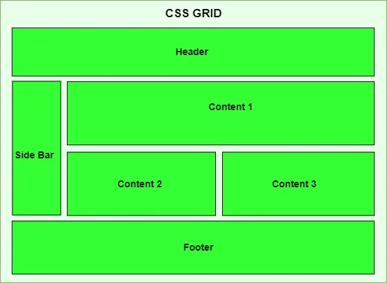
4. Holy Grail Layout
A classic web layout with header, sidebar, main content, and footer.
HTML:
<div class="holy-grail">

  <header class="header">Header</header>

  <aside class="sidebar">Sidebar</aside>

  <main class="content">Content</main>

  <footer class="footer">Footer</footer>

</div>
CSS:
.holy-grail {

  display: grid;

  grid-template-areas:

    "header header"

    "sidebar content"

    "footer footer";

  grid-template-columns: 200px 1fr;

  grid-template-rows: auto 1fr auto;

  height: 100vh;

}

.header  { grid-area: header; background: #2196f3; color: white; padding: 15px; }

.sidebar { grid-area: sidebar; background: #f0f0f0; padding: 15px; }

.content { grid-area: content; padding: 15px; }

.footer  { grid-area: footer; background: #ccc; padding: 15px; text-align: center; }
Use this for full-page layouts with clear content structure.
Tips, Tricks & Best Practices
To make the most of CSS Grid Layout and write clean, maintainable code, keep these essential tips and best practices in mind:
Use Semantic HTML with Grid
While Grid gives you control over layout, always prioritize using semantic HTML elements like <header>, <main>, and <section>. Stanford’s CS106E Grid Layout handout provides academic guidance on semantic structure and grid placement.
Why it matters:
- Improves accessibility and SEO
- Makes your code easier to read and maintain
- Enhances collaboration with other developers
Example:
<main class="grid">

  <section class="content">Content</section>

  <aside class="sidebar">Sidebar</aside>

</main>
Combine Grid and Flexbox Wisely
CSS Grid and Flexbox aren’t competitors, they complement each other.
- Use Grid for overall page or component layout (2D: rows and columns).
- Use Flexbox for internal alignment or 1D layout within grid items.
Example:
.card {

  display: flex; /* Align content inside a grid cell */

  flex-direction: column;

  justify-content: space-between;

}
Avoid trying to solve every layout problem with only one system.
Avoid Over-Complicating with Too Many Nested Grids
While nesting grids is possible, try not to go overboard.
- It can make your layout harder to debug and maintain
- Adds unnecessary complexity to the DOM
Instead, flatten your structure when possible, or use Flexbox inside grid items to simplify.
Tip: Only nest grids when you need entirely different grid logic inside a section.
Start Mobile-First When Possible
Build your layouts to work on small screens first, then scale up using media queries.
Why mobile-first matters:
- Encourages clean, minimal design
- Improves performance on slower connections
- Ensures accessibility and usability across devices
Example:
.grid {

  display: grid;

  grid-template-columns: 1fr; /* Mobile default: single column */

}

@media (min-width: 768px) {

  .grid {

    grid-template-columns: repeat(3, 1fr); /* Tablet and up: 3 columns */

  }

}
Additional Tips:
- Use minmax() and auto-fit for fluid responsiveness.
- Use browser DevTools to visualize and debug your grid layout.
- Keep a naming convention for grid areas and classes to avoid confusion.
- Prefer gap over manual margins for spacing within grids.
CSS Grid Layout is one of the most powerful tools in modern web design. It allows you to build complex, responsive, and clean layouts with minimal code. Whether you’re creating full-page structures, card galleries, or centered content blocks, Grid gives you flexibility and precision that older layout methods simply can’t match.
As you continue building projects, don’t hesitate to experiment. Use developer tools, online generators, and visual guides to explore new possibilities. The more you practice, the more intuitive Grid will feel.
Ever dreamed of becoming a software developer? This is your chance. At allthingsprogramming.com, we offer immersive, project-based software engineering course in Kenya that take you from beginner to professional in less than 10 months. Enroll today and join a supportive learning community, build real projects, and unlock new opportunities.