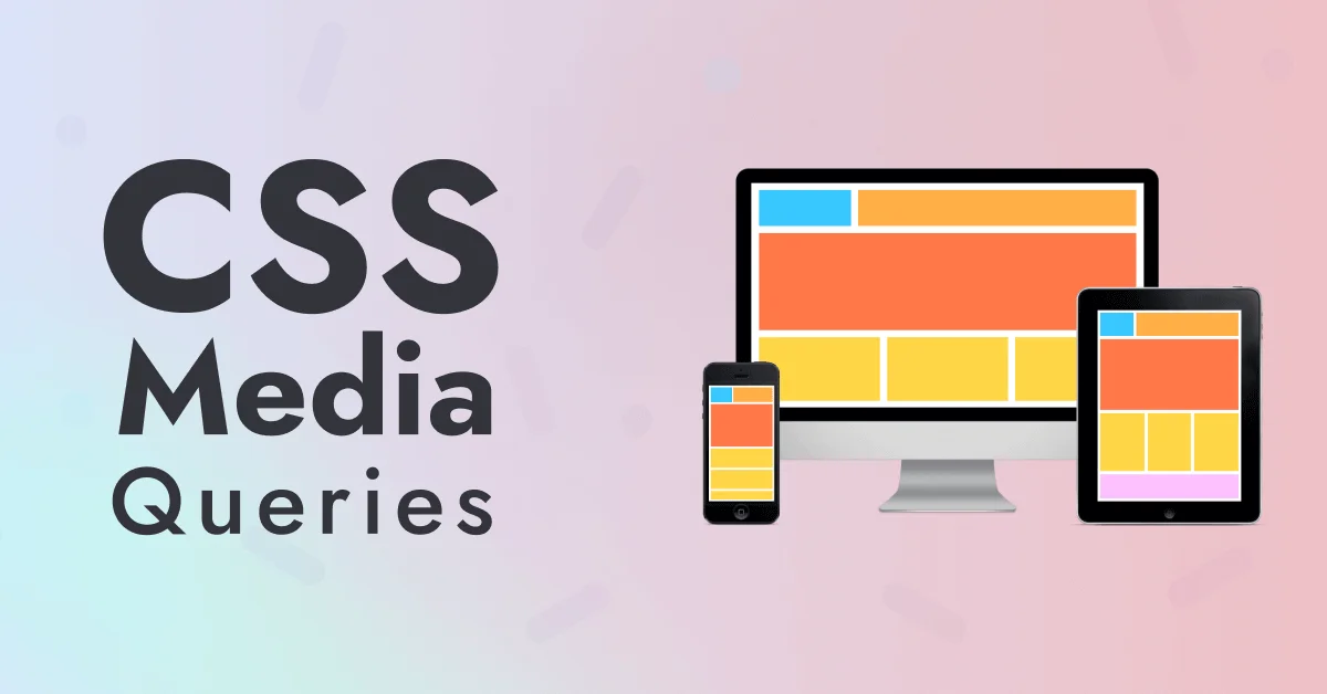
In today’s digital world, users access websites from a wide range of devices, smartphones, tablets, laptops, desktops, and even smart TVs. Responsive design in web development ensures that a website automatically adjusts its layout and content to fit any screen size or resolution, providing an optimal user experience across all devices. This adaptability not only improves usability but also enhances performance, accessibility, and SEO.
At the heart of responsive design lies a powerful CSS feature: Media Queries. With CSS media queries, developers can apply different styles based on device characteristics like screen width, height, orientation, or resolution. This makes CSS Media Queries a core tool for creating flexible, user-friendly, and device-aware web interfaces.
In this guide, you’ll learn everything you need to know about CSS Media Queries and Responsive Design, from the basics and syntax to best practices, real-life examples, and common pitfalls to avoid. Whether you’re a beginner or looking to refresh your skills, this article will help you build responsive websites that look great and function flawlessly on any device.
Dreaming of a career in software development? Turn that dream into reality with our immersive software engineering course in Kenya. With a focus on practical, real-world coding skills, you’ll be job-ready in as little as 10 to 12 months.
What Are CSS Media Queries?
CSS Media Queries are a fundamental feature in CSS used to apply styles conditionally based on specific characteristics of the user’s device, such as screen width, height, orientation, resolution, or even color preference. The primary purpose of media queries is to create responsive designs that adapt to different devices and screen sizes, ensuring a seamless and user-friendly experience across all platforms.
The basic syntax for a media query starts with the @media rule, followed by one or more conditions and a block of CSS rules. For example:
@media (max-width: 768px) {

  body {

    background-color: lightblue;

  }

}
In this example, the background color will only change to light blue if the device’s screen width is 768 pixels or less. You can combine multiple conditions using logical operators like and, not, and only to create more refined queries.
Media queries play a critical role in the responsive design workflow. Typically, developers start with a base style (often mobile-first) and then use media queries to progressively enhance the design for larger screens by adjusting CSS properties such as layout, spacing, and typography. This approach not only promotes better performance but also aligns with modern design principles, allowing websites to remain flexible and accessible across a broad spectrum of devices.
The Role of CSS Media Queries in Responsive Design
CSS Media Queries play a vital role in responsive web design by enabling developers to adapt a website’s layout and appearance based on the device’s screen size. Whether a user is viewing a site on a mobile phone, tablet, laptop, or desktop, media queries ensure that content remains readable, accessible, and visually appealing. By adjusting styles like font size, layout structure, image scaling, and navigation menus, designers can create fluid and flexible interfaces that respond gracefully to different screen resolutions and orientations. To dive deeper into the mechanics of media queries, check out this tutorial from Indiana University’s IT Training Library
This adaptability significantly enhances the user experience, as visitors don’t have to zoom, scroll excessively, or deal with broken layouts. A well-implemented responsive design improves usability, reduces bounce rates, and keeps users engaged regardless of the device they’re using.
Before media queries became standard, developers often created separate mobile versions of websites resulting in duplicate content, increased maintenance, and inconsistent branding. With media queries, a single codebase can serve all devices, reducing development time while ensuring a consistent and professional look across platforms. This unified approach is not only more efficient but also future-proof, as it can easily accommodate new devices and screen sizes without a complete redesign.
Media Query Syntax and Breakpoints
Writing your first media query is straightforward and a great way to start building responsive layouts. A basic media query uses the @media rule followed by a condition and a block of CSS styles that apply only when the condition is met. For example:
@media (max-width: 600px) {

  .container {

    padding: 10px;

    font-size: 14px;

  }

}
In this example, the styles inside the media query will only apply if the screen width is 600 pixels or less typically for smartphones. This approach lets you fine-tune the appearance of elements based on device size and capabilities.
Media queries can target various media features, such as:
- min-width and max-width: for setting size-based breakpoints
- orientation: to apply styles in landscape or portrait mode
- resolution: useful for targeting high-DPI screens like Retina displays
- prefers-color-scheme: for light or dark mode preferences
When it comes to breakpoints, many developers use standard screen widths as starting points. Common breakpoints include:
- 480px for small phones
- 768px for tablets
- 1024px for small laptops
- 1280px and up for larger desktops
However, there’s no one-size-fits-all. You can also define custom breakpoints based on your specific content and layout needs. This approach is known as content-driven breakpoints, where you adjust the layout when the design starts to break not necessarily at common device sizes. This ensures that your design remains visually consistent and functional regardless of how users resize or interact with your site.
Creating a Responsive Layout with CSS Media Queries
One of the most effective strategies for building responsive layouts is adopting a mobile-first approach. This means you begin by designing for smaller screens using base styles, then progressively enhance the layout with media queries as the screen size increases. This method prioritizes performance and ensures that content loads quickly and efficiently on mobile devices.
To make layouts flexible and scalable, it’s best to use percentages and relative units such as em, rem, vw (viewport width), and vh (viewport height), instead of fixed pixel values. These units adapt better to different screen sizes and user preferences, making your design more accessible and responsive.
Here’s a simple example of a two-column layout that adjusts based on screen width:
<div class="container">

  <div class="column">Column 1</div>

  <div class="column">Column 2</div>

</div>
.container {
display: flex;
flex-direction: column;
gap: 1rem;
padding: 1rem;
}
.column {
background-color: #f0f0f0;
padding: 1rem;
}
/* Media Query for tablets and up */
@media (min-width: 768px) {
.container {
flex-direction: row;
}
.column {
flex: 1;
}
}In this example, the layout stacks the columns vertically on smaller screens, but switches to a horizontal two-column layout on devices wider than 768px. By combining flexbox and media queries, you can easily build responsive components that adjust smoothly to different devices.
Combining Media Queries with Modern CSS Layouts
Modern CSS layout techniques like Flexbox and CSS Grid work seamlessly with media queries to create responsive, flexible, and powerful designs. Flexbox is ideal for one-dimensional layouts, either rows or columns, making it a great choice for elements like navigation bars, card layouts, or aligning items horizontally or vertically. With media queries, you can adjust the flex direction, spacing, or alignment based on screen size. For example, a row of buttons can stack vertically on small screens using flex-direction: column and shift back to a horizontal row on larger screens.
On the other hand, CSS Grid is best suited for two-dimensional layouts, giving you precise control over rows and columns. It’s perfect for more complex structures like full-page layouts, image galleries, and content-heavy sections. Media queries allow you to redefine grid templates, column spans, and gaps based on device width. For instance, a three-column desktop layout can collapse into a single column on mobile using a simple media query.
As a general rule, use Flexbox for simpler, linear arrangements and Grid for more structured, multi-row/column designs. Both can be combined in a single project, Flexbox inside Grid items or vice versa. This offers the flexibility to build truly responsive and modern user interfaces. Media queries act as the glue that adapts these layouts across all screen sizes, ensuring consistency and usability.
Best Practices for CSS Media Queries and Responsive Design
To build effective, scalable, and user-friendly responsive designs, it’s essential to follow a set of best practices when working with CSS media queries. Below are four key guidelines to help you get the most out of responsive design:
1. Use a Mobile-First Approach
Start by writing base styles for small screens, then use min-width media queries to enhance the layout as screen size increases. This mobile-first strategy ensures better performance on mobile devices, which typically have slower connections and limited processing power. It also encourages progressive enhancement and cleaner CSS structure.
2. Make Breakpoints Content-Driven, Not Device-Driven
Rather than designing for specific devices like tablets or phones, base your breakpoints on when your layout or content starts to break or look awkward. This method, known as content-driven breakpoints, results in a more flexible and future-proof design that adapts to any screen—regardless of brand or model.
3. Test on Multiple Devices and Screen Sizes
Don’t rely solely on browser resizing or emulators. Always test your responsive design on real devices when possible, including smartphones, tablets, and desktops. Tools like Chrome DevTools, Responsively App, or even physical hardware can help you spot and fix inconsistencies early in the design process.
4. Avoid Overusing Media Queries
Too many narrowly targeted media queries can clutter your code and reduce maintainability. Instead, group similar styles, avoid micro-adjustments, and use flexible units like em, rem, %, vw, and vh to let your layout respond naturally. This helps maintain performance and keeps your CSS efficient and scalable.
By following these best practices, you’ll ensure your designs are responsive, maintainable, and ready for any screen size or device type. A thoughtful media query strategy is key to modern, professional web development.
Common Mistakes to Avoid
While CSS media queries are powerful tools for responsive design, they can be misused if not applied thoughtfully. Below are some of the most common pitfalls developers should watch out for:
1. Overusing Media Queries
Writing too many breakpoints for minor tweaks can lead to bloated, hard-to-maintain CSS. Instead of micromanaging every small change, focus on meaningful layout shifts and rely on flexible CSS units like %, em, or vw that adapt naturally to various screen sizes.
2. Not Testing on Real Devices
Relying only on browser resizing or emulators can cause you to miss important device-specific issues, such as touch responsiveness or display quirks. Always test your layout on actual smartphones, tablets, and desktops to ensure a consistent and functional user experience.
3. Using Fixed Widths and Pixel Values
Avoid defining widths or element sizes in fixed px values. Fixed units limit flexibility and often break on smaller screens or when users zoom in. Instead, use relative units like rem, em, %, vh, and vw to build scalable and responsive layouts.
4. Ignoring Accessibility and Readability
Responsive design isn’t just about how content fits, it’s also about how easily users can interact with it. Ensure your design maintains legibility, tap targets, and proper contrast at all screen sizes. Accessibility should be an integral part of your responsive workflow to make your site inclusive and user-friendly.
By avoiding these common mistakes, you’ll build websites that are not only responsive but also maintainable, accessible, and ready for real-world usage.
Tools and Resources
To effectively implement and test CSS Media Queries and Responsive Design, it’s important to use the right tools throughout the development process. Below are some of the most helpful tools and platforms to enhance your workflow.
1. Responsive Testing Tools
Start with Chrome DevTools, which provides built-in device emulation, allowing you to simulate different screen sizes, resolutions, and orientations right from your browser. This is ideal for quickly checking how your layout responds to common devices. For a broader view, Responsively App is an excellent open-source tool that displays your site across multiple device viewports in real time, making cross-device testing faster and more accurate.
2. CSS Frameworks with Built-in Media Queries
Frameworks like Bootstrap and Tailwind CSS are powerful tools that include pre-defined responsive breakpoints and utility classes. These frameworks eliminate the need to write many custom media queries manually. For example, Tailwind’s utility classes like sm:text-center, md:flex, and lg:grid allow for quick and readable responsive styling. This can significantly speed up development while maintaining a clean and scalable codebase.
3. Online Playgrounds for Prototyping
Platforms such as CodePen, JSFiddle, and CSS Grid Generator are great for building, testing, and sharing small responsive layout prototypes. These tools allow you to experiment with CSS media queries in real-time, making it easier to troubleshoot issues or try out new layout ideas without needing to set up a full local environment.
By using these tools and resources, you can streamline your workflow, build more responsive designs faster, and ensure better cross-device performance and consistency.
Real-World Examples
Understanding CSS Media Queries and Responsive Design becomes easier when you see how they’re applied in practical scenarios. Below are three real-world examples that demonstrate how media queries help create flexible, device-friendly web experiences.
1. Responsive Navigation Menu
On smaller screens like smartphones, a horizontal navigation bar may not fit well. Media queries allow developers to hide the full menu and display a compact hamburger icon instead:
/* Default: mobile view */

.nav-menu {

  display: none;

}

/* Tablet and up: show full menu */

@media (min-width: 768px) {

  .nav-menu {

    display: flex;

  }

}
This approach creates a mobile-friendly navigation system that transforms into a full menu on larger screens. It also maintains usability and a clean design across devices.
2. Product Card Layout in E-Commerce
E-commerce websites often display product cards that need to be adjusted based on screen width. Using media queries with CSS Grid enables a responsive layout that scales gracefully:
.products {

  display: grid;

  grid-template-columns: 1fr;

  gap: 1rem;

}

@media (min-width: 768px) {

  .products {

    grid-template-columns: repeat(2, 1fr);

  }

}

@media (min-width: 1024px) {

  .products {

    grid-template-columns: repeat(4, 1fr);

  }

}
This setup ensures that the product cards are easy to browse on mobile while utilizing more space on tablets and desktops for a better shopping experience.
3. Responsive Image Gallery
For photography portfolios or gallery pages, it’s crucial to adapt the number of image columns to different screen sizes without breaking the layout:
.gallery {

  display: grid;

  grid-template-columns: 1fr;

}

@media (min-width: 600px) {

  .gallery {

    grid-template-columns: repeat(2, 1fr);

  }

}

@media (min-width: 900px) {

  .gallery {

    grid-template-columns: repeat(3, 1fr);

  }

}
This ensures that the gallery is aesthetically pleasing and responsive, offering a consistent experience across phones, tablets, and desktops.
These examples highlight that CSS media queries are not just about resizing elements; they are essential for delivering layouts that are visually effective, accessible, and tailored to a wide range of devices.
To conclude, creating websites that look great and function smoothly on any screen is no longer optional; it’s essential. CSS Media Queries are the foundation of responsive web design, enabling developers to adapt layouts, typography, images, and navigation for various devices without writing multiple versions of a site. If you’re ready to master skills like this and become a job-ready developer, enroll in our hands-on web development course.
By using a mobile-first approach, choosing content-driven breakpoints, and combining media queries with modern layout tools like Flexbox and Grid, you can build flexible, user-friendly interfaces that enhance user experience and accessibility. Avoiding common mistakes, testing on real devices, and leveraging the right tools and frameworks will ensure your designs are not only responsive but also future-ready.
Whether you’re just starting or refining your skills, mastering CSS media queries will empower you to create professional, polished, and universally accessible websites.