CSS Variables, also known as Custom Properties, are a powerful feature in modern CSS that allow you to store reusable values in a centralized way using a custom syntax (e.g., –main-color: #3498db). They bring a level of flexibility and maintainability to your stylesheets by letting you define a value once and reuse it across your entire project.
This approach is especially valuable for creating maintainable and scalable CSS, as it reduces repetition, simplifies updates, and makes theming and design system management much easier, whether you’re adjusting colors, spacing, or fonts. Instead of manually updating dozens of styles, you only change a single variable.
Initially introduced with limited browser support, CSS Variables are now fully supported in all modern browsers, including Chrome, Firefox, Safari, Edge, and even mobile browsers. Their growing popularity is due to their ability to work at runtime (unlike Sass or LESS variables), enabling dynamic styling with JavaScript and unlocking new possibilities in responsive and interactive design.
Thinking about becoming a software developer? We’ve got your back. Enroll in our hands-on software engineering course in Kenya and get the skills you need to build real projects, gain confidence, and secure a well-paying tech job in under a year.
What Are CSS Variables?
CSS Variables, officially known as Custom Properties, are user-defined values in CSS that can be reused throughout your stylesheets. They allow you to store a value (like a color, font size, or spacing unit) in a variable-like format and apply it wherever needed. This makes your CSS cleaner, easier to maintain, and more adaptable to changes.
Syntax Overview
CSS Variables are defined using a custom property name that starts with —, and they’re typically declared inside a CSS selector (commonly :root for global scope). You reference them using the var() function.
Example:
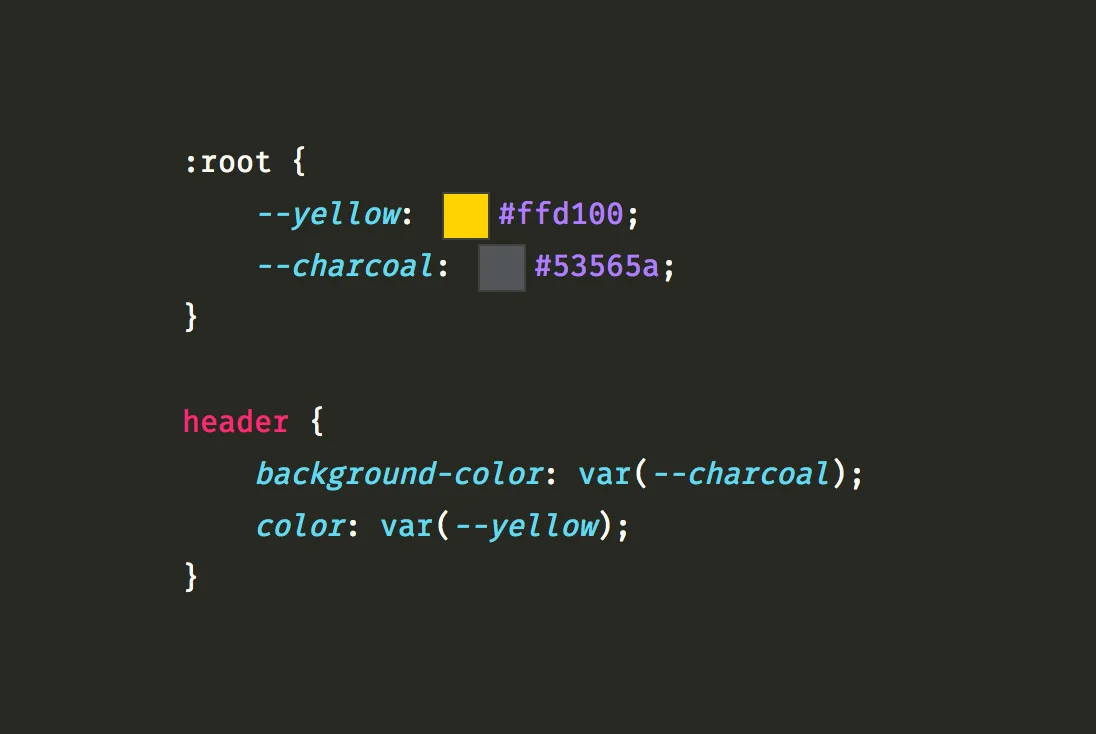
:root {

  --main-color: #3498db;

  --padding: 1rem;

}

.button {

  background-color: var(--main-color);

  padding: var(--padding);

}
In this example:
- –main-color is the variable name.
- #3498db is the value.
- var(–main-color) is how the variable is used in a rule.
CSS Variables vs Preprocessor Variables (Sass, LESS)
While CSS Variables might seem similar to variables in preprocessors like Sass or LESS, there are important differences:
| Feature | CSS Variables | Sass/LESS Variables |
| Defined in CSS | Yes (native feature) | No (compiled before CSS) |
| Runtime Access | Yes, can be changed dynamically (e.g., with JavaScript) | No, static after compilation |
| Scope | Cascade-aware, inherit through the DOM | Lexical (function/block-based) |
| Dynamic Updates | Yes, ideal for theming, user interactions | No, needs recompilation |
Key takeaway: CSS Variables are dynamic and live in the browser, making them ideal for responsive design, real-time theming (like switching between light and dark modes), and JavaScript manipulation. Preprocessor variables, on the other hand, are static and only useful at build time.
Why Use CSS Variables?
CSS Variables offer several practical benefits that make your stylesheets more powerful, maintainable, and scalable. Here’s why you should consider using them in your projects:
1. Reusability of Values
With CSS Variables, you define a value once and reuse it wherever needed. This avoids hardcoding repeated values like colors, font sizes, or spacing units throughout your CSS.
Example:
:root {

  --primary-color: #007BFF;

}

h1, .btn, .card-title {

  color: var(--primary-color);

}
Update-primary-color once, and it changes everywhere it’s used.
2. Easier Theme Management (Light/Dark Mode, Branding)
CSS Variables make it easy to manage and switch themes. You can define theme-specific variables and apply them conditionally (e.g., based on a class or user preference).
Example:
:root {

  --background: #fff;

  --text-color: #000;

}

.dark-theme {

  --background: #000;

  --text-color: #fff;

}
Switching between themes is as simple as toggling a class on the <body> element.
3. Reducing Repetition and Improving Maintainability
Variables reduce redundancy in your CSS by centralizing commonly used values. This simplifies maintenance when a brand color or spacing standard changes, you update just one value instead of many.
Benefits:
- Less chance of inconsistencies
- Faster debugging
- Easier collaboration across teams
4. Dynamic Updates with JavaScript
Unlike preprocessor variables, CSS Variables exist at runtime. That means you can read and modify them using JavaScript, enabling dynamic behavior based on user actions or preferences.
Example:
document.documentElement.style.setProperty('--primary-color', '#FF5733');Use this power to:
- Change themes on the fly
- Adjust layout spacing
- Implement accessibility features like high-contrast mode
In short, CSS Variables are not just about writing less code, they’re about writing smarter, more flexible code that can adapt and scale with your project.
CSS Variables Syntax and Usage
You can combine pseudo-classes and pseudo-elements to create interactive and dynamic effects. A common use case is styling a ::after element only when a user hovers over a link. For an academic guide on styling with pseudo-elements and user interactions, see the University of Washington’s tutorial on pseudo-classes and elements.
Declaring Variables in :root
To make CSS Variables accessible throughout your entire stylesheet, it’s common to declare them inside the :root pseudo-class. The :root selector matches the <html> element and acts as the highest-level scope in CSS.
Example:
:root {

  --main-color: #3498db;

  --font-size-base: 16px;

  --padding: 1rem;

}
By declaring variables in :root, they become global, meaning you can use them anywhere in your CSS.
Local vs Global Scope
CSS Variables are scoped, which means you can define them globally in: root or locally within a specific selector.
Global Scope (:root) Example:
:root {

  --bg-color: white;

}

body {

  background-color: var(--bg-color);

}
Local Scope Example:
.card {

  --bg-color: lightgray;

  background-color: var(--bg-color);

}
In this example:
- If a variable is not defined in a local scope, the browser looks for it in a higher (global) scope.
- Local variables can override global ones within their scope.
Using Variables in Properties
Once a variable is declared, you use the var() function to apply it as a value in any CSS property.
Example:
:root {

  --main-color: #3498db;

  --font-weight: bold;

}

h1 {

  color: var(--main-color);

  font-weight: var(--font-weight);

}
You can even use fallback values in case a variable is undefined:
color: var(--secondary-color, #333);This ensures a default is applied if –secondary-color hasn’t been set.
CSS Variables are versatile and easy to integrate into your styling workflow. Once you get comfortable with their syntax and scoping, you’ll find them incredibly helpful for keeping your styles DRY (Don’t Repeat Yourself) and adaptable.
Scope and Inheritance of CSS Variables
One of the most powerful features of CSS Variables is that they follow the CSS cascade and inheritance rules. This means their values can be scoped, overridden, and inherited just like regular CSS properties, giving you fine-grained control over how and where variables are applied.
How CSS Variables Follow the Cascade
CSS Variables respect the cascading nature of CSS. When a variable is defined on a parent element, it is automatically inherited by all child elements, unless it is explicitly overridden further down the hierarchy.
Example:
:root {

  --font-color: #333;

}

body {

  color: var(--font-color); /* inherited by child elements */

}
In this example, any child of the <body> will inherit –font-color and apply it via color.
Overriding Variables in Nested Selectors
You can override variables at any level of the DOM by redefining them inside more specific selectors. This is useful for contextual styling (e.g., different themes or components).
Example:
:root {

  --bg-color: white;

}

.section {

  --bg-color: lightgray;

}

.page {

  background-color: var(--bg-color); /* white */

}

.section .card {

  background-color: var(--bg-color); /* lightgray */

}
Here’s what happens:
- The default –bg-color is white.
- Inside .section, –bg-color is overridden to lightgray.
- Any element inside .section will now inherit the new value.
Examples Showing Scoped Usage
Global vs Local Scope Example:
:root {

  --primary-color: #007BFF;

}

.card {

  --primary-color: #FF5733;

  border: 2px solid var(--primary-color); /* #FF5733 */

}

.button {

  color: var(--primary-color); /* #007BFF from :root */

}- .card uses a locally scoped version of –primary-color.
- .button uses the global version defined in :root.
This flexible behavior allows for component-based theming or context-specific styles without affecting the rest of your layout.
Key Takeaways
- Variables cascade like normal CSS properties.
- Children inherit variables from their parents unless overridden.
- Use local scoping for component or section-specific styles.
- Combine scoped and global variables for modular, themeable design.
Fallback Values in CSS Variables
CSS Variables are powerful, but what happens if a variable is not defined? That’s where fallback values come in. They ensure your styles still work even when a variable is missing or undefined.
Using Fallback Syntax for Safety
The var() function allows you to specify a fallback value as a second parameter. This value is used only if the custom property is not defined or cannot be resolved.
Syntax:
property: var(--custom-property, fallback-value);Example:
color: var(--text-color, #000);- If –text-color is defined, its value is used.
- If –text-color is missing or invalid, #000 (black) is used instead.
This helps prevent layout or styling issues when variables are:
- Misspelled
- Undefined in certain contexts
- Dynamically removed via JavaScript
Best Practices for Fallback Design
Here are some tips to effectively use fallback values in your styles:
1. Always use fallbacks for critical properties
Use fallback values for essential visual properties like colors, font sizes, or layout-related values to avoid broken designs.
background-color: var(--bg-color, #f8f9fa);2. Use semantic variable names and meaningful fallbacks
Choose descriptive names for variables and provide fallbacks that make visual sense.
font-size: var(--heading-size, 2rem);3. Don’t rely solely on fallbacks
Fallbacks are a safety net, not a substitute for proper variable setup. Always define your variables in :root or appropriate scopes first.
4. Avoid fallbacks with invalid or conflicting types
Make sure fallback values are compatible with the property being styled.
padding: var(--spacing, 16px);  /* Correct */

padding: var(--spacing, red);   /* Incorrect for spacing */
When Are Fallbacks Not Triggered?
Fallbacks won’t activate if the variable is defined, even if its value is invalid or empty.
Example:
:root {

  --main-color: ;

}

div {

  color: var(--main-color, #333); /* This may not trigger fallback */

}
Always check that your variable values are valid and not unintentionally empty.
In summary, fallback values make your CSS Variables more robust, ensuring your design stays consistent and functional even when variables are missing or altered. Use them wisely to build resilient, production-ready styles.
Want to master techniques like this and build modern, responsive websites from scratch? Join our software development course in Kenya and gain the hands-on skills you need to succeed in front-end development. Start your journey today at and become a job-ready developer in just 10–12 months.
Dynamic Theming with CSS Variables
One of the most powerful use cases for CSS Variables is dynamic theming, changing styles (like light/dark mode, brand colors, or spacing) on the fly without rewriting your entire CSS. Because CSS Variables exist at runtime, they can be easily manipulated using CSS classes or JavaScript.
Example: Switching Between Light and Dark Themes
You can create two different themes by defining separate values for the same variables, then toggling them with a class on the <body> or <html> element.
Example CSS:
:root {

  --bg-color: #ffffff;

  --text-color: #111111;

}

.dark-theme {

  --bg-color: #111111;

  --text-color: #ffffff;

}

body {

  background-color: var(--bg-color);

  color: var(--text-color);

}
Toggle Theme with HTML:
<body class="dark-theme"> <!-- Switch to light theme by removing the class --> </body>By toggling the .dark-theme class on the <body>, you switch all variable values and the look of the entire site instantly and efficiently.
Changing Variable Values with JavaScript
CSS Variables can be updated in real time using JavaScript, allowing you to create theme switchers, color pickers, and user-controlled preferences.
Example JavaScript:
// Change primary color on the fly

document.documentElement.style.setProperty('--primary-color', '#e91e63');
Use Case Examples:
- Dark mode toggle based on system preference or user choice
- Live theme customization panel
- Accessibility tools (increase text contrast or spacing)
Toggle Example:
const toggleTheme = () => {

  document.body.classList.toggle('dark-theme');

}
Attach this to a button or switch for instant theme changes.
Using CSS Variables for Responsive Design
You can also use CSS Variables inside media queries to change layout or spacing values based on screen size.
Example:
:root {

  --gap: 1rem;

}

@media (min-width: 768px) {

  :root {

    --gap: 2rem;

  }

}

.container {

  gap: var(--gap);

}
This technique helps keep your responsive logic centralized and consistent, making layout adjustments easier to manage and update.
Benefits of Dynamic Theming with CSS Variables
- Scalable: One change affects your entire site instantly
- Efficient: No need for multiple CSS files or overrides
- Interactive: Works smoothly with JavaScript and user preferences
- Responsive: Variable values can adapt to screen size, device, or interaction
With CSS Variables, building flexible, theme-aware, and user-adaptive interfaces becomes faster and cleaner, especially for modern, component-based UI design.
CSS Variables vs Preprocessor Variables (Sass, LESS)
While both CSS Variables and preprocessor variables (like those in Sass or LESS) allow you to store and reuse values, they operate very differently under the hood. Understanding the key differences will help you choose the right tool for the job.
Key Differences
| Feature | CSS Variables | Sass/LESS Variables |
| Syntax | –primary-color: #3498db; | $primary-color: #3498db; (Sass) |
| Where They’re Processed | In the browser (runtime) | At build time (compile to static CSS) |
| Dynamic Capabilities | Yes – can be changed via JS | No – values are static after compilation |
| Scoped | Yes – cascade and inherit | No–lexical (code block scope) |
| Media Query Support | Can redefine inside media queries | Also supported, but static |
| Browser Support | Modern browsers only | Works once compiled to plain CSS |
| Can Use with JavaScript | Yes | No |
Advantages of Runtime Flexibility
CSS Variables can be updated on the fly, giving you dynamic control over your styles at runtime. This offers several powerful benefits:
- Live theming: Change colors, fonts, or spacing without reloading the page.
- User customization: Let users choose their theme or font size, and apply it instantly.
- JavaScript integration: Use JavaScript to read or write variable values dynamically.
Example:
document.documentElement.style.setProperty('--primary-color', '#ff0000');This is simply not possible with preprocessor variables, which are compiled into fixed values before the browser even sees them.
When to Use One Over the Other
Use CSS Variables when:
- You need dynamic theming (light/dark mode)
- You’re working with user interactions or preferences
- You want responsive styles that change using media queries or JavaScript
- You need cascading, inheritable values
Use Preprocessor Variables (Sass/LESS) when:
- You need logic like loops, conditionals, or functions (e.g., @for, @if)
- You’re building design systems at build-time
- Your project already uses a CSS preprocessor pipeline
- You don’t need runtime changes or interactivity
Best of Both Worlds
In large projects, developers often use both:
- Preprocessor variables for logic and structure during development
- CSS Variables for flexibility and theming in the final product
In summary, CSS Variables are ideal for dynamic, browser-controlled styling, while preprocessor variables shine in build-time logic and organization. Understanding when and how to use each empowers you to write smarter, more maintainable CSS.
Real-World Examples Using CSS Variables
CSS Variables aren’t just theoretical, they shine in real-world applications. From theming entire UIs to maintaining consistent spacing and building scalable design systems, custom properties offer powerful, maintainable solutions in modern CSS.
1. Theming Buttons and UI Components
You can easily use CSS Variables to theme components like buttons, making it simple to switch styles or create multiple theme variants.
Example:
:root {

  --btn-bg: #007bff;

  --btn-color: #fff;

  --btn-padding: 0.75rem 1.5rem;

  --btn-radius: 6px;

}

.button {

  background-color: var(--btn-bg);

  color: var(--btn-color);

  padding: var(--btn-padding);

  border-radius: var(--btn-radius);

  border: none;

  cursor: pointer;

}
Want to switch to a dark theme or brand-specific variant? Just override the variables:
.dark-theme {

  --btn-bg: #222;

  --btn-color: #eee;

}
No need to duplicate class definitions, just change the values.
2. Responsive Spacing and Sizing
CSS Variables make it easier to maintain consistent spacing and size values across breakpoints.
Example:
:root {

  --gap: 1rem;

  --font-size: 1rem;

}

@media (min-width: 768px) {

  :root {

    --gap: 2rem;

    --font-size: 1.25rem;

  }

}

.container {

  display: grid;

  gap: var(--gap);

  font-size: var(--font-size);

}
Instead of repeating pixel values throughout media queries, update one variable and apply it everywhere.
3. Building a Design System with Custom Properties
A scalable design system benefits hugely from centralized tokens defined with CSS Variables, colors, font stacks, spacings, border-radius, and more.
Example:
:root {

  /* Color Palette */

  --color-primary: #4caf50;

  --color-secondary: #ff9800;

  --color-neutral: #f5f5f5;

  /* Typography */

  --font-base: 'Segoe UI', sans-serif;

  --font-size-base: 16px;

  /* Spacing */

  --space-sm: 0.5rem;

  --space-md: 1rem;

  --space-lg: 2rem;

}

body {

  font-family: var(--font-base);

  font-size: var(--font-size-base);

  background-color: var(--color-neutral);

  padding: var(--space-md);

}

.card {

  background-color: var(--color-primary);

  padding: var(--space-lg);

  color: white;

}
By adjusting a single value in :root, your design updates across the entire app making your system modular, responsive, and easier to maintain.
These real-world examples show that CSS Variables aren’t just a nice-to-have, they’re a modern, efficient way to write flexible, maintainable, and future-proof CSS.
Tips, Best Practices, and Gotchas
CSS Variables are powerful but to get the most out of them, it’s important to follow clean conventions, keep your code organized, and avoid common pitfalls. Below are essential tips and best practices, along with warnings for common mistakes.
1. Use Clear, Consistent Naming Conventions
A good naming system keeps your variables readable and scalable, especially in large projects or design systems.
Common naming patterns:
--color-primary

--font-size-base

--spacing-sm

--border-radius-lg
Best practices:
- Use lowercase with dashes (–font-size-base)
- Group variables by type (colors, typography, spacing)
- Avoid overly generic names like –blue or –size
This approach improves collaboration and future-proofing.
2. Organize Variables in a Central Location
Define your core variables in a predictable, central spot usually inside the :root selector. This gives them global scope and makes them easy to find and update.
Example:
:root {

  /* Colors */

  --color-primary: #4caf50;

  --color-secondary: #f44336;

  /* Typography */

  --font-base: 'Segoe UI', sans-serif;

  --font-size-base: 1rem;

  /* Spacing */

  --spacing-md: 1rem;

  --spacing-lg: 2rem;

}
If you’re building themes (like dark/light), use additional selectors:
.dark-theme {

  --color-primary: #111;

  --color-secondary: #eee;

}
3. Watch Out for Common Pitfalls
Here are some gotchas that can trip up even experienced developers:
Scope Confusion
Variables defined in a local scope don’t affect styles outside that scope.
.card {

  --padding: 2rem;

}
/* Won’t apply outside of .card unless explicitly redefined */
Tip: Define global values in :root, override locally only when needed.
Empty or Invalid Values
If a variable is defined but empty or invalid, fallback won’t be triggered.
:root {

  --bg-color: ;

}

div {

  background-color: var(--bg-color, #fff); /* #fff may NOT be applied! */

}
Tip: Always assign valid defaults and check for missing or empty values.
Older Browser Quirks
While most modern browsers fully support CSS Variables, older versions of IE and early mobile browsers do not.
Tip: If you need backward compatibility, provide hardcoded fallback styles before variable declarations:
color: #333; /* fallback */

color: var(--text-color);
Bonus Tips
Use variables in media queries for responsive theming:
@media (min-width: 768px) {

  :root {

    --font-size-base: 1.25rem;

  }

}- Keep a variables file in component libraries or frameworks (if using pre/post processors)
By following these tips and staying aware of the pitfalls, you’ll write CSS that’s not only clean and reusable but also powerful, flexible, and scalable.
Tools and Browser Support
They are are well-supported in modern development workflows and browsers. With helpful tooling and online resources, working with custom properties has never been easier.
Using DevTools to Inspect CSS Variables
Modern browser DevTools make it easy to inspect and debug CSS Variables:
- Chrome & Edge:
- Inspect an element
- Go to the Styles panel
- You’ll see variables listed (e.g., var(–main-color))
- Hover over a variable to see its resolved value
- Firefox:
- Has a dedicated “Variables” section in the Computed tab
- Shows variable origins and overridden values
This makes debugging scoped variables and theme overrides much easier.
Online Playgrounds for Testing CSS Variables
Want to experiment with CSS Variables without setting up a project? Try these free online tools:
- CodePen – Great for live HTML/CSS/JS prototypes
- JSFiddle – Flexible for testing scoped variables and JavaScript manipulation
- CSS Variables Playground – Focused on variable testing and real-time updates
- StackBlitz or CodeSandbox – Ideal for larger projects or using variables within frameworks like React or Vue
These platforms are especially helpful when building:
- Theme switchers
- Design token experiments
- Responsive prototypes using media query variables
In short, CSS Variables are fully production-ready, and modern tooling makes them easy to test, debug, and experiment with. You’re free to build dynamic, flexible designs with confidence.
In conclusion, CSS Variables have transformed the way developers write and manage styles. With their flexibility, reusability, and runtime power, they make your CSS more maintainable, responsive, and dynamic, especially when it comes to theming, responsive design, and user-driven customization.
By understanding how to declare, scope, override, and safely fall back on variables, you can build smarter, cleaner codebases that scale easily across projects. Unlike preprocessor variables, CSS Variables live in the browser, allowing for real-time updates with JavaScript and seamless integration with modern UI patterns.
Whether you’re managing a design system, building a dark mode toggle, or simply avoiding repetition, CSS Variables are a must-have tool in any modern front-end developer’s toolkit.