Centering elements is a key skill in web design that improves visual balance and user experience. Whether you’re aligning text, centering a button, or placing a modal in the middle of the screen, it helps create clean, professional layouts across all devices.
To effectively center elements in CSS, it’s important to consider the type of element and layout involved—inline vs. block, fixed vs. flexible size, and whether you’re centering horizontally, vertically, or both. In this guide, you’ll learn how to center elements in CSS using techniques like Flexbox, Grid, margins, and positioning, each suited for different design needs. Want to turn your CSS skills into a career in tech? Learn by building real projects in our hands-on software development course in Kenya. Join one of our programs and become a job-ready developer in 10–12 months.
Centering Text Inside Elements
One of the simplest ways to center elements in CSS, specifically text, is by using the text-align: center property. This method is ideal for inline and inline-block elements, such as text, links, or images, when placed inside a block-level container like a <div>, <section>, or <header>.
To apply it, set text-align: center on the parent container, and all inline content inside it will align horizontally to the center.
Example:
<div class="centered-text">

  <p>This text is centered.</p>

</div>
.centered-text {
text-align: center;
background-color: #f2f2f2;
padding: 20px;
}This technique is widely supported and great for centering headings, paragraphs, or buttons within a container.
Horizontally Center Elements
When it comes to aligning elements horizontally in CSS, you have several reliable methods depending on the type of content and layout structure. Below are the most common techniques to horizontally center elements in various scenarios.
a. Using margin: auto (For Block Elements with Fixed Width)
One of the oldest and simplest ways to horizontally center a block-level element is to apply margin: auto but it only works if the element has a defined width.
Example:
<div class="center-box">

  I’m centered using margin auto.

</div>
.center-box {
width: 300px;
margin: 0 auto;
background-color: #e0e0e0;
padding: 20px;
}b. Using Flexbox
Flexbox is a powerful modern layout model. You can center any element horizontally (inline or block) by setting the parent container to display: flex and applying justify-content: center.
Example:
<div class="flex-container">

  <div class="item">Centered with Flexbox</div>

</div>
.flex-container {
display: flex;
justify-content: center;
background-color: #f9f9f9;
padding: 30px;
}
.item {
background-color: #b3d9ff;
padding: 15px 30px;
}c. Using CSS Grid
CSS Grid also allows easy horizontal centering using justify-items: center (for individual items) or place-items: center (for both horizontal and vertical centering).
Example:
<div class="grid-container">

  <div class="grid-item">Centered with Grid</div>

</div>
.grid-container {
display: grid;
justify-items: center;
background-color: #fff0f5;
padding: 30px;
}
.grid-item {
background-color: #ffb3cc;
padding: 15px 25px;
}d. Text Alignment vs Element Alignment
It’s important to distinguish between text alignment and element alignment:
- text-align: center is used to center inline content inside a block container.
- Margin: auto, Flexbox, and Grid are used to center block or inline-block elements within a container.
Understanding this difference ensures you’re applying the right tool for the job.
Vertically Centered Elements
Vertical centering used to be one of the more challenging aspects of CSS layout, but with modern techniques like Flexbox and Grid, it’s now much easier. Below are the most effective ways to vertically center elements in CSS, depending on your layout needs.
a. Using Flexbox
Flexbox allows easy vertical alignment by applying align-items: center to the parent container. To fully center an item both vertically and horizontally, you can also include justify-content: center.
Example:
<div class="flex-vertical">

  <div class="item">Centered with Flexbox</div>

</div>
.flex-vertical {
display: flex;
align-items: center;
justify-content: center;
height: 300px;
background-color: #e0f7fa;
}
.item {
background-color: #4dd0e1;
padding: 20px;
}b. Using CSS Grid
Grid provides an even cleaner approach to vertical centering. You can use place-items: center to center content both vertically and horizontally with a single line of CSS. For an academic explanation and example of this technique, see this Harvard Extension School lecture on CSS Grid alignment from Harvard University, which covers place-items, align-items, and justify-items In-depth.
Example:
<div class="grid-vertical">

  <div class="item">Centered with Grid</div>

</div>
.grid-vertical {
display: grid;
place-items: center;
height: 300px;
background-color: #ede7f6;
}
.item {
background-color: #9575cd;
padding: 20px;
}c. Using line-height (For Single-Line Text)
For vertically centering single-line text, you can match the container’s line-height to its height. This only works well when the text doesn’t wrap.
Example:
<div class="line-height-center">Centered Text</div>.line-height-center {
height: 100px;
line-height: 100px;
text-align: center;
background-color: #fff9c4;
}d. Using position: absolute and transform
For more manual control, especially when the content size is unknown, you can use position: absolute with top: 50% and transform: translateY(-50%).
Example:
<div class="relative-container">

  <div class="absolute-center">Centered with Transform</div>

</div>
.relative-container {
position: relative;
height: 300px;
background-color: #ffe0b2;
}
.absolute-center {
position: absolute;
top: 50%;
left: 50%; /* Optional for full centering */
transform: translate(-50%, -50%);
background-color: #fb8c00;
padding: 20px;
}Each method has its strengths depending on the situation, but Flexbox and Grid are generally the most versatile and responsive-friendly solutions for vertical centering. If you’re ready to master these modern layout techniques and build professional websites, our web development course bootcamp in Kenya is the perfect place to start.
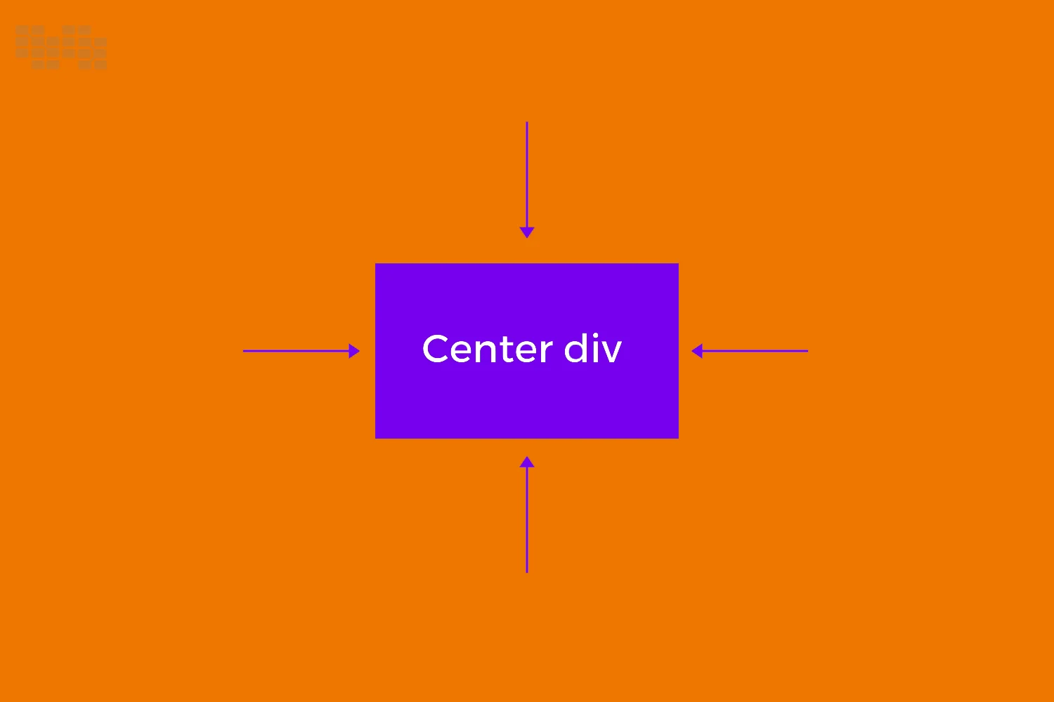
Center Elements Both Horizontally and Vertically
Centering an element perfectly in the middle of the screen or container, both horizontally and vertically, is a common requirement in web design. Here are three powerful methods to achieve this using Flexbox, CSS Grid, and absolute positioning with transform.
a. Using Flexbox
Flexbox makes full centering easy by applying display: flex, then combining justify-content: center (horizontal) and align-items: center (vertical) on the parent container.
Example:
<div class="flex-center">

  <div class="box">Centered with Flexbox</div>

</div>
.flex-center {
display: flex;
justify-content: center;
align-items: center;
height: 100vh; /* Full viewport height */
background-color: #e0f2f1;
}
.box {
background-color: #26a69a;
padding: 20px 40px;
color: white;
}b. Using CSS Grid
CSS Grid offers an even cleaner solution for full centering. Use place-items: center to align content in both directions with one line of code.
Example:
<div class="grid-center">

  <div class="box">Centered with Grid</div>

</div>
.grid-center {
display: grid;
place-items: center;
height: 100vh;
background-color: #f3e5f5;
}
.box {
background-color: #8e24aa;
padding: 20px 40px;
color: white;
}c. Using Absolute Positioning + Transform
This method works well when using fixed dimensions or centering elements within a relatively positioned container. Use top: 50%, left: 50%, and transform: translate(-50%, -50%).
Example (Full Page Centering):
<div class="relative-wrapper">

  <div class="centered-box">Absolutely Centered</div>

</div>
.relative-wrapper {
position: relative;
height: 100vh;
background-color: #fff3e0;
}
.centered-box {
position: absolute;
top: 50%;
left: 50%;
transform: translate(-50%, -50%);
background-color: #f57c00;
padding: 20px 40px;
color: white;
}All three techniques are effective. Flexbox and Grid are best for responsive layouts, while absolute positioning is handy when working with fixed content inside a specific container.
Responsive Centering Tips
Centering elements is one thing making sure they stay centered on all devices is another. As screens vary in size, it’s important to use techniques that adapt gracefully. Here are some key tips for keeping your layouts responsive while centering elements in CSS:
1. Use Relative Units and Flexible Layouts
Instead of relying on fixed px values, use relative units like %, em, rem, or vw/vh for widths, padding, and positioning. This helps your centered elements adjust smoothly across different screen sizes.
.center-box {

  width: 80%;

  max-width: 600px;

  margin: 0 auto;

}
2. Combine Centering Techniques with Media Queries
Use media queries to adjust centering strategies when layouts shift on smaller or larger screens. For example, you might use flex-direction: column on mobile but switch to row on larger screens.
.flex-wrapper {

  display: flex;

  justify-content: center;

  align-items: center;

  flex-direction: column;

}

@media (min-width: 768px) {

  .flex-wrapper {

    flex-direction: row;

  }

}
3. Avoid Fixed Dimensions Where Possible
Fixed widths and heights can break responsiveness and cause centering issues, especially on smaller devices. Instead, let content determine the size, or use min/max constraints for control.
Avoid:
.box {

  width: 400px;

  height: 300px;

}
Better:
.box {

  width: 80%;

  max-width: 400px;

  padding: 2rem;

}
By designing with flexibility in mind, you can ensure that your centered elements look great on desktops, tablets, and smartphones alike.
Common Mistakes and How to Avoid Them
Centering elements might seem straightforward, but it’s easy to run into issues if key details are overlooked. Here are some of the most common mistakes developers make and how to avoid them when trying to center elements in CSS.
1. Forgetting to Set Height or Width
Many centering techniques rely on knowing the dimensions of the element or its container. For example, margin: auto requires a fixed width, and vertical centering often depends on setting a height.
Mistake:
.center-box {

  margin: 0 auto;

}
Fix:
.center-box {

  width: 300px;

  margin: 0 auto;

}
2. Applying margin: auto on Inline Elements
The margin: auto trick only works on block-level elements. If you try it on an inline element (like a <span>), it won’t have any effect.
Mistake:
<span style="margin: auto;">I'm inline!</span>Fix:
<span style="display: block; width: fit-content; margin: 0 auto;">Now I'm centered!</span>3. Not Setting display: flex or grid on the Parent Container
Flexbox and Grid-based centering only works when the parent element has the correct display context. If you forget to set display: flex or display: grid, justify-content and align-items won’t do anything.
Mistake:
.parent {

  justify-content: center;

  align-items: center;

}
Fix:
.parent {

  display: flex;

  justify-content: center;

  align-items: center;

}
By understanding and avoiding these pitfalls, you’ll be able to confidently center elements in CSS across a wide range of layouts and screen sizes.
Tools and DevTips
Mastering how to center elements in CSS becomes much easier when you use the right tools and workflows. Whether you’re debugging layout issues or experimenting with different techniques, these tools and tips can save you time and effort.
1. Inspecting Centering with Browser DevTools
Modern browsers like Chrome, Firefox, and Edge come with powerful Developer Tools that let you inspect and tweak your CSS in real time. Use the Elements panel to:
- Check the parent element’s display value (e.g., flex, grid, block)
- Visualize padding, margin, and alignment
- Toggle properties like justify-content and align-items live
- Quickly test different centering methods without editing your source files
Tip: Use the box model overlay to see exactly how space is distributed.
2. Using CSS Frameworks (Tailwind, Bootstrap)
If you’re using utility-first or component-based frameworks, they provide built-in classes to simplify centering.
Tailwind CSS:
<div class="flex justify-center items-center h-screen">

  <div class="bg-blue-500 text-white p-6">Centered</div>

</div>
Bootstrap:
<div class="d-flex justify-content-center align-items-center vh-100">

  <div class="bg-primary text-white p-4">Centered</div>

</div>
These libraries handle the underlying CSS for you, making centering easier and more consistent.
3. Online Playgrounds (CodePen, JSFiddle, StackBlitz)
Experimenting in online editors is a great way to learn and refine your centering techniques without setting up a local environment.
- CodePen – Great for testing layout concepts quickly
- JSFiddle – Good for comparing multiple centering methods side-by-side
- StackBlitz – Ideal for building full projects with real file structures
These platforms let you instantly see how changes affect layout, which is especially helpful when testing responsive behavior.
Using the right tools makes it much easier to identify issues and apply the most effective method to center elements in CSS.
In conclusion, centering elements in CSS is a foundational skill that every web developer should master. Whether you’re aligning text inside a container, placing a button in the middle of a section, or perfectly centering a modal on the screen, there’s a method that fits each scenario. From classic techniques like margin: auto to modern solutions using Flexbox and Grid, the key is choosing the right approach based on the layout and content type..