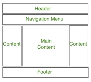
A web page layout is the structural foundation of any website. It defines how content like headers, navigation bars, sidebars, and footers are arranged on the screen. A well-organized layout not only improves user experience but also makes your site more visually appealing and easier to maintain.
Learning how to build a simple web page layout using CSS is a fundamental skill for anyone starting in web development. CSS (Cascading Style Sheets) gives you the power to control positioning, alignment, spacing, and responsiveness, turning plain HTML into professional, functional designs.
This guide is perfect for beginners and aspiring web developers who want to understand how to structure and style a web page using CSS. No advanced knowledge is required, just a basic understanding of HTML and a willingness to learn.
Want to become a professional software developer? Our software engineering course in Kenya at allthingsprogramming.com is built to teach you the skills employers actually want. Through hands-on, project-based learning, you’ll be ready to land a high-paying job in as little as 10–12 months. Enroll today and start your journey toward a successful tech career.
Building a Simple Web Page Layout Using CSS
1. Understanding Web Page Structure Basics
Before you dive into CSS, it’s crucial to understand how to structure your content using semantic HTML. A clean, logical structure lays the groundwork for any layout you build with CSS.
Here are five essential HTML elements commonly used in modern web page layouts:
- <header> Contains the site’s logo, title, or main heading. It often includes the navigation menu.
- <nav> Defines a section of links that allow users to navigate through the website
- <main> The primary content area of your page. There should only be one <main> per page.
- <aside> Optional content like sidebars, related links, or ads that support the main content.
- <footer> Found at the bottom of the page, it typically includes contact info, copyright, and links.
To build a simple web page layout using CSS, using these semantic tags ensures your code is both accessible and easier to style. It also helps screen readers and search engines better understand the structure of your site.
HTML Wireframe Example:
<body>
<header>
<h1>My Website</h1>
<nav>
<a href="#">Home</a>
<a href="#">About</a>
<a href="#">Contact</a>
</nav>
</header>
<main>
<section>
<h2>Main Content</h2>
<p>This is where the main article or page content goes.</p>
</section>
<aside>
<h3>Sidebar</h3>
<p>Additional links or information.</p>
</aside>
</main>
<footer>
<p>© 2025 My Website</p>
</footer>
</body>This basic structure gives you a solid starting point. With this in place, you’re ready to apply CSS and begin crafting your layout.
2. Setting Up Your CSS Environment
Before you can style your layout, you need to properly set up your CSS environment. This step ensures your styles are correctly applied and organized as your project grows.
1. Linking CSS to HTML (<link> tag)
To apply styles to your HTML page, you need to link your CSS file in the <head> section of your HTML document using the <link> tag:
<head>

  <title>My Web Page</title>

  <link rel="stylesheet" href="styles.css">

</head>
This tells the browser to load the external CSS file named styles.css.
2. CSS Reset or Normalization (Optional but Recommended)
Different browsers apply their own default styles to HTML elements. This can lead to inconsistencies in how your layout appears. To fix this, developers often use a CSS reset or normalize.css.
- Reset CSS: Strips out all default styling
- Normalize.css: Keeps useful defaults but standardizes inconsistencies
Example (simple reset):
/* Reset some default margins and paddings */

* {

  margin: 0;

  padding: 0;

  box-sizing: border-box;

}
3. Best Practices for Organizing CSS
To build a simple web page layout using CSS efficiently, organization matters.
Use external stylesheets
Keep your CSS in a separate file (styles.css) instead of using inline or internal styles. This improves maintainability and reuse.
Use a logical folder structure
Organize your files like this:
project-folder/
├── index.html
├── css/
│ └── styles.css
├── images/
│ └── logo.png
Name files clearly
Use meaningful names like layout.css, header.css, or main.css if you split your styles into multiple files for larger projects.
With your CSS environment ready, you can now start applying layout styles using Flexbox or CSS Grid.
3. Core Layout Techniques
When you’re ready to build a simple web page layout using CSS, two of the most powerful tools at your disposal are Flexbox and CSS Grid. These layout modules simplify how you position and align elements across the page without needing floats or complex positioning hacks. For an academic overview of both systems and their use in modern layout, see the Stanford CS 142 “CSS Lecture Notes” PDF, which includes sections explicitly discussing display: flex; and display: grid;
A. Using Flexbox for Layout
What is Flexbox?
Flexbox (Flexible Box Layout) is a one-dimensional layout method that helps you arrange items in a row or column, with control over spacing, alignment, and distribution.
It’s ideal for:
- Lining items horizontally (like navigation menus)
- Creating side-by-side layouts (content + sidebar)
- Aligning elements vertically or horizontally with ease
Creating a Horizontal Layout (Header + Main + Sidebar)
Let’s build a basic layout where the main content and sidebar sit next to each other.
HTML:
<body>

  <header>Header</header>

  <div class="container">

    <main>Main Content</main>

    <aside>Sidebar</aside>

  </div>

  <footer>Footer</footer>

</body>
CSS with Flexbox:
body {

  font-family: sans-serif;

  margin: 0;

}

header, footer {

  background-color: #333;

  color: #fff;

  padding: 1rem;

  text-align: center;

}

.container {

  display: flex;

  padding: 1rem;

}

main {

  flex: 2;

  padding: 1rem;

  background: #f0f0f0;

}

aside {

  flex: 1;

  padding: 1rem;

  background: #ddd;

}

footer {

  margin-top: auto;

}
B. Using CSS Grid for Layout
What is CSS Grid?
CSS Grid Layout is a two-dimensional system, allowing you to control rows and columns simultaneously. It’s great for full-page layouts where you need precise control over both axes.
It’s ideal for:
- Page templates with multiple rows and columns
- Gallery-style layouts
- Creating areas like header, sidebar, main content, and footer in one go
Building a 2-Column Layout with Header and Footer
HTML:
<body>

  <div class="grid-container">

    <header>Header</header>

    <aside>Sidebar</aside>

    <main>Main Content</main>

    <footer>Footer</footer>

  </div>

</body>
CSS with Grid:
.grid-container {

  display: grid;

  grid-template-areas:

    "header  header"

    "sidebar main"

    "footer  footer";

  grid-template-columns: 1fr 2fr;

  grid-template-rows: auto 1fr auto;

  min-height: 100vh;

}

header {

  grid-area: header;

  background: #333;

  color: white;

  padding: 1rem;

  text-align: center;

}

aside {

  grid-area: sidebar;

  background: #ddd;

  padding: 1rem;

}

main {

  grid-area: main;

  background: #f0f0f0;

  padding: 1rem;

}

footer {

  grid-area: footer;

  background: #333;

  color: white;

  text-align: center;

  padding: 1rem;

}
Both Flexbox and Grid are powerful and often used together in real-world projects. As a beginner, start with Flexbox for simple layouts, then explore Grid for more advanced, two-dimensional layouts.
4. Step-by-Step: Build a Simple Web Page Layout Using CSS
Now that you’ve learned the core layout tools, let’s walk through a full example to build a simple web page layout using CSS. We’ll create a responsive layout with a header, main content, sidebar, and footer using Flexbox, and make it mobile-friendly with media queries.
a. HTML Structure
This semantic structure includes a header, a content area with main and aside, and a footer.
<!DOCTYPE html>
<html lang="en">
<head>
<meta charset="UTF-8">
<meta name="viewport" content="width=device-width, initial-scale=1.0">
<title>Simple Layout</title>
<link rel="stylesheet" href="styles.css">
</head>
<body>
<header>
<h1>My Website</h1>
<nav>
<a href="#">Home</a>
<a href="#">About</a>
<a href="#">Contact</a>
</nav>
</header>
<div class="container">
<main>
<h2>Welcome</h2>
<p>This is the main content of the page.</p>
</main>
<aside>
<h3>Sidebar</h3>
<p>Helpful links and other info go here.</p>
</aside>
</div>
<footer>
<p>© 2025 My Website</p>
</footer>
</body>
</html>b. CSS for Layout with Flexbox
This CSS styles the page and applies Flexbox to the layout container.
/* Reset default styles */

* {

  margin: 0;

  padding: 0;

  box-sizing: border-box;

}

/* Global styling */

body {

  font-family: Arial, sans-serif;

  line-height: 1.6;

}

/* Header and footer styles */

header, footer {

  background-color: #333;

  color: white;

  padding: 1rem;

  text-align: center;

}

nav a {

  color: white;

  margin: 0 10px;

  text-decoration: none;

}

/* Layout container using Flexbox */

.container {

  display: flex;

  gap: 1rem;

  padding: 1rem;

}

/* Main content takes more space */

main {

  flex: 2;

  background-color: #f9f9f9;

  padding: 1rem;

}

/* Sidebar takes less space */

aside {

  flex: 1;

  background-color: #ddd;

  padding: 1rem;

}

/* Footer styling */

footer {

  margin-top: auto;

  padding: 1rem;

  background-color: #333;

  color: #fff;

}
c. Responsive Adjustments with Media Queries
We’ll make the layout stack vertically on smaller screens.
/* Responsive layout for smaller screens */

@media (max-width: 768px) {

  .container {

    flex-direction: column;

  }

}
d. Code Comments to Explain Each Section
Add inline comments to help beginners understand each part of the code:
/* Use Flexbox for horizontal layout */

.container {

  display: flex;

  gap: 1rem; /* Space between main and sidebar */

  padding: 1rem;

}

/* On small screens, stack layout vertically */

@media (max-width: 768px) {

  .container {

    flex-direction: column;

  }

}
With this full example, you’ve successfully learned how to build a simple web page layout using CSS that looks great on both desktop and mobile devices.
5. Responsive Design Considerations
In today’s world, people browse websites on a wide variety of devices, smartphones, tablets, laptops, and desktops. That’s why it’s essential to make your layout responsive, meaning it automatically adjusts to fit different screen sizes.
Why Mobile Responsiveness Matters
- Improved User Experience: Users shouldn’t have to zoom or scroll horizontally to read content.
- Better SEO: Google prioritizes mobile-friendly sites in search results.
- Accessibility: A responsive layout makes your site more inclusive for all users.
- Future-Proofing: New screen sizes and devices keep emerging, responsive design ensures your layout adapts.
Basic Media Queries for Layout Adjustments
Media queries allow you to apply different CSS rules based on the user’s screen width. They are the foundation of responsive design.
Example:
@media (max-width: 768px) {

  .container {

    flex-direction: column;

  }

  nav a {

    display: block;

    margin-bottom: 0.5rem;

  }

}- max-width: 768px: Targets screens that are 768 pixels wide or less.
- Inside the media query, styles override the default layout for small screens.
Stacking Content on Smaller Screens
In a typical desktop layout, content might sit side-by-side using Flexbox:
.container {

  display: flex;

}
But on mobile, this can look cramped. A media query can stack items vertically:
@media (max-width: 768px) {

  .container {

    flex-direction: column;

  }

}
This switches the layout from a row to a column, which is much easier to read on small screens.
By incorporating these responsive design techniques, you ensure your layout is not only functional but also user-friendly across all devices, provided they’re implemented using correct CSS syntax.
6. Styling Tips to Improve Your Layout
Once you’ve structured your layout and made it responsive, the next step is to refine the look and feel of your page. Good styling choices enhance usability, readability, and visual hierarchy.
Here are simple but effective tips to polish your layout:
1. Add Spacing with Padding and Margin
Whitespace is essential for a clean, readable design. Use padding to create space inside elements and margin to add space between elements.
main {

  padding: 1rem;  /* Space inside the box */

  margin-bottom: 1rem;  /* Space below the box */

}
Spacing helps group related content and separate different sections visually.
2. Use Background Colors to Visually Separate Sections
Applying different background colors to your layout sections makes the structure more clear and appealing.
header {

  background-color: #333;

  color: white;

}

main {

  background-color: #f9f9f9;

}

aside {

  background-color: #ddd;

}

footer {

  background-color: #333;

  color: white;

}
Tip: Stick to a simple color palette for a consistent look.
3. Typography and Font Settings for Readability
Readable text improves user experience. Use clear fonts, proper font sizes, and enough line spacing.
body {

  font-family: Arial, sans-serif;

  font-size: 16px;

  line-height: 1.6;

  color: #333;

}
Avoid using too many font types, limit to 1 or 2 (e.g., one for headings, one for body text).
4. Avoid Fixed Widths, Use Percentages or max-width
Using fixed widths like width: 800px can break your layout on smaller screens. Instead, use relative units:
.container {

  width: 100%;

  max-width: 1200px;

  margin: 0 auto; /* center the container */

}
This ensures your layout stretches to fit small screens but doesn’t become too wide on large screens.
By following these styling tips, your web page will not only function well but also look clean, modern, and professional.
7. Common Mistakes to Avoid
When learning to build a simple web page layout using CSS, it’s easy to fall into some common traps especially when experimenting with positioning and layout techniques. Avoiding these mistakes will save you hours of frustration and make your layouts more robust and maintainable.
a. Overusing Fixed Positions and Sizes
Using position: fixed or setting hard-coded widths/heights like width: 800px can easily break your layout across different screen sizes.
Why it’s a problem:
- Fixed elements may overlap or disappear on smaller screens
- Hardcoded widths don’t adapt, breaking responsiveness
What to do instead:
- Use Flexbox or Grid for layout
- Prefer relative units like %**, em, rem, or max-width`
/* Bad */

.sidebar {

  width: 400px;

}

/* Better */

.sidebar {

  width: 100%;

  max-width: 300px;

}
b. Nesting Layout Techniques Incorrectly
Mixing Flexbox and Grid without understanding how they behave inside each other can lead to layout issues.
Example mistake:
Using display: flex on a Grid container or assuming nested grids behave the same as the parent.
Tip:
Keep layout systems clean and separated. For instance, use Grid for the page structure and Flexbox inside components (like nav menus or cards).
/* Page layout with Grid */

.container {

  display: grid;

  grid-template-columns: 2fr 1fr;

}

/* Inside the sidebar, use Flexbox */

.sidebar {

  display: flex;

  flex-direction: column;

}
c. Ignoring Browser Dev Tools for Testing Layout
Many beginners guess and adjust styles without checking how the layout behaves in the browser.
Why it’s a mistake:
- You might miss hidden issues like overflow, margin collapse, or unintended stacking
- Slows down debugging and development
What to do instead:
- Use browser Developer Tools (right-click → Inspect)
- Inspect layout boxes, margins, flex/grid behavior, and responsiveness in real time
Avoiding these common pitfalls will help you write cleaner CSS and build layouts that work across different devices and browsers.
8. Tools and Resources
Mastering layout takes time and hands-on experience. Thankfully, there are plenty of tools, templates, and platforms that make it easier to practice and experiment while you learn to build a simple web page layout using CSS.
a. CSS Layout Generators
CSS layout generators help you visually create layout structures and then copy the code.
Popular tools:
- CSS Grid Generator – Create grid layouts visually
- Flexbox Froggy – A fun game to learn Flexbox
- Layoutit! – Drag-and-drop layout builder using Bootstrap, Flexbox, or Grid
- Froala Design Blocks – Prebuilt responsive layout sections
These tools can help you learn layout properties faster and give you code you can tweak and study.
b. Free HTML/CSS Templates for Practice
Using free templates is a great way to reverse-engineer how layouts are built.
Where to find them:
- HTML5 UP – Beautiful, fully responsive templates
- Templatemo – Free modern CSS templates
- Free CSS – Hundreds of free HTML/CSS templates for personal use
- BootstrapMade – Clean, mobile-friendly templates
Download a template, open the code in your editor, and explore how different layout techniques are implemented.
c. Code Editors and Sandboxes
Test, debug, and share your CSS layout code in the browser using these platforms:
- CodePen – Write HTML, CSS, and JS in one window and see live results
- JSFiddle – Great for quickly testing layout changes
- StackBlitz – Online IDE with a full development environment
- Playcode – Fast live preview and CSS experiments
These tools make experimenting easy and reduce the barrier to learning.
Using the right tools can accelerate your learning and help you build and test layouts more efficiently. Don’t hesitate to explore them as you continue practicing.
9. Tools and Resources
To become confident in your ability to build a simple web page layout using CSS, it helps to use tools that simplify the process and give you real-time feedback. Whether you’re designing from scratch or learning by example, the following resources will support your progress.
Want to turn your CSS skills into a professional career? Join our hands-on web development course in Kenya and learn how to build real-world web layouts, applications, and responsive designs from the ground up.
a. CSS Layout Generators
CSS layout generators let you visually build layout structures and instantly see the code behind them. These tools are especially helpful for beginners learning Flexbox and Grid.
- CSS Grid Generator – Drag and drop grid layout builder with customizable areas.
- Flexbox Froggy – A fun, interactive game to help you master Flexbox.
- Layoutit Grid – Visual grid editor with easy-to-use drag-and-drop features.
- CSS Layout Generator by Angrytools – Create multi-column layouts and download the CSS.
These generators make it easier to experiment and learn layout behavior without writing everything from scratch.
b. Free HTML/CSS Templates for Practice
Practicing with real HTML/CSS templates is a great way to see how professionals structure layouts. You can learn by editing these templates or using them as the foundation for your own designs.
- HTML5 UP – Modern, fully responsive site templates.
- Templatemo – A variety of free website templates using HTML and CSS.
- Free CSS – A large collection of downloadable CSS templates.
- BootstrapMade – Clean, mobile-first HTML templates, many of which use Flexbox and Grid.
Download a few templates and explore how layouts are structured in real-world examples.
c. Sites for Testing Layouts (CodePen, JSFiddle, etc.)
Want to quickly write and test your HTML/CSS code without setting up files? These online code editors and sandboxes are perfect for layout experiments.
- CodePen – Live coding playground. Write HTML, CSS, and JavaScript side-by-side.
- JSFiddle – Ideal for creating and sharing small layout tests or fixes.
- PlayCode – Lightweight editor with instant preview.
- StackBlitz – For more advanced projects and full-page layout development.
These platforms are great for trying out new ideas, debugging layouts, and sharing your work with others.
To conclude, learning to build a simple web page layout using CSS is one of the most important steps in becoming a confident web developer. Whether you’re creating a basic blog, portfolio, or a full website, understanding how to structure and style your layout gives you the control to design clean, functional, and responsive pages.