Interactive web forms are essential for collecting user input and improving the overall experience on a website. Whether you’re building a contact form, a product filter, or a signup page, well-designed form elements help users navigate and respond with ease. One of the most common form elements is the HTML dropdown, which allows users to select a single option from a list. Created using the <select> and <option> tags, an HTML dropdown is compact, user-friendly, and ideal for situations where space-saving input is needed.
HTML dropdowns are widely used in online forms (e.g., selecting a country), navigation menus, and filtering systems on e-commerce or search-based websites.
In this article, we’ll explore how to create a basic HTML dropdown, enhance it with styling and JavaScript, and apply it in real-world scenarios. By the end, you’ll understand how to implement a fully functional and accessible HTML dropdown in your own web projects.
Want to become a full-stack software developer and build powerful, real-world applications from start to finish?
Enroll in our intensive Software Engineering Course in Kenya, designed to equip you with the skills to thrive in today’s tech industry. Through hands-on projects and expert-led modules in front-end development, back-end systems, APIs, and databases, you’ll gain everything you need to build complete software solutions and launch a successful career in tech.
What is an HTML Dropdown?
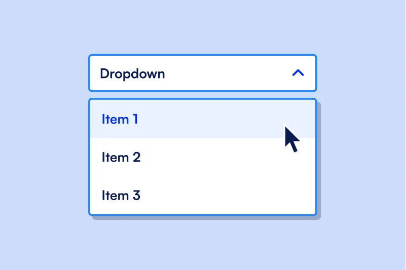
An HTML dropdown is a form element that lets users choose one item from a list of predefined options. It’s created using the <select> element in combination with one or more <option> elements.
The <select> tag defines the dropdown menu itself, while each <option> tag represents an individual item within the dropdown list. These tags work together to create a clean and space-saving input method, especially useful when many choices are available.
Example of a Basic HTML Dropdown
<select>

  <option value="1">Option 1</option>

  <option value="2">Option 2</option>

</select>
In this example:
- The <select> tag creates the dropdown box.
- Each <option> tag defines a selectable item, with a value attribute that can be used in form submissions or scripts.
How HTML Dropdowns Improve User Experience
HTML dropdowns streamline the process of selecting from multiple options by:
- Keeping forms clean and compact, especially when dealing with long lists.
- Reducing input errors by limiting choices to predefined options.
- Making data collection more consistent and manageable.
- Enhancing navigation when used in menus or filters.
By guiding users with structured choices, an HTML dropdown helps create intuitive and efficient web interfaces.
Basic Structure of an HTML Dropdown
Creating an HTML dropdown is straightforward, but understanding its structure helps you use it more effectively in different web scenarios. Here’s a step-by-step breakdown of how it works:
1. The <select> Tag
The <select> tag defines the dropdown menu container. It tells the browser that this is a selectable list input. You can assign it a name or id attribute so it can be easily identified in forms or scripts.
Example:
<select name="fruit" id="fruit-select">

</select>
2. Adding <option> Elements
Each option in the dropdown is created using the <option> tag. The text between the opening and closing <option> tags is what the user sees, while the value attribute is what gets submitted with a form or accessed via JavaScript.
Example:
<select name="fruit" id="fruit-select">

  <option value="apple">Apple</option>

  <option value="banana">Banana</option>

  <option value="cherry">Cherry</option>

</select>
3. Value Attributes and Default Selections
- The value attribute defines the actual data sent when the form is submitted.
- If you omit the value, the displayed text will be used by default.
- To make an option selected by default, use the selected attribute.
Example:
<select name="fruit" id="fruit-select">

  <option value="apple" selected>Apple</option>

  <option value="banana">Banana</option>

  <option value="cherry">Cherry</option>

</select>
In this case, Apple will be pre-selected when the page loads.
Understanding this basic structure gives you the foundation to create more advanced and styled HTML dropdowns later on.
Enhancing Your HTML Dropdown
Once you’re comfortable with the basic structure of an HTML dropdown, you can enhance it for better organization and usability. Two key techniques are labeling your dropdown and grouping related options with <optgroup>, as well as pre-selecting a default choice using the selected attribute.
1. Adding Labels and Grouping Options with <optgroup>
When your dropdown contains a large number of choices or categories, using <optgroup> helps organize options into logical groups. This makes the dropdown easier to navigate and understand.
Example:
<select name="items" id="item-select">

  <optgroup label="Fruits">

    <option value="apple">Apple</option>

    <option value="banana">Banana</option>

  </optgroup>

  <optgroup label="Vegetables">

    <option value="carrot">Carrot</option>

    <option value="spinach">Spinach</option>

  </optgroup>

</select>- The label attribute in <optgroup> defines the group name.
- Options inside each group are nested <option> tags.
This method enhances both usability and visual structure in your HTML dropdown.
2. Pre-selecting an Option Using selected
To guide users or highlight the most likely choice, you can pre-select a specific option using the selected attribute.
Example:
<select name="fruit" id="fruit-select">

  <option value="apple" selected>Apple</option>

  <option value="banana">Banana</option>

  <option value="cherry">Cherry</option>

</select>
In this example, Apple is displayed as the default selected option when the dropdown first appears.
Using <optgroup> and the selected attribute helps you build more intuitive and user-friendly HTML dropdowns, especially when dealing with larger sets of data.
Styling an HTML Dropdown with CSS
Although HTML dropdowns have a default browser appearance, you can use CSS to customize their look and feel to better match your website’s design. While some styling options are limited due to browser constraints, you can still control basic aspects like size, spacing, font, and colors.
What Can Be Styled?
You can style the <select> element to:
- Adjust its width and height
- Change font size and text color
- Add padding for spacing
- Modify border and background color
Sample CSS to Style an HTML Dropdown
select {

  width: 200px;

  padding: 8px;

  font-size: 16px;

  color: #333;

  background-color: #f9f9f9;

  border: 1px solid #ccc;

  border-radius: 4px;

}
This styling:
- Sets the dropdown width to 200 pixels
- Adds internal spacing with padding
- Increases readability with a larger font-size
- Changes the background and text color
- Adds rounded corners and a subtle border
By styling your HTML dropdown, you ensure it not only functions well but also fits seamlessly into your site’s overall design.
Making HTML Dropdowns Dynamic with JavaScript
While a basic HTML dropdown is static and defined directly in the HTML code, JavaScript allows you to make it dynamic adding, removing, or updating options based on user actions or data sources. This is especially useful when working with APIs or when you want the dropdown content to change depending on other selections on the page.
Overview: Dynamically Populating Dropdowns
Using JavaScript, you can:
- Populate dropdown options based on an array or external data
- Respond to user input or page events by updating the dropdown
- Improve reusability by generating dropdowns on the fly
Example: Populate an HTML Dropdown with JavaScript
Here’s how to dynamically add options to an HTML dropdown:
HTML
<select id="colorDropdown"></select>JavaScript
const options = ["Red", "Green", "Blue"];

const select = document.getElementById("colorDropdown");

options.forEach(color => {

  const option = document.createElement("option");

  option.value = color;

  option.text = color;

  select.add(option);

});
Explanation:
- We start with an empty <select> element with an id of colorDropdown.
- The options array contains the values we want to display.
- We loop through each item, create a new <option> element, assign its value and text, and add it to the dropdown.
This method gives your HTML dropdown flexibility and makes it ideal for modern, interactive web applications.
Starting out with HTML and aiming to become a top-tier web developer?
Join our beginner-friendly Web Development Course and master the skills to build responsive, scalable websites and web apps from scratch. In less than 3 months, you’ll go from zero to job-ready, learning by doing, with real-world projects and expert guidance every step of the way.
Common Use Cases for HTML Dropdowns
HTML dropdowns are incredibly versatile and are used in a wide range of web applications. Their ability to simplify and organize choices makes them ideal for both simple and complex interfaces. Here are some of the most common use cases:
1. Country/State Selector in Forms
When collecting address or location details, dropdowns are commonly used to list countries, states, or regions. This ensures consistency in data input and improves accuracy by limiting entries to predefined values.
Example:
<select name="country">

  <option value="us">United States</option>

  <option value="ca">Canada</option>

  <option value="uk">United Kingdom</option>

</select>
2. Product Filters on E-commerce Sites
Online stores often use HTML dropdowns to let users filter products by size, color, price range, or category. This keeps the interface clean while still offering users precise control.
Example:
Filter by Size:
<select name="size">

  <option value="s">Small</option>

  <option value="m">Medium</option>

  <option value="l">Large</option>

</select>
3. Navigation Menus
Dropdowns can also be used as part of website navigation menus. This is useful for displaying subcategories or additional links under a main menu item.
Example:
A dropdown menu for Services:
<select onchange="location = this.value;">

  <option value="#">Select Service</option>

  <option value="/web-design">Web Design</option>

  <option value="/seo">SEO</option>

  <option value="/marketing">Marketing</option>

</select>
4. Survey and Feedback Forms
In surveys or feedback forms, HTML dropdowns are helpful for questions with predefined answers such as rating levels, job roles, or experience levels. They reduce clutter and streamline the form completion process.
Example:
<select name="satisfaction">

  <option value="1">Very Dissatisfied</option>

  <option value="2">Dissatisfied</option>

  <option value="3">Neutral</option>

  <option value="4">Satisfied</option>

  <option value="5">Very Satisfied</option>

</select>
Using html dropdowns in these ways not only improves user experience but also keeps your interface organized and easy to manage.
Accessibility Tips for HTML Dropdowns
Creating accessible HTML dropdowns ensures that all users including those using screen readers or keyboard navigation can interact with your web forms effectively. Here are essential accessibility best practices to follow when working with dropdowns:
1. Use <label> with for and id Attributes
Linking a label to your dropdown provides context for screen readers and improves overall usability. Use the for attribute on the <label> and match it with the id of the <select> element.
Example:
<label for="country-select">Choose your country:</label>

<select id="country-select" name="country">

  <option value="us">United States</option>

  <option value="uk">United Kingdom</option>

</select>
This ensures that users understand what the dropdown is for—even when using assistive technologies.
2. Use aria-label or aria-labelledby for Screen Readers
If a visible label isn’t possible (e.g., in compact UI elements), you can use aria-label to provide an accessible name directly on the <select> element.
Example:
<select aria-label="Select a fruit">

  <option value="apple">Apple</option>

  <option value="banana">Banana</option>

</select>
Alternatively, use aria-labelledby to reference another element that acts as a label.
3. Support Keyboard Navigation
Dropdowns should always be operable using just a keyboard:
- Users should be able to use Tab to focus on the dropdown.
- Arrow keys should allow scrolling through options.
- Enter or Space should select the highlighted option.
HTML dropdowns created with the native <select> element automatically support these behaviors, which is one reason they’re preferred over custom dropdown components unless additional functionality is needed.
By following these accessibility guidelines, your HTML dropdown will be more inclusive and user-friendly for all types of users.
Accessibility Tips for HTML Dropdowns
Making your HTML dropdowns accessible is key to ensuring all users, including those with disabilities, can interact with your forms and interfaces effectively. Here are three important practices to follow:
1. Use <label> with for and id Attributes
Always associate a <label> with your <select> element. This helps screen readers announce what the dropdown is for and improves usability for all users.
Example:
<label for="language">Choose a language:</label>

<select id="language" name="language">

  <option value="en">English</option>

  <option value="fr">French</option>

</select>
The for=”language” attribute in the label connects it to the dropdown with id=”language”.
2. Use aria-label for Screen Readers
If a visible label is not practical, you can use the aria-label attribute to provide an accessible name for screen readers.
Example:
<select aria-label="Select payment method">

  <option value="credit">Credit Card</option>

  <option value="paypal">PayPal</option>

</select>
This ensures users relying on assistive technologies understand the purpose of the dropdown even without a visible label.
3. Keep Keyboard Navigation in Mind
Native HTML dropdowns are keyboard-friendly by default:
- Users can press Tab to focus on the dropdown.
- Use the ↑ and ↓ arrow keys to scroll through options.
- Press Enter or Space to select an option.
Avoid replacing standard dropdowns with custom JavaScript components unless necessary custom versions require additional scripting to replicate this accessibility.
Following these tips will ensure your HTML dropdowns are inclusive, functional, and compliant with web accessibility standards.
In this article, we’ve covered the essentials of creating and enhancing HTML dropdowns, making them a powerful tool for improving user experience on your website. From basic dropdown creation using the <select> and <option> tags to dynamic population with JavaScript, we’ve seen how flexible and useful they can be in various contexts.
We also discussed key accessibility considerations, including the importance of using <label> tags, aria-label attributes for screen readers, and ensuring keyboard navigation is supported. By following these best practices, you ensure that your dropdowns are not only functional but also accessible to all users.
Whether you’re building forms, filters, or navigation menus, HTML dropdowns remain an essential element of interactive web design. By understanding how to use and enhance them, you can create more intuitive and user-friendly web interfaces.