CSS background properties allow web developers to control the appearance of background images, colors, and patterns on a webpage. These properties are integral in enhancing the visual appeal of a website by allowing for creative design choices and fine-tuning of how backgrounds appear and behave within an element. The main background properties in CSS include:
- background-color: Sets the background color of an element.
- background-image: Defines the background image applied to an element.
- background-position: Specifies the starting position of the background image.
- background-repeat: Controls whether the background image repeats horizontally, vertically, or not at all.
- background-attachment: Defines whether the background image scrolls with the page or remains fixed in place.
Together, these properties enable developers to create visually rich and engaging designs by manipulating the background layer of an element. The background-size property, specifically, focuses on determining the size of background images, offering crucial control over how images fill an element.
Are you looking to start your journey as a software developer? If yes, consider our software engineering course in Kenya. We teach industry-relevant skills that will get you a high-paying job in 10 months.
Importance of Background-Size in Web Design
The background-size property is vital in web design because it helps ensure that background images are displayed correctly and responsively across different screen sizes and devices. Without proper control of image size, backgrounds can appear stretched, cropped, or improperly scaled, detracting from the overall aesthetics of the site. This property also plays a significant role in:
- Responsive design: background-size allows images to scale appropriately on various screen sizes, ensuring a consistent and professional look on both desktop and mobile devices.
- Visual appeal: Proper use of background-size can enhance design elements like hero images, banners, and section backgrounds by ensuring they look great without distortion or pixelation.
- Performance optimization: By controlling the size of background images, developers can improve page load times, which directly impacts user experience and SEO rankings.
In modern web design, effective use of background-size helps create dynamic layouts that adapt seamlessly to user needs and different viewing contexts. You can also learn more about using background images by reading this CSS Background Image guide.
What is CSS Background-Size?
The background-size property in CSS defines the dimensions of a background image within an HTML element. It controls how large or small the background image appears and how it is scaled within the element’s box. By using this property, designers can ensure that background images display as intended, whether they need to fully cover a section, fit neatly within an area, or maintain specific proportions.
Syntax Example:
element {

  background-image: url("image.jpg");

  background-size: cover;

}
Role of background-size in Controlling Background Image Size
The background-size property gives precise control over how background images are rendered inside elements. Without this control, background images may default to their natural size, which can result in unwanted stretching, tiling, or cropping depending on the container size.
With background-size, you can:
- Scale images proportionally to fit a container (contain)
- Make images fill a container completely while possibly cropping excess parts (cover)
- Set exact dimensions using units (like px, %, em)
- Maintain responsiveness across different devices and screen sizes
This property is especially important for maintaining visual consistency, responsiveness, and aesthetic appeal across a variety of layouts.
Common Use Cases for background-size
Here are some practical scenarios where background-size is commonly used:
- Hero Sections and Banners
Using background-size: cover ensures that the background image fills the entire banner area without leaving any gaps, even if it means cropping part of the image. - Logos or Patterned Backgrounds
Applying background-size: contain; to scale logos or patterns so the entire image fits within the container without distortion. - Responsive Design
Using percentage values (e.g., background-size: 100% 100%) to make sure the background image scales with the container as it changes size on different devices.
- Thumbnail Previews or Cards
Assigning specific pixel dimensions (e.g., background-size: 150px 100px;) for consistent layout in galleries or card components. - Repeating Backgrounds with Custom Sizes
Combining with background-repeat and background-position for tailored backgrounds that repeat neatly or appear in fixed locations.
In all these cases, background-size helps enhance layout flexibility and visual impact without compromising performance or user experience. To dive deeper into background-size to control image dimensions in CSS responsive layouts see the stylesheet from the University of Louisville Arts & Sciences site.
CSS Background-Size Syntax
Basic Syntax
The background-size property is written in CSS as:
background-size: value;
It is used to specify how background images should be scaled inside the element. This value can be a keyword, a length, a percentage, or a combination of values.
Different Value Types
- Keywords
These are the most commonly used and simplest values:
cover
Scales the background image to completely cover the entire container. The image will fill the area, potentially cropping parts to maintain its aspect ratio.
background-size: cover;
contain
Scales the background image to ensure the entire image is visible within the container. It maintains the aspect ratio, but might leave empty space if the image doesn’t match the container’s shape.
background-size: contain;
- Length Values (e.g., px, em)
You can define the exact width and height of the background image using fixed units:
One value sets the width only; height adjusts automatically to maintain aspect ratio.
dit
background-size: 200px;
Two values define width and height respectively:
background-size: 200px 100px;
You can also use other length units like em, rem, or vw/vh.
- Percentage Values
Percentage values scale the image relative to the container’s size.
One percentage sets width; height is auto-scaled:
background-size: 50%;
Two percentage values define both width and height:
background-size: 100% 50%;
This is especially useful for responsive designs.
- Multiple Background Images (Optional Advanced)
When using multiple background images, you can specify a size for each
background-image: url(“img1.jpg”), url(“img2.jpg”);
background-size: cover, 50% 50%;
Each size corresponds to the image at the same position in the background-image list.
CSS Background-Size Values Explained
Understanding how different background-size values work is key to creating flexible, visually appealing layouts. Below are the most commonly used values explained with their behaviors, use cases, and advantages.
1. cover
What it does:
The cover value scales the background image so that it completely fills the element. If the aspect ratio of the image doesn’t match the element, the image will be cropped to avoid empty space.
background-size: cover;
Use Cases and Benefits:
- Hero sections and full-screen background images.
- Ensures the element is always completely covered with no gaps.
- Great for creating immersive, bold design elements.
- Maintains the image’s aspect ratio automatically.
Tip: Some parts of the image might be cut off depending on the container shape.
2. contain
What it does:
The contain value scales the image so that the entire image is visible within the element, fitting it completely without cropping. It preserves the image’s aspect ratio.
background-size: contain;
Use Cases and Benefits:
- Useful when image visibility is more important than coverage (e.g., logos, product images).
- Ensures the whole image is displayed.
- Prevents image distortion or loss of content.
Tip: May leave empty space (background-color shows) if the image and element have different aspect ratios.
3. Percentage Values
What it does:
Percentage values scale the image relative to the size of the container.
background-size: 100% 50%;
- The first value is the width, the second is the height.
- 100% means the image width equals the container’s width.
- 50% means the image height is half the height of the container.
Use Cases and Benefits:
- Perfect for responsive design where image sizing depends on container dimensions.
- Can create dynamic scaling based on the element’s size.
- Allows for precise control over image proportions in flexible layouts.
Tip: May distort the image if width and height are not proportionate to the original.
4. Length Values (px, em, rem, etc.)
What it does:
Allows you to set the exact size of the background image using length units.
background-size: 200px 100px;
- First value = width
- Second value = height
If only one value is set, height is auto-scaled:
background-size: 150px;
Use Cases and Benefits:
- Best for elements that need fixed image dimensions, such as cards, icons, or static sections.
- Ensures consistent appearance across different browsers.
- Useful when you don’t need responsiveness.
Tip: Use em or rem for more flexible, scalable sizing in relation to font size or root size.
Each background-size value offers different advantages depending on your design needs whether you’re prioritizing coverage, visibility, or responsiveness. Mastering these options will help you craft clean, modern layouts with effective use of imagery.
Practical Examples of Using background-size
Let’s explore some real-world examples that show how different background-size values behave and when to use each one.
Example 1: Using background-size: cover; for Full Coverage
.hero-section {

  background-image: url("hero.jpg");

  background-size: cover;

  background-position: center;

  background-repeat: no-repeat;

  height: 400px;

}
What it does:
- The background image completely covers the .hero-section element.
- It maintains aspect ratio and centers the image.
- Some parts of the image may be cropped.
Use case: Perfect for large hero banners, headers, or fullscreen background sections.
Example 2: Using background-size: contain; for Fitting the Image
.logo-container {

  background-image: url("logo.png");

  background-size: contain;

  background-repeat: no-repeat;

  background-position: center;

  width: 200px;

  height: 200px;

}
What it does:
- The entire image is visible within the container.
- It maintains the original aspect ratio.
- May leave space around the image if aspect ratios differ.
Use case: Ideal for placing logos, product images, or icons where full visibility is needed.
Example 3: Custom Size with Percentage or Pixel Values
.thumbnail {

  background-image: url("thumb.jpg");

  background-size: 100px 80px;

  background-repeat: no-repeat;

  background-position: top left;

}
OR using percentages:
.banner {

  background-image: url("banner.jpg");

  background-size: 100% 50%;

  background-repeat: no-repeat;

}
What it does:
- The image is scaled to a specific size in pixels or as a percentage of the container.
- Offers full control over how the image appears.
Use case: Useful when you need fixed image dimensions or proportional scaling based on container size.
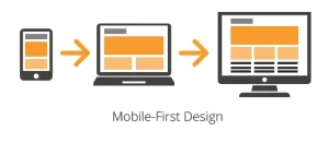
Example 4: Responsive background-size for Mobile Design
.responsive-section {

  background-image: url("responsive.jpg");

  background-size: cover;

  background-repeat: no-repeat;

  background-position: center;

}

/* Optional media query for smaller screens */

@media (max-width: 768px) {

  .responsive-section {

    background-size: contain;

  }

}
What it does:
- On larger screens, the image covers the section.
- On smaller screens (like mobile), the image adjusts to fit within the section.
- Ensures content remains visible and well-proportioned across devices.
Use case: Great for creating mobile-friendly layouts with optimized background behavior.
These examples show how flexible background-size is and how you can tailor it to fit almost any layout or design scenario. Whether you’re building a dynamic landing page, a clean gallery, or a responsive mobile section, this property is essential.
Common Pitfalls to Avoid When Using background-size
While the background-size property is a powerful tool in CSS, it’s important to use it thoughtfully to avoid common mistakes that can negatively impact your design or site performance.
1. Stretching or Distorting Images
Problem:
Using mismatched width and height values (especially with percentage or pixel units) can distort the image’s aspect ratio, making it appear stretched or squished.
/* This may distort the image */
background-size: 100% 100%;
How to Avoid It:
Use only one value if you want the browser to maintain aspect ratio automatically:
background-size: 100%;
- Or use cover or contain, which preserve the image’s natural proportions.
2. Issues with Responsiveness and Scaling
Problem:
A background image may look great on desktop but appear poorly cropped or scaled on mobile if not sized responsively.
How to Avoid It:
- Use a cover for full coverage that adapts to screen size, but test to make sure important content isn’t cropped.
Use media queries to adjust background-size for smaller screens:
@media (max-width: 600px) {

  .section {

    background-size: contain;

  }

}
Test across multiple screen sizes and orientations to fine-tune background behavior.
3. Performance Concerns with Large Images and background-size
Problem:
Using high-resolution images with background-size: cover or contain can lead to large file sizes and longer load times, especially on mobile.
How to Avoid It:
- Optimize your images before using them as backgrounds (use tools like TinyPNG, ImageOptim, etc.).
- Serve different image sizes for different screen resolutions using CSS media queries or responsive techniques.
- Consider using background-color or simple patterns for lower-priority design elements.
Bonus Tips for Best Practices
- Combine background-size with background-position for better control over image placement.
- Avoid relying on background images for conveying critical content—screen readers can’t access them.
- Test on real devices, not just resized browser windows, to evaluate how your backgrounds behave in the real world.
By being mindful of these pitfalls, you can harness the full power of background-size while maintaining performance, responsiveness, and design integrity.
Advanced Tips and Tricks with background-size
Once you’re comfortable with the basics of background-size, you can level up your designs by combining it with other CSS properties and techniques to create more engaging and professional-looking layouts.
1. Combining background-size with Other Background Properties
You can use background-size alongside other background-related properties to gain complete control over how images appear.
Example: Full control over a hero section
.hero {

  background-image: url('hero.jpg');

  background-size: cover;

  background-position: center center;

  background-repeat: no-repeat;

  background-attachment: scroll;

  height: 100vh;

}
Key properties:
- background-position: aligns the image (e.g., center, top left)
- background-repeat: prevents tiling (no-repeat)
- background-attachment: can be set to fixed for parallax-like effects
Use Case: Ideal for hero sections, banners, and landing page headers.
2. Creating Parallax Effects Using background-size
Parallax scrolling is a popular design technique where the background moves at a different speed than the foreground.
Simple Parallax Effect:
.parallax {

  background-image: url('parallax.jpg');

  background-size: cover;

  background-attachment: fixed;

  background-position: center;

  background-repeat: no-repeat;

  height: 500px;

}
How it works:
- background-attachment: fixed; keeps the background static while the content scrolls.
- background-size: cover; ensures the image still fills the element.
Note: Not fully supported on all mobile devices, but great for desktop experiences.
3. Using background-size in Modern Web Design Trends
Modern design heavily relies on full-width background images and visual storytelling, and background-size is at the heart of that.
Trendy Use Cases:
Fullscreen hero images
With cover and height: 100vh, you create immersive intros to your website.
.fullscreen-hero {

  background-image: url('hero-banner.jpg');

  background-size: cover;

  background-position: center;

  height: 100vh;

}
Card-based layouts
Using fixed background-size values in UI cards for previews or product listings.
.card-thumbnail {

  background-image: url('product.jpg');

  background-size: 150px 100px;

  background-position: top center;

  background-repeat: no-repeat;

}- Text overlays on background images
Combine background-size: cover; with semi-transparent overlays for better readability of text on images.
Pro Tips
Use shorthand with the background property to keep your CSS concise:
background: url(‘image.jpg’) no-repeat center/cover;
Combine multiple background images with individual sizes:
background-image: url(‘pattern.png’), url(‘texture.jpg’);
background-size: 30px 30px, cover;
- Test on high-DPI screens and optimize your images to ensure visual quality and performance.
By mastering these advanced techniques, you can turn simple layouts into stunning visual experiences, all with the strategic use of background-size and its companion properties.
Why Mastering background-size Matters
Understanding and using background-size effectively helps you:
- Create flexible, responsive designs that look great on all devices.
- Elevate the professionalism and polish of your UI.
- Avoid common layout and image scaling issues.
“The best way to learn is by doing.”
Try out different background-size values in your next project. Combine them with media queries, layering, and animation to push your creativity. Even small tweaks can make a big difference in how polished your design feels.
Ready to turn these creative skills into a career? Join our software development course in Kenya and start building professional, responsive websites with confidence. Enroll today in one of our programs and become a job-ready developer in just 10–12 months