In visual design, shadows are used to create the illusion of depth and dimension. They mimic the way light interacts with objects in the real world, helping elements appear lifted, pressed, or layered. Whether you’re working with print, digital, or UI design, shadows are a powerful tool to guide user focus and add a subtle sense of realism.
In web design, shadows are especially important for enhancing the aesthetic appeal and usability of user interfaces. They can make buttons look clickable, highlight important components, or simply give your layout a more polished and modern feel. When used correctly, shadows help create visual hierarchy and improve overall user experience.
One of the most versatile tools for adding shadows in web development is the CSS box-shadow property. It allows designers and developers to apply custom shadows to HTML elements with fine-tuned control over direction, blur, spread, and color. In this article, we’ll dive deep into how to use CSS box-shadow effectively to elevate your designs.
You can also read more about Box models by reading this CSS Box Model article.
What is CSS box-shadow?
The CSS box-shadow property is used to add shadow effects to elements in a web page. It allows you to create a drop shadow around an element’s frame, giving it a sense of depth and elevation similar to how light casts a shadow in the real world.
This property is incredibly flexible, letting you control the position, blur, spread, and color of the shadow. It can also be used to create inner shadows that give the illusion of indentation or pressed surfaces.
Syntax Overview
box-shadow: offset-x offset-y blur-radius spread-radius color inset;
- offset-x: Horizontal distance of the shadow (positive for right, negative for left)
- offset-y: Vertical distance of the shadow (positive for down, negative for up)
- blur-radius (optional): Controls the softness or blurriness of the shadow
- spread-radius (optional): Expands or contracts the size of the shadow
- color: Defines the color of the shadow
- inset (optional): Changes the shadow from an outer shadow to an inner shadow
Here’s a quick example:
box-shadow: 4px 4px 10px 0 rgba(0, 0, 0, 0.25);
This would create a soft, subtle outer shadow that appears offset to the bottom-right of the element.
The CSS box-shadow property plays a key role in modern UI/UX design by giving elements a visual hierarchy. It helps distinguish interactive components like buttons and cards, making interfaces more intuitive and visually engaging.
CSS box-shadow Syntax Breakdown
Understanding each part of the box-shadow property helps you gain full control over how your shadows look and behave. Here’s a breakdown of its components:
1. Offset-x and Offset-y
These two values control the position of the shadow relative to the element:
- offset-x: Moves the shadow left or right.
- Positive value – shadow moves right
- Negative value – shadow moves left
- offset-y: Moves the shadow up or down.
- Positive value – shadow moves down
- Negative value – shadow moves up
Example:
box-shadow: 10px 5px black;
This adds a shadow 10px to the right and 5px down from the element.
2. Blur-radius
This optional value controls how soft or sharp the shadow appears.
- A larger value creates a more blurred, subtle shadow.
- A smaller value creates a sharper, crisper edge.
Example:
box-shadow: 0 4px 8px gray;
This creates a slightly blurred shadow with an 8px blur radius.
3. Spread-radius
Another optional value, this expands or contracts the size of the shadow.
- Positive values make the shadow larger than the element.
- Negative values shrink it inward.
Example:
box-shadow: 0 4px 8px 2px rgba(0, 0, 0, 0.3);
The 2px spread expands the shadow slightly beyond its blur radius.
4. Color
Defines the color of the shadow. You can use color names, hex codes, RGB, or RGBA (for transparency).
Example:
box-shadow: 0 4px 6px rgba(0, 0, 0, 0.25);
Using rgba allows you to control both the color and its opacity.
5. Inset
By default, shadows appear outside an element (drop shadow). Adding inset places the shadow inside the element’s border, giving a pressed or sunken effect.
Example:
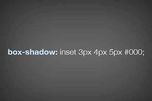
box-shadow: inset 0 2px 5px rgba(0, 0, 0, 0.3);
This creates a soft inner shadow inside the element.
Together, these properties make box-shadow a highly customizable and powerful CSS feature for creating realistic and stylish effects.
Basic Examples of CSS box-shadow
The box-shadow property is flexible and easy to experiment with. Below are some simple examples to show how it can be applied in real-world design.
1. Simple Outer Shadow Example
This is the most common use of box-shadow a subtle shadow that gives the illusion of depth, as if the element is lifted off the page.
box-shadow: 4px 4px 10px rgba(0, 0, 0, 0.2);
What it does:
Creates a soft shadow to the bottom-right of the element, often used for cards, buttons, and containers.
2. Inner Shadow Example
By adding the inset keyword, you can create an inner shadow that makes the element appear pressed or sunken in.
box-shadow: inset 2px 2px 6px rgba(0, 0, 0, 0.3);
What it does:
This inner shadow gives a subtle indented look, great for inputs or UI panels that need a tactile appearance.
3. Multiple Shadows on a Single Element
You can layer multiple shadows by separating them with commas. This adds more depth or allows for more creative effects.
box-shadow:

  2px 2px 5px rgba(0, 0, 0, 0.2),

  -2px -2px 5px rgba(255, 255, 255, 0.3);
What it does:
Creates a neumorphic look by combining a dark and light shadow from opposite directions perfect for soft UI design.
These examples show just how adaptable box-shadow can be. From sleek cards to playful buttons, it’s a simple property with endless design potential.
Practical Use Cases for CSS box-shadow
The box-shadow property isn’t just for decoration, it plays a crucial role in modern web UI design by helping users understand hierarchy, interactivity, and focus. Here are some practical ways it’s used:
1. Card Components (e.g., Material Design Cards)
Cards are a key UI pattern in frameworks like Material Design. Shadows help visually elevate the card above the background, making it feel like a standalone container.
.card {

  box-shadow: 0 4px 12px rgba(0, 0, 0, 0.1);

}
Use it for:
Content boxes, product previews, article summaries, and dashboard widgets.
2. Buttons and Hover Effects
Adding a shadow to buttons gives them a clickable, interactive feel. Combined with hover states, it can simulate a button being pressed or lifted.
.button {

  box-shadow: 0 2px 6px rgba(0, 0, 0, 0.2);

  transition: box-shadow 0.3s ease;

}

.button:hover {

  box-shadow: 0 4px 10px rgba(0, 0, 0, 0.3);

}
Use it for:
CTAs, menu items, and interactive controls.
3. Modals and Overlays
When you display a modal or popup, box-shadow helps visually separate it from the rest of the content, drawing the user’s attention to the foreground.
.modal {

  box-shadow: 0 8px 30px rgba(0, 0, 0, 0.4);

}
Use it for:
Alerts, login popups, and confirmation dialogs.
4. Image Frames and Highlight Boxes
Use shadows to frame images or highlight important content without using borders, giving a softer and more modern look.
.image-frame {

  box-shadow: 0 6px 20px rgba(0, 0, 0, 0.15);

}
Use it for:
Portfolios, featured blog images, or product galleries.
These use cases show that CSS box-shadow is more than just a visual flair—it’s a strategic design tool for improving both aesthetics and usability.
Advanced Techniques with CSS box-shadow
Once you’re comfortable with the basics, box-shadow can become a powerful creative tool for crafting rich visual effects. Let’s explore some advanced techniques to take your designs to the next level.
1. Layering Multiple Shadows
You can apply multiple shadows to a single element by separating them with commas. This allows you to simulate complex lighting effects or add both soft and sharp shadows for realism.
box-shadow:

  0 2px 4px rgba(0, 0, 0, 0.2),

  0 8px 16px rgba(0, 0, 0, 0.1);
What it does:
Creates a layered shadow that feels more natural, similar to how light behaves in real life.
Pro tip: Mix soft and subtle shadows with slightly larger ones for depth.
2. Neumorphism (Soft UI Design Trend)
Neumorphism is a modern UI trend that uses light and dark shadows from opposite directions to create soft, extruded elements that look like they’re embedded into the background.
.neumorphic {

  background: #e0e0e0;

  box-shadow:

    6px 6px 10px #bebebe,

   -6px -6px 10px #ffffff;

  border-radius: 12px;

}
What it does:
Simulates a raised or pressed look with minimal contrast. Ideal for dashboards, toggle switches, and cards.
Note: Neumorphism looks great on light UIs but may suffer from low contrast. Always test for accessibility.
3. Combining box-shadow with Transitions and Animations
Adding transitions or keyframe animations with box-shadow can make elements feel more dynamic and responsive.
.button {

  box-shadow: 0 2px 6px rgba(0, 0, 0, 0.2);

  transition: box-shadow 0.3s ease;

}

.button:hover {

  box-shadow: 0 6px 12px rgba(0, 0, 0, 0.3);

}
What it does:
Gives buttons or cards a smooth “lift” effect on hover, enhancing interactivity without using JavaScript.
These advanced techniques show how creative you can get with a single CSS property. Whether you want clean realism or futuristic soft UI, CSS box-shadow has the flexibility to deliver. Learn more about box-shadow on MDN Web Docs.
CSS box-shadow Best Practices
While box-shadow is a powerful tool, using it effectively requires a thoughtful approach. Here are some best practices to help you get the most out of it without compromising performance or accessibility.
1. Use rgba for Transparent Shadows
Using rgba (Red, Green, Blue, Alpha) allows you to control the opacity of the shadow, which results in more natural and subtle effects. Transparent shadows blend better with various backgrounds and prevent the design from feeling too harsh.
box-shadow: 0 4px 10px rgba(0, 0, 0, 0.2);
Why it works:
Softens the shadow and avoids strong, unrealistic outlines.
2. Avoid Overuse for Performance
Although one or two shadows won’t impact performance, heavy use of large or layered shadows on multiple elements can slow down rendering especially on mobile devices or lower-end systems.
Tip:
Use shadows strategically, focus on interactive elements like buttons, cards, or modals where depth adds value.
3. Keep Accessibility and Contrast in Mind
Shadows can be visually appealing, but they should never replace clear contrast or essential UI elements. Users with vision impairments or low screen contrast might not see subtle shadows well.
Best practice:
- Combine shadows with clear borders, color contrast, or size differences.
- Avoid relying on shadow alone to indicate interactivity (e.g., clickable buttons).
- Use tools like WebAIM Contrast Checker to ensure accessibility compliance.
By following these best practices, you can ensure your use of CSS box-shadow enhances your design without sacrificing clarity, performance, or accessibility.
Want to learn how to apply professional CSS techniques like this across full web projects? Join our software development course in Kenya and gain hands-on front-end experience that sets you apart.
Common Mistakes to Avoid when using Box Shadows
While box-shadow is a powerful design tool, it’s easy to misuse. Here are some common mistakes to watch out for and how to avoid them.
1. Overpowering Shadows
Using shadows that are too dark, too large, or too blurry can overwhelm your design. Instead of adding depth, they can make the layout feel cluttered, heavy, or even outdated.
Example of overpowering shadow:
box-shadow: 0 10px 50px rgba(0, 0, 0, 0.8);
What to do instead:
Keep shadows subtle and balanced. Most modern UIs use soft shadows with low opacity.
box-shadow: 0 4px 12px rgba(0, 0, 0, 0.15);
2. Shadows Not Matching the Design Theme
Your shadows should match the overall visual style of your site. For instance, if your site has a flat or minimal design, deep 3D-style shadows may look out of place.
Tip:
Choose shadow styles (hard, soft, inset, layered) that complement your layout, colors, and design tone.
3. Ignoring Mobile Responsiveness
On smaller screens, large or complex shadows can appear exaggerated or distorted, especially if the layout changes. Shadows can also impact rendering performance on mobile devices.
Best practices:
- Test your shadows on multiple screen sizes.
- Use media queries to adjust or remove shadows on small screens if needed.
@media (max-width: 480px) {

  .card {

    box-shadow: none;

  }

}
By avoiding these common pitfalls, your shadows will feel intentional, consistent, and well-integrated into your design no matter the device or layout.
In conclusion, the CSS box-shadow property is a simple yet powerful feature that adds depth, dimension, and polish to web desing From subtle button hovers to sophisticated card layouts and modern UI effects like neumorphism, box shadows help create a visual hierarchy and guide the user’s attention.
By understanding its syntax and components, such as offset, blur, spread, colour, and the optional inset, designers can craft shadows that enhance both aesthetics and usability.