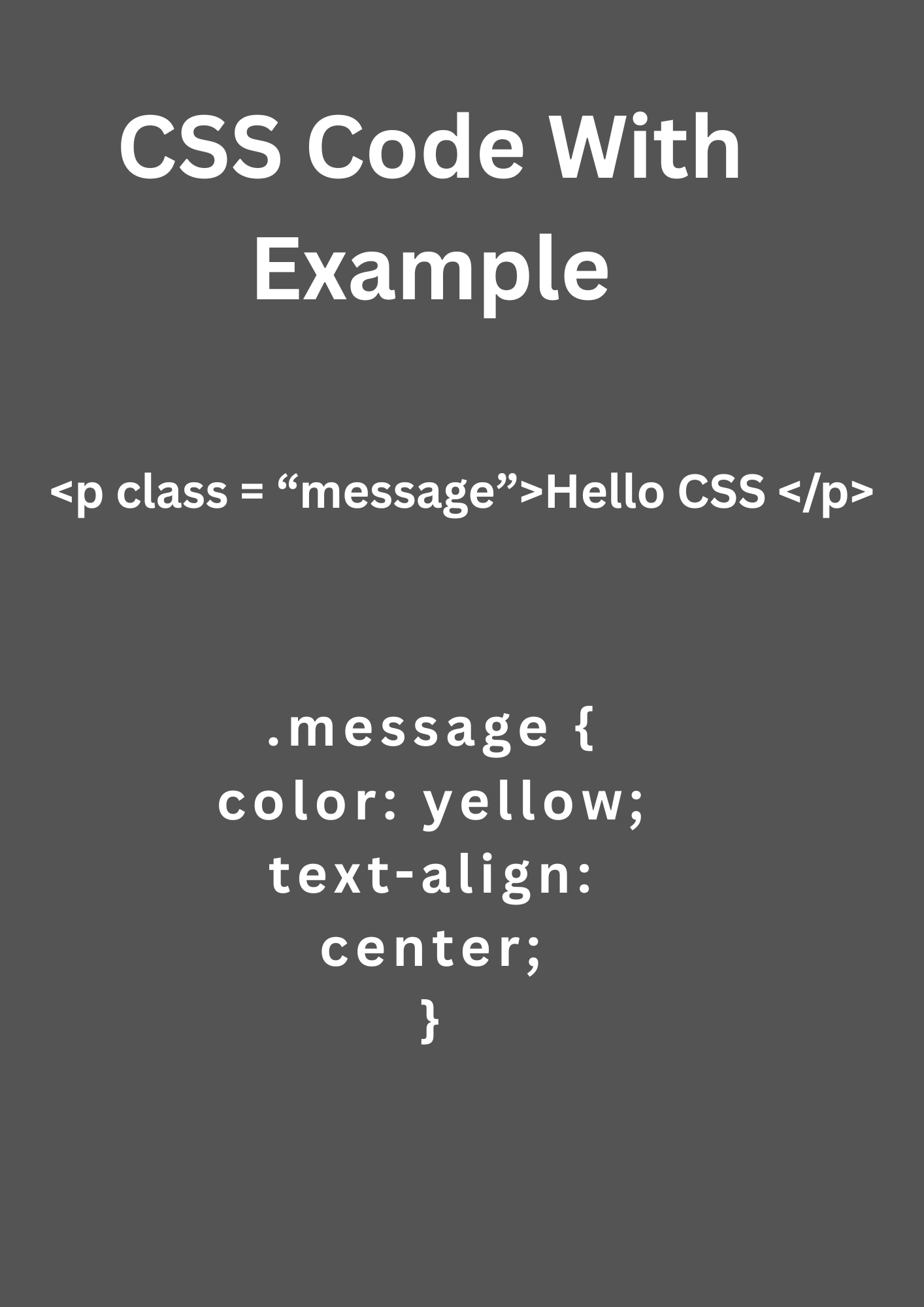
CSS code is used to style and layout web pages. It enhances visual presentation, supports responsive design, and separates structure from design, making web development cleaner and more maintainable.
This article covers essential CSS code concepts with practical examples for beginners and intermediate learners. From selectors and the box model to layout techniques like Flexbox and Grid, you’ll learn how to write clean, responsive, and maintainable CSS for modern web development.
What CSS Actually Does (Under the Hood)
CSS tells the browser how to render elements. Think of HTML as the structure, and CSS as the design layer that interprets “how things should look”.
The browser builds a render tree by combining the DOM (from HTML) and the CSSOM (from CSS). Then, it calculates the layout and paints pixels on the screen.
CSS Selectors:
CSS selectors are how we target elements:
a) Type Selector
p {

  font-size: 16px;

}
Targets all <p> elements.
b) Class Selector
.card {

  padding: 20px;

}
.card targets all elements with class card. Use for reusable components.
c) ID Selector
#header {

  background: black;

}
It should only be used once per page.
d) Attribute Selector
input[type="text"] {

  border: 1px solid #ccc;

}
e) Combinators
nav ul li a {

  color: blue;

}
This is descendant combinator: targets anchor tags inside li inside ul inside nav.
3. Box Model
Every element in CSS is a box. The box model includes:
+----------------------------+

|        margin             |

|  +---------------------+  |

|  |      border         |  |

|  |  +---------------+  |  |

|  |  |   padding     |  |  |

|  |  | +-----------+ |  |  |

|  |  | |  content  | |  |  |

|  |  | +-----------+ |  |  |

|  |  +---------------+  |  |

|  +---------------------+  |

+----------------------------+
.card {
margin: 20px;
padding: 16px;
border: 2px solid #ccc;
}Positioning & Layout Systems
a) Static (default) – elements flow naturally.
b) Relative – offset relative to its normal position.
c) Absolute – positioned relative to the nearest positioned ancestor.
d) Fixed – relative to the viewport.
e) Sticky – behaves like relative until it scrolls to a threshold.
Example:
.fixed-header {

  position: fixed;

  top: 0;

  width: 100%;

  z-index: 1000;

}
Flexbox (1D Layout)
Great for aligning items in a row or column.
.container {

  display: flex;

  justify-content: space-between;

  align-items: center;

}- justify-content: horizontal alignment
- align-items: vertical alignment
Grid (2D Layout)
.grid-container {

  display: grid;

  grid-template-columns: 1fr 2fr;

  gap: 20px;

}
Useful for complex, responsive layouts.
Variables in CSS (Custom Properties)
:root {

  --primary-color: #1abc9c;

  --spacing: 1rem;

}

button {

  background-color: var(--primary-color);

  padding: var(--spacing);

}
This makes your design system scalable and themable.
Media Queries (Responsive Design)
@media (max-width: 768px) {

  .container {

    flex-direction: column;

  }

}
Lets you create mobile-first responsive designs.
CSS Architecture & Best Practices
a) BEM Naming Convention
<div class="card card--highlighted">

  <h2 class="card__title">Title</h2>

</div>
BEM = Block → Element → Modifier
Helps maintain structure and avoid naming conflicts.
b) Modular CSS
Split styles by component/page.
c) CSS Preprocessors (SASS/SCSS)
Allows nesting, mixins, variables, inheritance, etc.
$primary-color: #e67e22;

.button {

  background: $primary-color;

  &:hover {

    background: darken($primary-color, 10%);

  }

}
Tooling & Integration
- PostCSS: Transforms modern CSS into something older browsers understand.
- Tailwind CSS: Utility-first CSS framework.
- CSS-in-JS (React): Styled Components, Emotion
- Webpack/Vite: Bundles CSS with JS.
- Linting: Stylelint ensures consistent CSS code quality
In conclusion, CSS plays a vital role in modern web development by enhancing structure with design. In this article, we explored key CSS concepts including selectors, box model, positioning, Flexbox, Grid, variables, media queries, and best practices like BEM and preprocessors. With practical code examples throughout, you now have a foundation to build beautiful and responsive web pages more effectively.


