Designing web layouts can be challenging, especially when working with elements that need to sit side by side or wrap around one another. Before the advent of modern layout systems like Flexbox and CSS Grid, developers relied heavily on the float property to create multi-column designs, wrap text around images, and build complex layouts.
CSS Float and Clear are two fundamental CSS properties that help control how elements flow and interact within a webpage. The float property allows elements to shift to the left or right of their container, letting other content wrap around them. Meanwhile, the clear property is used to manage the behavior of elements following floated items, ensuring layouts don’t break or behave unpredictably.
While newer layout techniques offer more flexibility today, mastering CSS Float and Clear remains important. They are still widely used in legacy code, and understanding them is essential for debugging, maintaining older websites, or building simpler layouts that don’t require full Flexbox or Grid implementations.
Want to master foundational and modern CSS techniques hands-on? Join our software engineering course in Kenya and become a confident, job-ready developer in less than 10 months.
What is CSS Float?
The float property in CSS is used to position elements to the left or right within their container, allowing inline content such as text or other elements to wrap around them. It’s one of the earliest layout tools in CSS and was originally designed for wrapping text around images much like how newspapers or magazines layout text beside pictures.
Definition of the Float Property
The float property removes an element from the normal document flow and aligns it to the left or right of its containing element. Once an element is floated, other inline elements flow around it, which can lead to unique layout structures.
Syntax and Available Values
selector {

  float: left | right | none | inherit;

}- left: The element floats to the left of its container.
- right: The element floats to the right of its container.
- none: The element does not float (default behavior).
- inherit: The element inherits the float value from its parent.
Example:
img {

  float: left;

  margin-right: 10px;

}
In this case, an image will float to the left, and text will wrap around it on the right side.
Historical Context: Float’s Original Purpose
When CSS was first introduced, the float property was mainly used to allow text to wrap around images, similar to what editors did with print layouts. Over time, developers began to repurpose float for creating full-page layouts sidebars, multi-column grids, and navigation bars even though it wasn’t designed for that purpose.
How Float Affects Element Positioning
When an element is floated:
- It is taken out of the normal flow of the document.
- Surrounding block elements ignore the floated element, while inline content (like text) wraps around it.
- Its container may collapse if it only contains floated children, because floats don’t expand the height of the parent by default.
- Floated elements do not overlap other floated elements unless explicitly forced with positioning.
Understanding these behaviors is crucial, as improper use of float can lead to broken layouts or unpredictable results.
Common Use Cases for CSS Float
Although modern CSS layout systems like Flexbox and Grid have taken center stage, CSS Float still serves important purposes, especially in legacy code or simpler layouts. Here are some of the most common use cases:
1. Wrapping Text Around Images
One of the original and most common uses of float is to wrap text around an image. By floating the image to the left or right, the surrounding text flows neatly around it, creating a visually appealing layout.
Example:
<img src="image.jpg" alt="example" style="float: left; margin-right: 15px;">

<p>This paragraph wraps around the image. The text flows naturally beside the image thanks to the float property.</p>
2. Creating Multi-Column Layouts
Before CSS Grid and Flexbox, floats were commonly used to create basic column structures, such as a two-column or three-column layout.
Example:
.column {

  float: left;

  width: 50%;

}
<div class="column">Left Column</div>
<div class="column">Right Column</div>In this setup, two divs sit side by side, each occupying half the container’s width.
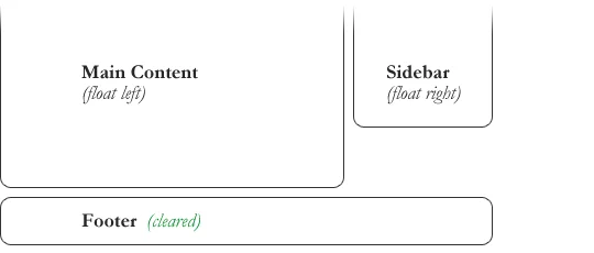
3. Sidebar and Content Layouts
Many older websites used floats to build a layout where the sidebar floats left or right and the main content adjusts accordingly.
Example:
.sidebar {

  float: left;

  width: 25%;

}

.content {

  float: right;

  width: 70%;

}
This layout allows content and sidebars to exist next to each other without overlapping, with proper margins and padding for spacing.
These use cases show the versatility of CSS Float especially when combined with the clear property to manage layout flow. However, it’s important to know when float is the right tool and when modern layout techniques are more appropriate. Ready to learn how to choose the right CSS tools for any project? Join our web development course bootcamp and get hands-on experience with both foundational and modern web design techniques. Become a skilled developer in less than 10 months,
Problems with Using CSS Float
While the float property has been a foundational CSS tool, it comes with several challenges especially when used for full-page layouts rather than its original purpose (text wrapping). Here are the most common issues developers face when working with CSS Float:
1. Collapsing Parent Height
When all child elements inside a container are floated, the container often collapses to zero height. This happens because floated elements are removed from the normal document flow, and the container doesn’t recognize their height unless cleared.
Example:
<div class="container">

  <div class="child" style="float: left;">Floated Box</div>

</div>
In the example above, .container won’t expand to wrap .child, potentially breaking the layout.
Solution: Use the clearfix technique or apply overflow: auto; or overflow: hidden; to the container.
2. Overlapping Elements
Floated elements can sometimes overlap with other elements unintentionally, especially if widths, margins, or padding aren’t handled carefully. This often leads to broken layouts or visual clutter.
Common cause: Not accounting for total width (float + margin + padding) or forgetting to clear the float on the following element.
3. Inconsistent Behavior Across Browsers
Although browser compatibility for float has improved, it can still cause inconsistent layout rendering across different browsers or screen sizes especially if the layout lacks proper clearing or fallback rules.
Example Issues:
- Unexpected white space or content wrapping
- Text not aligning properly next to floated items
- Floated containers collapsing differently in various browsers
Summary Tip:
Floats are best used for small, localized layout adjustments (like image wrapping), not for full-page structures. Always use clear or clearfix methods to manage floats, and consider modern CSS tools like Flexbox or Grid for more robust and maintainable layouts.
Introduction to CSS Clear
When working with floated elements, you often encounter layout issues like content wrapping around elements where it shouldn’t, or containers collapsing in height. That’s where the clear property in CSS comes in. For an academic breakdown, you can check out the University of Washington’s explanation of CSS floats and clear.
What is clear in CSS?
The clear property is used to control the behavior of an element after a floated element. It tells the browser not to allow the element to appear beside a floated element, effectively forcing it to move down below the float.
In simple terms:
If float pushes an element to the side, clear pushes the next element down to avoid it.
Syntax and Available Values
selector {

  clear: left | right | both | none;

}- left – The element will move below any left-floated elements.
- right – The element will move below any right-floated elements.
- both – The element will move below both left and right floated elements.
- none – Default value; the element can be placed next to floated elements.
Example:
<div style="float: left; width: 50%;">Left Column</div>

<div style="clear: both;">This starts below the floated element</div>
In this example, the second div won’t appear beside the floated one; instead, it starts on the next line, below the floated content.
How CSS Clear Solves Float-Related Layout Issues
- Prevents Overlapping: It ensures that elements following floated elements do not overlap or wrap around them unexpectedly.
- Restores Flow: It allows you to restore the normal document flow after floated elements.
- Fixes Collapsing Containers: When used in combination with clearing techniques (like the clearfix hack), it can help fix collapsed parent containers that only contain floated children.
Use Case:
If a floated image causes the next paragraph to wrap around it but you want the paragraph to start below the image, use clear: both on the paragraph.
Clearing Floats: Techniques and Best Practices
When using float, elements are removed from the normal document flow, which can lead to layout issues like collapsed parent containers or overlapping elements. To solve these problems, you need to clear the floats in other words, re-establish the normal flow of content. Below are the most effective techniques and best practices.
1. Using the clear Property on the Next Element
One of the simplest ways to clear floats is to apply the clear property to the element that follows the floated content.
Example:
<div style="float: left; width: 50%;">Floated Left</div>

<p style="clear: both;">This paragraph clears the float and starts below it.</p>
When to use it:
When you want to force the next sibling to start on a new line after a floated element.
Limitation:
This only works if the next element is known and accessible. It doesn’t help when the issue lies with a parent container collapsing.
2. Using a Clearing <div>
You can add an empty div element with clear: both after the floated content to force the layout to reset.
Example:
<div class="float-box" style="float: left; width: 50%;">Floated Box</div>

<div style="clear: both;"></div>
When to use it:
When you need a quick fix and don’t want to modify existing styles.
Limitation:
Adding non-semantic elements purely for layout is not ideal for accessibility or clean HTML structure.
3. The “Clearfix” Hack (Modern Method Using ::after)
The most elegant and reusable method for clearing floats is the clearfix technique, which uses a pseudo-element to clear floats without extra HTML markup.
CSS:
.clearfix::after {

  content: "";

  display: block;

  clear: both;

}
Usage:
<div class="clearfix">

  <div style="float: left;">Left Box</div>

  <div style="float: right;">Right Box</div>

</div>
Why it’s preferred:
- No need to add extra HTML elements
- Keeps layout logic in CSS
- Works reliably for parent containers with floated children
4. When and Why to Clear Floats
When to clear floats:
- When a parent container doesn’t wrap its floated children (collapsing height)
- When subsequent content overlaps or wraps around floated items
- When layout flow needs to be reset cleanly
Why it’s important:
- Prevents visual glitches
- Ensures layout consistency across devices and browsers
- Improves maintainability and structure of your HTML/CSS
Best Practice Summary
- Use clear: both when needed, but avoid cluttering HTML with clearing <div>s.
- Prefer the clearfix method for reusable, scalable layout control.
- Always test float-based layouts on different screen sizes and browsers for stability.
CSS Float and Clear in Responsive Design
As web design continues to move toward mobile-first and responsive layouts, understanding how CSS Float and Clear behave on various screen sizes and how they compare to modern layout methods is essential. While float can still be used in responsive design, it has several limitations that developers must work around.
1. How Float and Clear Behave on Different Screen Sizes
When using float in responsive design, elements may stack awkwardly or overflow their containers if not handled with care. Since float relies heavily on widths and fixed positioning, you must use percentages or media queries to make layouts adapt to smaller screens.
Common issues include:
- Floated columns appearing too narrow or wide on small screens
- Text wrapping unpredictably around floated images
- Collapsed containers on mobile devices
Example:
.column {

  float: left;

  width: 50%;

}

@media (max-width: 768px) {

  .column {

    width: 100%;

    float: none;

  }

}
This media query ensures that columns stack vertically on smaller screens instead of sitting side by side.
2. Limitations of Float in Responsive Design
While float helped shape early web layouts, it wasn’t designed for complex or dynamic grid systems. Using float for responsive design presents several challenges:
- Requires extra clearing logic
- Does not naturally support alignment, distribution, or ordering
- Often depends on fixed widths and additional markup for spacing
- Not ideal for vertical centering or dynamic content reordering
3. Modern Alternatives: Flexbox and Grid
Today, Flexbox and CSS Grid offer far more powerful, flexible, and responsive layout systems:
- Flexbox is great for one-dimensional layouts (e.g., horizontal navigation, centered buttons)
- Grid excels at two-dimensional layouts (e.g., full-page or section-based design)
Advantages over float:
- No need for clear hacks
- Cleaner and more semantic code
- Better support for alignment, spacing, and responsiveness
Example (Flexbox):
.container {

  display: flex;

  flex-wrap: wrap;

}

.column {

  flex: 1 1 50%;

}

@media (max-width: 768px) {

  .column {

    flex: 1 1 100%;

  }

}
This layout adapts naturally without using floats or clearfixes.
4. Combining Float with Media Queries
If you’re maintaining legacy code or have a specific reason to use float, media queries are essential to make the layout responsive.
Tips:
- Use float: none and width: 100% to stack elements on small screens.
- Always pair float-based layouts with clear or clearfix methods to avoid collapsing or overlap.
- Minimize float use in modern responsive projects, stick to small-scale layout tweaks.
While CSS Float and Clear can be adapted for responsive design using media queries and careful planning, their limitations make them less ideal for modern, flexible layouts. Whenever possible, opt for Flexbox or CSS Grid, but keep float in your toolkit for simpler use cases or when working with older codebases.
Real-Life Examples Using CSS Float and Clear
To fully understand how float and clear work in real scenarios, let’s walk through some practical examples that demonstrate their behavior and how to manage layout issues using these properties.
Example 1: Text Wrapping an Image
This is one of the most common and original uses of float, wrapping text neatly around an image.
HTML:
<img src="example.jpg" alt="Floating image" style="float: left; margin: 10px 15px 10px 0; width: 150px;">

<p>

  This paragraph wraps around the floated image. The image is floated to the left, so the text flows to the right of it. This technique is useful for creating magazine-style layouts or blog posts with inline visuals.

</p>
Explanation:
- The image floats to the left.
- Text naturally flows to the right of the image.
- The margin gives spacing between the image and the text.
Example 2: Two-Column Layout Using Float and Clear
This layout creates two equal-width columns using float, with proper clearing to prevent parent collapse.
HTML:
<div class="container">

  <div class="column left">Left Column</div>

  <div class="column right">Right Column</div>

  <div style="clear: both;"></div>

</div>
CSS:
.container {

  width: 100%;

  background: #f0f0f0;

}

.column {

  float: left;

  width: 50%;

  padding: 20px;

  box-sizing: border-box;

}
Explanation:
- Both .column divs float to the left and split the container in half.
- The clear: both; ensures that any content after .container doesn’t wrap or overlap.
Example 3: Clearfix Method in Action
Instead of using a clearing <div>, this modern technique clears floats using a CSS pseudo-element.
HTML:
<div class="clearfix">

  <div class="box">Floated Left</div>

  <div class="box">Floated Right</div>

</div>
CSS:
.clearfix::after {

  content: "";

  display: table;

  clear: both;

}

.box {

  float: left;

  width: 50%;

  padding: 20px;

  background-color: #dfe6e9;

  box-sizing: border-box;

}
Explanation:
- Both .box elements float and fill 50% of the container.
- The .clearfix ensures the parent div wraps its floated children without collapsing.
- This method keeps HTML clean and is reusable in many layouts.
These real-life examples show how to:
- Float images for inline text wrapping
- Build classic column layouts using float and clear
- Fix float issues cleanly using the clearfix technique
Though newer layout systems like Flexbox are more robust, knowing how to use float and clear correctly remains valuable for maintaining older sites or simpler designs.
When Not to Use CSS Float and Clear
While CSS Float and Clear were once go-to tools for web layouts, modern CSS techniques have significantly outpaced them in flexibility, readability, and maintainability. Knowing when not to use float and clear is just as important as knowing how to use them.
1. Use Flexbox or Grid for Layout Instead of Float
If you’re building layouts like navigation bars, sidebars, card grids, or footers, it’s best to use Flexbox or CSS Grid not float.
Why?
- Float was never intended for full layouts; it was meant for text wrapping around images.
- Flexbox and Grid offer better alignment, spacing, and responsiveness.
- You don’t need to worry about clearing floats or container height collapse.
Example:
Instead of this:
.left {

  float: left;

  width: 50%;

}

.right {

  float: right;

  width: 50%;

}
Use this with Flexbox:
.container {

  display: flex;

}

.left, .right {

  flex: 1;

}
2. Consider Performance and Maintainability
Float-based layouts are:
- Harder to read You often need extra elements (<div style=”clear: both;”>) or hacks (clearfix).
- Error-prone Forgetting to clear floats can cause content overlap, broken layouts, or parent height issues.
- Less scalable Adjusting layouts for responsiveness becomes messy compared to using Flexbox/Grid with media queries.
In large or dynamic projects, using float can lead to technical debt, making future changes difficult and time-consuming.
Avoid Float and Clear When:
- You’re designing flexible, responsive layouts
- You need easy horizontal/vertical alignment
- You’re building complex grid or component-based interfaces
- You want to maintain semantic, minimal HTML
Use Float and Clear Only When:
- Wrapping text around an image
- Working in a legacy codebase
- Creating small layout tweaks where modern methods aren’t necessary
Pro Tip:
If you’re reaching for float to solve layout problems, there’s almost always a better solution using Flexbox or Grid.
Inconclusion, CSS Float and Clear have been essential tools in the evolution of web design, allowing developers to create text-wrapped images, multi-column layouts, and basic structural designs long before more powerful layout systems existed. Understanding how float positions elements and how clear manages layout flow is crucial especially when working with legacy projects or simple design patterns.
However, while float and clear still have their place in modern CSS, they come with limitations. For responsive, scalable, and more maintainable layouts, it’s best to rely on Flexbox and CSS Grid. These modern techniques offer greater flexibility and cleaner code, eliminating many of the issues associated with float-based layouts.