In web development, CSS layout techniques are essential for organizing content visually on a webpage. Common methods include Flexbox, CSS Grid, floats, and the CSS Position Property. Each plays a unique role in how elements are arranged, stacked, or moved.
Among these, the CSS Position Property is particularly powerful because it allows precise control over where elements appear within the document or viewport. Whether you’re creating sticky headers, floating buttons, or layered elements, understanding how different position values behave is key to building responsive and interactive layouts.
This article will break down the five main position values in CSS: static, relative, absolute, fixed, and sticky, with explanations, use cases, and examples to help you use them effectively in your own designs.
Want to master skills like this and become a professional software developer in under 10 months? Join our hands-on programming software engineering course in Kenya and position yourself to get a high-paying job.
What is the CSS Position Property?
The CSS Position Property defines how an HTML element is placed in the document flow and how it behaves relative to other elements on the page. It determines where an element appears and how it reacts to layout changes, scrolling, or parent containers.
Why It Matters in Web Layout and Design
Positioning is essential for creating clean, organized, and interactive layouts. Whether you’re building a navigation bar, pop-up modal, tooltip, or sticky header, the position property gives you control to place elements exactly where you want them.
By mastering this property, you can:
- Remove elements from the normal document flow.
- Stack elements on top of each other.
- Lock elements in place while scrolling.
- Create layered, responsive designs.
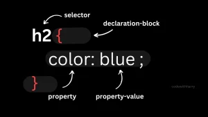
Syntax Overview
selector {

  position: value;

}
Where value can be any of the supported position types, each affecting layout behavior differently.
Common Position Values
| Value | Description |
| static | Default. Element follows normal flow. Top/left/right/bottom have no effect. |
| relative | Positioned relative to its normal position. Offset by top/left/right/bottom. |
| absolute | Positioned relative to the nearest positioned ancestor or the document if none. Removed from flow. |
| fixed | Positioned relative to the viewport. Stays fixed during scroll. |
| sticky | Acts like relative until a scroll threshold is passed, then behaves like fixed. |
Static Positioning (Default)
Definition and Behavior
static is the default position value in CSS. When an element has position: static (or no position specified at all), it follows the normal flow of the HTML document. This means elements appear one after another, stacked vertically as they are written in the code.
Characteristics
- Not affected by top, right, bottom, or left properties.
- Appears exactly where the browser would naturally place it in the layout.
- Does not stack above or below other elements using z-index.
When to Use It
- When you want elements to flow naturally on the page.
- When no special positioning or offset is needed.
- Ideal for simple, static content like paragraphs, headings, or images placed in order.
Code Example
<style>

  .static-box {

    position: static;

    width: 200px;

    height: 100px;

    background-color: lightblue;

    top: 50px; /* This has no effect */

  }

</style>

<div class="static-box">This is a static box</div>
Visual Illustration (Text-Based)
[Header]
[Paragraph]
[Static Box]
[Footer]
The Static Box appears directly after the paragraph, because it’s placed there in the HTML and follows the natural document flow. To understand more about CSS position properties, enroll in our full stack development program that lasts for 10 – 12 months.
Relative Positioning
How It Behaves in Relation to the Element’s Normal Position
When you apply position: relative to an element, it remains in the normal document flow, but you can shift it visually using top, right, bottom, or left. The space the element originally occupied does not change, meaning the surrounding layout is unaffected.
Think of it like nudging an element from where it would normally be.
How top, left, right, and bottom Work with relative
These directional properties offset the element from its original position:
- top: 20px moves the element 20px down.
- left: 30px moves it 30px to the right.
- Negative values move it in the opposite direction.
- The element’s original position is still preserved in the document flow.
Use Cases
- Slightly adjusting the position of elements (e.g., icons, badges).
- Creating tooltips that appear slightly above or beside an element.
- Animating small movements (e.g., hover effects).
- Setting a reference point for absolutely positioned child elements.
Code Snippet with Demo Layout
<style>

  .container {

    margin: 50px;

  }

  .normal-box {

    width: 150px;

    height: 100px;

    background-color: lightgray;

    margin-bottom: 10px;

  }

  .relative-box {

    position: relative;

    top: 20px;

    left: 30px;

    width: 150px;

    height: 100px;

    background-color: skyblue;

  }

</style>

<div class="container">

  <div class="normal-box">Normal Box</div>

  <div class="relative-box">Relative Box</div>

</div>
Visual Result (Text-Based Preview)
[Normal Box]
[Relative Box] ← visually shifted down & right
Even though the Relative Box is moved, its original spot is still “reserved,” so it doesn’t overlap or affect other elements’ flow.
Absolute Positioning
Positioning Relative to the Nearest Positioned Ancestor
When an element is given position: absolute, it is removed from the normal document flow and positioned relative to its nearest positioned ancestor that is, the closest parent with a position of relative, absolute, or fixed.
If no such ancestor exists, it will be positioned relative to the <html> (or viewport) by default.
How It Affects Document Flow
- The absolutely positioned element does not take up space in the layout.
- Other elements ignore it, as if it doesn’t exist.
- It can overlap other content freely, depending on its coordinates.
Common Uses
- Pop-ups or modals
- Tooltips and dropdown menus
- Floating buttons or labels
- Image overlays and decorations
Code Example
<style>

  .parent {

    position: relative;

    width: 300px;

    height: 200px;

    background-color: lightgray;

  }

  .absolute-child {

    position: absolute;

    top: 10px;

    right: 10px;

    width: 100px;

    height: 50px;

    background-color: steelblue;

    color: white;

    text-align: center;

    line-height: 50px;

  }

</style>

<div class="parent">

  Parent Box

  <div class="absolute-child">I'm Absolute</div>

</div>
Visual Example: Absolute vs. Relative
With position: relative (child moves slightly, but still affects layout):
[Parent Box]
└─ [Relative Child (nudged visually)]
With position: absolute (child floats over top, no effect on layout):
[Parent Box]
└─ [Absolute Child (overlayed in top-right corner)]
In this example, the .absolute-child is placed in the top-right corner inside its parent, but is completely independent of the surrounding layout.
Fixed Positioning
Always Fixed Relative to the Viewport
When an element has position: fixed, it is positioned relative to the browser’s viewport, not any ancestor element. This means its position stays constant, no matter how far the user scrolls the page.
Does Not Move When Scrolling
Unlike other position types, a fixed element is locked in place. Even if the page scrolls up or down, the fixed element remains visible at the same spot on the screen.
Common Use Cases
- Sticky headers or navbars that remain at the top
- “Back to top” buttons that stick to a corner
- Persistent chat widgets or help icons
- Floating call-to-action buttons
Browser Behavior and Performance Notes
- Works consistently across modern browsers.
- On mobile devices, excessive use of fixed elements can affect performance or layout stability, especially within scrolling containers.
- z-index may need to be adjusted to keep fixed elements above other content.
Sample Code and Effect
<style>

  body {

    height: 2000px; /* Just to allow scrolling */

  }

  .fixed-box {

    position: fixed;

    top: 20px;

    right: 20px;

    width: 150px;

    height: 50px;

    background-color: tomato;

    color: white;

    text-align: center;

    line-height: 50px;

    font-weight: bold;

    box-shadow: 0 2px 6px rgba(0,0,0,0.3);

  }

</style>

<div class="fixed-box">I'm Fixed</div>
Visual Effect (Text-Based)
[Scroll down the page…]
The red “I’m Fixed” box stays in the top-right corner of the screen.
Even as you scroll down a 2000px-tall page, the element remains fixed in place perfect for elements that need constant visibility.
Sticky Positioning
Hybrid Between Relative and Fixed
position: sticky is a unique CSS value that acts as a hybrid between relative and fixed positioning.
- Initially, the element behaves like a relative; it scrolls with the page.
- Once a defined scroll threshold is met (based on top, left, right, or bottom), it becomes fixed in place, “sticking” to that position within its parent container.
Sticks to a Defined Position When Scrolling Reaches a Threshold
You can define the point where the element “sticks” using a directional offset (e.g., top: 0;). The element will scroll until it reaches that point then it remains stuck until its parent scrolls out of view.
Browser Support and Quirks
- Well-supported in modern browsers (Chrome, Firefox, Edge, Safari).
- May not work properly if:
- The parent element has overflow: hidden or overflow: auto.
- The element lacks a defined top/left/right/bottom value.
- It’s used inside a table cell or grid area in older browsers.
Practical Use Cases
- Sticky navigation headers
- Floating section titles (that stick until the next section)
- Sticky table columns for large data tables
- Scroll-aware call-to-actions or filters
Example with Scrolling Effect
<style>

  body {

    margin: 0;

    font-family: sans-serif;

  }

  .header {

    background: #333;

    color: white;

    padding: 15px;

    font-size: 18px;

  }

  .sticky-bar {

    position: sticky;

    top: 0;

    background: orange;

    padding: 10px;

    font-weight: bold;

    z-index: 10;

  }

  .content {

    height: 1500px;

    padding: 20px;

    background: #f2f2f2;

  }

</style>

<div class="header">Normal Header</div>

<div class="sticky-bar">I'm Sticky – I’ll stick when you scroll!</div>

<div class="content">

  Scroll down to see the sticky effect in action. The sticky bar will stay at the top once it reaches it.

</div>
Visual Effect (Text-Based Simulation)
[Normal Header]
[Sticky Bar] ← Scrolls up with page, then sticks to top
[Content… scrolls underneath]
Once the Sticky Bar reaches the top of the viewport, it remains fixed in place while the rest of the page scrolls.
Here’s a clean and easy-to-read comparison table for the CSS position values, summarizing their behavior and use cases:
Comparison Table: CSS Position Values
| Value | Positioned Relative To | Affects Layout? | Scrolls with Page? | Common Use Case |
| static | Normal document flow | Yes | Yes | Default element positioning |
| relative | Itself | Yes | Yes | Small adjustments, offsets |
| absolute | Nearest positioned ancestor | No | No | Tooltips, modals, overlays |
| fixed | Viewport | No | No | Sticky navbars, floating buttons |
| sticky | Scroll container / threshold | Yes | Sometimes (stops when parent scrolls out) | Sticky headers, section labels |
This table gives you a quick way to choose the right positioning strategy based on layout behavior, scrolling, and practical use cases.
Tips for Using the CSS Position Property Effectively
Mastering CSS positioning goes beyond just applying values, it’s about using them strategically in real-world layouts. Here are some key tips to help you use the CSS position property more effectively:
1. Always Set a Positioned Parent for Absolute Children
When using position: absolute, make sure the parent container has a position value (like relative, absolute, or fixed).
Otherwise, the element will be positioned relative to the entire page (<html>), which can lead to unexpected layout results.
.parent {

  position: relative; /* Crucial for child absolute positioning */

}

.child {

  position: absolute;

  top: 10px;

  right: 10px;

}
2. Watch Out for z-index Stacking Issues
When elements overlap (e.g., absolute or fixed), you may need to manage stacking order using z-index.
Remember, z-index only works on positioned elements (relative, absolute, fixed, or sticky).
.modal {

  position: fixed;

  z-index: 1000;

}
3. Use Developer Tools to Debug Positioning Problems
Most browsers have built-in developer tools (Inspect Element) that let you:
- View box model spacing and positioning
- Highlight parent-child relationships
- See how positioning is affected by scroll or layout changes
Right-click an element → Inspect → Look at the “Computed” tab or layout panel.
4. Combine with Flexbox or Grid for Advanced Layouts
The position property works well alongside layout systems like Flexbox or Grid:
- Use relative containers inside a Flexbox layout to allow absolutely positioned badges or icons.
- Use sticky inside CSS Grid columns to create fixed headers or sidebars.
This combo helps create responsive, layered, and modern UI layouts.
5. Keep Mobile Responsiveness in Mind
Fixed and absolute elements can cause issues on small screens if not handled properly:
- Avoid position: fixed for large elements on mobile (it may overlap content).
- Use media queries to adjust or disable sticky/fixed behavior.
- Always test on different screen sizes and scroll behaviors.
@media (max-width: 600px) {

  .fixed-header {

    position: static;

  }

}
By following these tips, you can avoid common pitfalls and create layouts that are both flexible and reliable across devices and browsers. Want to align text inside your positioned boxes or overlays? Learn how to master text-align in CSS for perfect content alignment.
Common Mistakes and How to Avoid Them
Even experienced developers can run into issues with CSS positioning. Below are some frequent mistakes and how to fix them, so you can avoid unexpected layout behavior and improve your workflow.
1. Using absolute Without a Positioned Parent
The mistake:
Placing an element with position: absolute inside a container that doesn’t have a position set (like relative or absolute).
The result:
The element is positioned relative to the <html> or the viewport, not the parent, often placing it in a weird spot.
How to fix it:
.parent {

  position: relative; /* Needed for the child to be placed inside it */

}

.child {

  position: absolute;

  top: 10px;

  left: 10px;

}
2. Unexpected Overlaps with fixed Elements
The mistake:
Using position: fixed without accounting for how it interacts with other elements on the page.
The result:
The fixed element overlaps content or hides important elements, especially on small screens.
How to fix it:
- Use z-index to manage stacking.
- Add padding or margin to body/content to make space.
- Use media queries to adjust visibility or size.
3. Misunderstanding How sticky Behaves
The mistake:
Expecting position: sticky to always stick, but it doesn’t work due to missing conditions.
The result:
The element behaves like relative only, never sticking at all.
How to fix it:
- Make sure a directional value is set (e.g., top: 0;).
- The parent container must not have overflow: hidden or overflow: auto.
- The sticky element must have enough space in its container to scroll into view.
4. Forgetting z-index in Layered Layouts
The mistake:
Using absolute, fixed, or sticky positioning without setting z-index.
The result:
Elements appear behind other content unintentionally or don’t layer properly.
How to fix it:
Always use z-index when layering elements, especially modals, tooltips, and navbars.
.modal {

  position: fixed;

  z-index: 9999; /* Ensure it appears above everything else */

}
By avoiding these common traps, you’ll have a smoother experience with CSS positioning and create more stable, predictable layouts.
Understanding the CSS Position Property is essential for building responsive, interactive, and well-structured web layouts. Each position value, static, relative, absolute, fixed, and sticky, has its own behavior, use cases, and quirks. Mastering how and when to use them will help you:
- Control element layout and stacking
- Create sticky headers, overlays, and floating elements
- Design interfaces that adapt across devices and screen sizes
By combining positioning with tools like Flexbox, CSS Grid, and media queries, you’ll unlock powerful layout capabilities. Avoiding common mistakes, like forgetting to set a positioned parent or misusing z-index, ensures smoother development and fewer layout bugs.
Ready to take your skills to the next level? Enroll in our software engineering bootcamp and become a job-ready developer in under 10 months. Use this knowledge as a foundation, experiment with positioning in real projects, and take full control of your web designs.