In web design, text alignment refers to how text is positioned horizontally within an element, left, right, center, or justified. Proper alignment plays a crucial role in enhancing readability, guiding the user’s eye, and creating a visually appealing layout.
Choosing the right text alignment can make a design feel more professional and balanced, while poor alignment can confuse users or make content hard to follow. That’s why understanding how to control text alignment with CSS is an essential skill for any web development student.
In this article, we’ll dive into CSS text align a powerful CSS property that lets you control how text appears within HTML elements. Whether you’re building a blog, a landing page, or an app interface, mastering text-align will help you create clean, readable designs that look great across devices.
To begin your journey as a software developer, enrol in one of our software engineering courses in Kenya. We offer hands-on practical skills that make you a software developer in less than 10 months.
What Is CSS Text Align?
CSS text align is a property in CSS used to control the horizontal alignment of text within a block-level element. It helps you position text to the left, right, center, or justify it so that it spreads evenly across the line. You can also learn more about CSS text shadow and how it can be used to create a more immersive web experience.
The text-align property in CSS works on block-level containers like <div>, <p>, <h1>–<h6>, and more. It affects the alignment of the inline content inside those containers.
Syntax Overview
selector {

  text-align: value;

}- selector: The HTML element you want to style (e.g., p, h1, .class-name, #id-name)
- value: The alignment type you want to apply (like left, right, center, or justify)
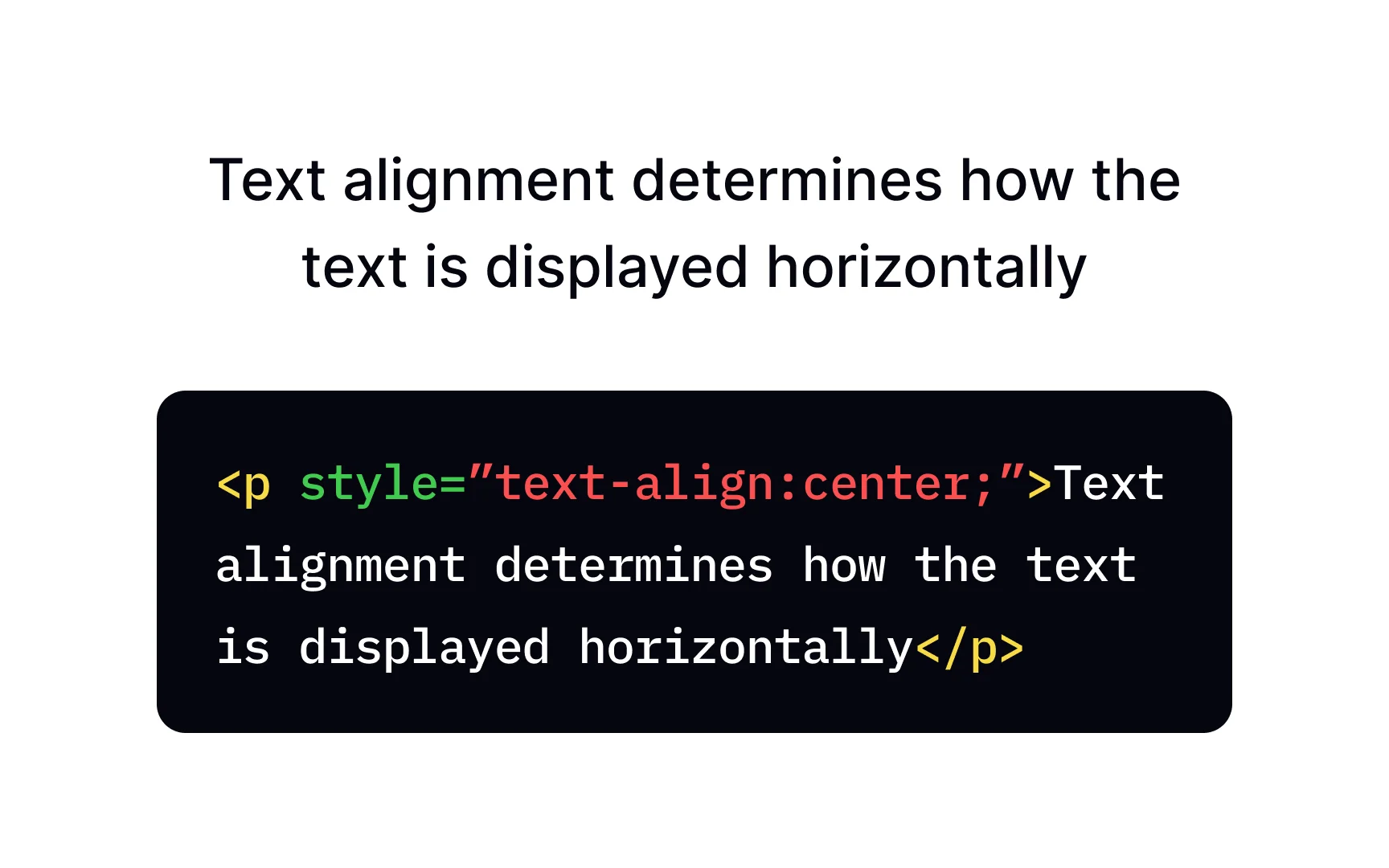
For example:
p {

  text-align: center;

}
This will center-align all text inside <p> tags.
Common Values of CSS Text Align
The text-align property accepts several values that determine how the text should be aligned within an element. Here are the most commonly used ones:
1. left
- This is the default alignment for most elements, especially in left-to-right (LTR) languages like English.
- Text aligns flush to the left edge of the container.
p {

  text-align: left;

}
2. right
- Aligns text to the right edge of the container.
- Commonly used for right-to-left (RTL) languages such as Arabic or Hebrew.
p {

  text-align: right;

}
3. center
- Centers the text horizontally within its container.
- Often used for headings, buttons, or special content areas.
h2 {

  text-align: center;

}
4. justify
- Aligns text to both the left and right edges, adjusting spacing between words to fill the entire line.
- Creates a clean block of text, similar to newspapers or books.
p {

  text-align: justify;

}
5. start and end
- These are logical values that respect the text direction.
- start aligns text to the starting edge of the writing direction (left for LTR, right for RTL).
- end aligns to the ending edge.
div {

  text-align: start;

}
Using start and end is helpful when working with multilingual or dynamic content, ensuring proper alignment without needing to manually change values.
How CSS Text Align Works
The text-align property is applied to block-level elements and controls the horizontal alignment of inline content (like text or inline elements) inside that block. Understanding how browsers interpret this behavior is key to using it effectively.
How Browsers Interpret text-align
When you set text-align on a block-level container (like <div> or <p>), the browser aligns the inline content inside that container. It does not align the container itself, just the content within it.
So, for example:
<div style="text-align: center;">

  <p>This text is centered inside the div.</p>

</div>
In this case, the <p> tag remains block-level and spans the full width of the <div>, but the text inside it is centered.
Block-Level vs Inline Elements
- Block-level elements (e.g., <div>, <p>, <h1>) span the full width of their parent container.
- You apply text-align to align the inline content inside them.
- Inline elements (e.g., <span>, <a>, <strong>) do not accept text-align directly.
- Instead, apply text-align to their block-level parent to affect them.
Practical Examples
Example 1: Left Alignment (Default)
<p style="text-align: left;">This text is aligned to the left.</p>2: Centered Heading
<h2 style="text-align: center;">Welcome to My Website</h2>3: Justified Paragraph
<div style="width: 300px; text-align: justify;">

  <p>Lorem ipsum dolor sit amet, consectetur adipiscing elit. Sed do eiusmod tempor incididunt ut labore et dolore magna aliqua.</p>

</div>
4: Aligning Inline Elements Inside a Div
<div style="text-align: right;">

  <span>This inline text is aligned to the right.</span>

</div>
These examples show how the text-align property affects content within its parent and how different values change the appearance.
CSS Text Align Examples
Now that you understand how text-align works, let’s look at some real-world examples of how to use it effectively in web design.
1. Aligning Paragraph Text
Paragraphs often use left alignment by default, but you can easily change this depending on your design needs.
<p style="text-align: justify;">

  This paragraph uses justified alignment, which evenly spaces the text across the width of the container for a clean, block-like look.

</p>
2. Centering Headings and Div Content
Centering text is commonly used for headings or feature sections.
<h1 style="text-align: center;">Welcome to Our Website</h1>

<div style="text-align: center;">

  <p>Centered paragraph inside a div.</p>

</div>
3. Using text-align with Images and Inline-Block Elements
While text-align doesn’t move block-level elements, it can center inline or inline-block elements—like images—inside a block-level container.
<div style="text-align: center;">

  <img src="logo.png" alt="Logo" style="display: inline-block;">

  <p>This image and text are centered within the div.</p>

</div>
Note: You need to set the image to display: inline or inline-block to make text-align work for it.
4. Responsive Text Alignment Tips
You can adjust text alignment based on screen size using media queries:
.responsive-text {

  text-align: center;

}

@media (min-width: 768px) {

  .responsive-text {

    text-align: left;

  }

}
<p class="responsive-text">This text is centered on small screens, and left-aligned on larger ones.</p>This is especially useful for mobile-friendly layouts, ensuring content is easily readable on all devices.
Advanced Use Cases of CSS Text Align
As you dive deeper into layout design, you’ll find that combining text-align with other CSS techniques like Flexbox, Grid, and media queries gives you powerful control over content presentation. It’s also crucial when working with multilingual websites.
1. Combining text-align with Flexbox or Grid
While Flexbox and Grid provide their own alignment properties (like justify-content and align-items), text-align is still useful especially for aligning text inside individual items.
Example: Centering text inside a Flexbox item
<div style="display: flex; justify-content: center;">

  <div style="text-align: center;">

    <p>This text is centered within the flex item.</p>

  </div>

</div>
Example: Grid with centered content
.grid-container {

  display: grid;

  place-items: center;

  text-align: center;

}
<div class="grid-container">
<p>This text is centered using CSS Grid and text-align.</p>
</div>2. Aligning Multilingual Content (RTL vs LTR)
If your website supports multiple languages, using text-align with logical values like start and end helps maintain proper alignment based on the language direction.
Example: Using logical values
p {

  text-align: start; /* Aligns left for LTR, right for RTL */

}
Setting direction with HTML
<p dir="rtl">مرحبا بكم في موقعنا</p> <!-- Arabic: right-aligned by default -->Using text-align: start; is especially helpful in dynamic or CMS-based websites where text direction can change.
3. Using Media Queries to Change Alignment for Different Screens
Responsive design often calls for different alignments on different devices. Use media queries to change text-align depending on screen size.
Example: Responsive header alignment
.hero-text {

  text-align: center;

}

@media (min-width: 768px) {

  .hero-text {

    text-align: left;

  }

}
<h1 class="hero-text">Welcome to My Responsive Site</h1>This makes the text centered on small screens (for better mobile UX) and left-aligned on larger screens, matching a more traditional layout.
These advanced techniques help you use text-align not just for basic styling, but as part of a thoughtful, adaptable layout strategy. Want to master layout techniques and build professional, responsive websites from scratch? Join our software development courses in kenya and get hands-on experience that prepares you for real-world development.
Common Mistakes and How to Avoid Them
While the text-align property is simple to use, it’s easy to run into issues if you’re not aware of how it behaves in different contexts. Here are some of the most common mistakes and how to fix them:
1. Misapplying text-align to Inline Elements
Mistake:
Applying text-align directly to inline elements like <span> or <a> and expecting it to work.
span {

  text-align: center; /* Won't work as expected */

}
Why it’s a problem:
text-align doesn’t affect how an inline element aligns itself. It affects the alignment of inline content inside a block-level parent.
Fix:
Apply text-align to the parent block-level element.
<div style="text-align: center;">

  <span>This span will now be centered inside the div.</span>

</div>
2. Forgetting the Parent Context
Mistake:
Using text-align on an element and wondering why nothing changes, because the element doesn’t have any inline content to align.
.container {

  text-align: center;

}
Why it’s a problem:
If the content inside .container is block-level (e.g., <div>, <section>), text-align won’t affect them.
Fix:
Ensure you’re applying text-align only when there’s inline or inline-block content to align, or adjust the layout using Flexbox/Grid if you need to move block-level items.
3. Relying Solely on text-align for Layout
Mistake:
Trying to build complex layouts using only text-align.
Why it’s a problem:
text-align is great for aligning text and inline content, but it’s not a layout tool. For full element positioning, use Flexbox, Grid, or positioning properties.
Fix:
Use text-align for simple text alignment, and combine it with more powerful layout systems like:
display: flex;
justify-content: center;
align-items: center;
For example:
<div style="display: flex; justify-content: center; align-items: center; height: 100vh;">

  <div style="text-align: center;">

    <h1>Centered Layout</h1>

    <p>With text-align inside a flex container</p>

  </div>

</div>
Avoiding these mistakes helps ensure your alignment works as intended and keeps your layout clean and responsive.
CSS Text Align Techniques
While text-align is great for aligning inline content, CSS has more powerful layout tools for aligning and positioning block-level elements.
Example: Flexbox
.flex-container {

  display: flex;

  justify-content: center; /* centers block elements */

}
<div class="flex-container">
<div>Item 1</div>
</div>Use Flexbox when you’re aligning block-level items like cards, images, or buttons horizontally or vertically.
When to Use text-align vs CSS Grid Alignment
CSS Grid offers precise control over two-dimensional layouts. It also includes alignment properties like justify-items and align-items.
Example: Centering with Grid
.grid-container {

  display: grid;

  place-items: center;

  text-align: center;

}
<div class="grid-container">
<p>This text and container are both centered.</p>
</div>Use Grid when working with multi-row/multi-column layouts and you want full control over placement.
Best Practice Tip: Combine Techniques
In real-world layouts, you’ll often combine text-align with Flexbox or Grid to align both content and containers. Use the right tool for the right job:
- Text alignment? text-align
- Element alignment? Flexbox/Grid
The text-align property in CSS is a simple yet powerful tool for controlling the alignment of text and inline content within block-level elements. Whether you’re creating clean, readable paragraphs or centering headlines in a hero section, mastering text-align is essential for effective web design.
While it’s ideal for managing inline content alignment, it’s important to understand its limitations and how it fits into the broader CSS layout ecosystem. Combining text-align with Flexbox and Grid lets you build responsive, flexible, and visually appealing layouts.
By understanding how text-align behaves, using it in the right context, and avoiding common mistakes, you’ll be well-equipped to create web pages that are not only beautiful but also user-friendly and accessible.