In the world of modern web design, creating visually engaging and interactive user experiences is more important than ever. CSS Transitions and Animations are powerful tools that allow developers to add motion and smooth effects to elements on a webpage without relying on JavaScript or heavy frameworks.
CSS Transitions and Animations play a vital role in modern web design by enhancing the user experience in subtle yet impactful ways. They help guide users’ attention and make interactions feel more intuitive, which improves overall usability. Smooth transitions and well-timed animations also contribute to a more visually appealing interface, giving websites a polished, modern look. Additionally, dynamic motion helps boost user engagement, making the experience more memorable and interactive. Best of all, when used efficiently, CSS-based motion is typically more lightweight and performance-friendly than JavaScript-heavy alternatives, ensuring faster load times and better responsiveness across devices.
This guide will walk you through everything you need to know to get started with CSS Transitions and Animations. You’ll learn the difference between transitions and animations, explore the key properties and syntax used to create them, and see real-world examples and practical use cases. We’ll also cover advanced techniques to elevate your motion design, along with performance tips to ensure smooth interactions. Lastly, you’ll find best practices to avoid common mistakes and ensure your animations are both effective and accessible.
Are you planning to become a software developer? If so, our software engineering courses in Kenya are designed just for you. We offer hands-on, practical training to help you gain in-demand skills and land a high-paying job in just 10–12 months. Enroll today and take the first step toward your tech career.
Understanding CSS Transitions
What Are CSS Transitions?
CSS Transitions allow changes in CSS property values to occur smoothly over a duration, rather than instantly. This creates a gradual visual effect when an element’s state changes such as when a user hovers over a button or focuses on a form field.
Definition and Basic Concept
In simple terms, a CSS transition makes an element animate from one style to another when a state change occurs. You define which property to animate and how long the transition should take.
For example, changing a button’s background color from blue to green when a user hovers can be made smooth with a transition.
When to Use Transitions
Use CSS transitions when:
- You want to smooth out interactions (hover, focus, active, etc.)
- You’re enhancing visual feedback for user actions
- You need simple animations that depend on state changes (e.g., button hover, dropdown open)
Note: CSS transitions only work when the property change is triggered by a state change like: hover, : focus, or via JavaScript.
CSS Transition Properties Explained
To create a transition, you use a combination of the following properties:
-
transition-property
Specifies the CSS property you want to animate (e.g., background-color, width, transform).
transition-property: background-color;
-
transition-duration
Defines how long the transition should take to complete (in seconds or milliseconds).
transition-duration: 0.5s; /* or 500ms */
-
transition-timing-function
Controls the pace of the transition using functions like ease, linear, ease-in, ease-out, and cubic-bezier.
transition-timing-function: ease-in-out;
-
transition-delay
Delays the start of the transition by a specified time.
transition-delay: 0.2s;
You can also use the shorthand property:
transition: background-color 0.5s ease-in-out 0.2s;
Syntax and Basic Example
Here’s a basic example of a smooth hover effect on a button using CSS transitions:
<style>

.button {

  background-color: #3498db;

  color: white;

  padding: 12px 24px;

  border: none;

  cursor: pointer;

  transition: background-color 0.3s ease-in-out;

}

.button:hover {

  background-color: #2ecc71;

}

</style>

<button class="button">Hover Me</button>Explanation:
- The button will smoothly transition from blue to green when hovered.
- The transition lasts 0.3 seconds and uses an ease-in-out pacing function.
Real-World Use Cases for CSS Transitions
Here are some common and practical scenarios where CSS transitions are used:
Button Hover Effects
- Smooth background color, border, or shadow changes on hover.
Link Color Changes
- Gradual color transitions occur when a user hovers over a navigation link.
Image Zoom on Hover
- Enlarging an image or adding a scale transform when hovered.
.image {

  transition: transform 0.4s ease;

}

.image:hover {

  transform: scale(1.1);

}
These subtle enhancements make interfaces more interactive, engaging, and professional without overwhelming the user.
Introduction to CSS Animations
What Are CSS Animations?
CSS Animations allow developers to create complex, multi-step motion effects by defining how an element’s styles change over time using keyframes. Unlike transitions, which rely on a change in state (like: hover), animations can run automatically when the page loads or be triggered programmatically. To dive deeper, check out the University of Geneva’s academic-style tutorial on CSS animations, which includes real examples and keyframe explanations.
Difference Between Transitions and Animations
| Feature | CSS Transitions | CSS Animations |
| Trigger | Requires a state change (e.g., : hover) | Can start automatically or with a trigger |
| Control | Limited to start and end states | Can define multiple steps using keyframes |
| Complexity | Simpler, one-step effects | Supports complex sequences |
| Repetition | No loop support | Can loop infinitely or a set number of times |
Keyframes Concept
At the heart of CSS animations is the @keyframes rule. It lets you define style changes at different points (percentages) during the animation cycle.
Example:
@keyframes bounce {

  0%   { transform: translateY(0); }

  50%  { transform: translateY(-20px); }

  100% { transform: translateY(0); }

}
This keyframe describes an element that moves up and then comes back down like a bouncing effect.
Key CSS Animation Properties
Here are the core properties used to control CSS animations:
-
@keyframes
Defines the intermediate steps or frames of an animation sequence.
-
animation-name
Specifies the name of the keyframe animation you want to use.
animation-name: bounce;
-
animation-duration
Sets how long the animation lasts (e.g., 2s for two seconds).
animation-duration: 2s;
-
animation-timing-function
Determines the speed curve of the animation (ease, linear, ease-in, ease-out, etc.).
animation-timing-function: ease-in-out;
-
animation-delay
Delays the start of the animation.
animation-delay: 0.5s;
-
animation-iteration-count
Controls how many times the animation runs (use infinite for looping).
animation-iteration-count: 3;
-
animation-direction
Specifies whether the animation should play in reverse on alternate cycles (normal, reverse, alternate, alternate-reverse).
animation-direction: alternate;
-
animation-fill-mode
Defines how styles are applied before and after the animation ends (none, forwards, backwards, both).
animation-fill-mode: forwards;
-
animation-play-state
Controls whether the animation is running or paused.
animation-play-state: paused;
You can also use the shorthand property:
animation: bounce 2s ease-in-out infinite;
Syntax and Basic Example
Here’s a simple example of a bounce animation using @keyframes:
<style>

@keyframes bounce {

  0%   { transform: translateY(0); }

  50%  { transform: translateY(-20px); }

  100% { transform: translateY(0); }

}

.bouncing-box {

  width: 100px;

  height: 100px;

  background-color: #e67e22;

  animation: bounce 1s ease-in-out infinite;

}

</style>

<div class="bouncing-box"></div>Explanation:
- The orange box moves up and down every second, infinitely.
- The @keyframes rule defines the movement steps.
- The animation shorthand ties it all together.
Common Use Cases for CSS Animations
Here are popular ways CSS animations are used in real-world designs:
Loading Spinners
Animating borders, opacity, or rotation to create visual indicators for loading content.
@keyframes spin {

  to { transform: rotate(360deg); }

}

.loader {

  border: 4px solid #ccc;

  border-top: 4px solid #3498db;

  border-radius: 50%;

  width: 40px;

  height: 40px;

  animation: spin 1s linear infinite;

}
Bouncing Buttons
Animating scale or transform to make buttons bounce subtly on page load or hover.
Slide-in/out Effects
Animating elements from off-screen into view using transform: translateX() or translateY().
@keyframes slideIn {
from { transform: translateX(-100%); }
to { transform: translateX(0); }
}
.slide-in {
animation: slideIn 0.5s ease-out;
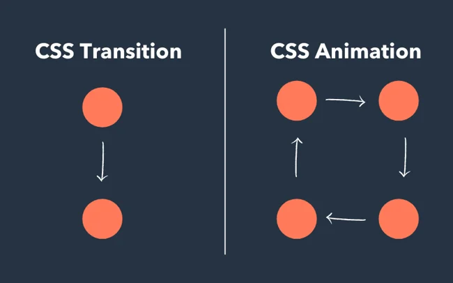
}CSS Transitions vs CSS Animations
Although CSS Transitions and CSS Animations both allow you to add motion to elements, they serve different purposes and excel in different situations. Understanding when and how to use each is crucial for creating efficient and intuitive UI experiences. Want to master UI animations and build stunning, interactive websites from scratch? Join our hands-on software development course boot camp and become a full-stack developer in under 12 months.
Comparison Table
| Feature | CSS Transitions | CSS Animations |
| Trigger | Requires a state change (:hover, :focus) | Can start automatically or be triggered by JS |
| Complexity | One-step, simple changes | Multi-step keyframe animations |
| Control Over Steps | Limited: only start and end states | Full control with multiple keyframes |
| Repetition | No loop support | Can loop (infinite or set number of times) |
| Timing Flexibility | One timing per property | Custom timing per keyframe |
| Best Use Case | UI feedback and micro-interactions | Complex motion graphics and attention grabbers |
| Shorthand Available | transition | animation |
When to Use Each
Use CSS Transitions When:
- You want simple hover/focus effects, like color, opacity, or scale changes
- Animations are tied to user interaction
- You only need a single state change (from A to B)
- You want to keep CSS minimal and fast-loading
Example: Button background color changes on hover, or icon grows slightly when focused.
Use CSS Animations When:
- You need multi-step animations
- You want motion that loops or plays automatically
- You’re creating loading spinners, slide-ins, fade-ins, or keyframe-based effects
- You need more control over how an animation behaves over time
Example: A card that slides into view from the left or a spinner that rotates infinitely.
Performance Considerations
CSS transitions and animations are generally more efficient than JavaScript-based animations, but performance still matters, especially on low-end devices.
Best Practices for Performance:
Use transform and opacity. These are GPU-accelerated and reduce layout thrashing.
transition: transform 0.3s ease;
- Avoid animating layout-affecting properties like width, height, top, or left unless necessary. These trigger layout recalculations.
Use will-change for heavy animations, but don’t overuse it.
.animated-element {

  will-change: transform, opacity;

}- Test on multiple devices and browsers, especially when using keyframe-heavy or infinite animations.
Accessibility Tip:
Respect user preferences with prefers-reduced-motion to reduce or disable animations for users who are sensitive to motion.
@media (prefers-reduced-motion: reduce) {

  * {

    animation: none !important;

    transition: none !important;

  }

}Summary:
Use CSS Transitions for quick, state-based interactions and CSS Animations for more complex, choreographed sequences. Both can significantly enhance user experience when used appropriately and with performance in mind.
Advanced Techniques
Once you’re comfortable with basic CSS transitions and animations, you can unlock even more creative possibilities by combining and enhancing them using advanced techniques. These include chaining effects, integrating with JavaScript, and leveraging CSS variables for flexibility.
Chaining Transitions and Animations
This refers to the process of running multiple transitions or animations in sequence or combining them to create layered effects.
Chaining Transitions
You can transition multiple properties at once by listing them or using delays to stagger them.
.box {

  transition: opacity 0.3s ease, transform 0.5s ease 0.3s;

}

.box:hover {

  opacity: 1;

  transform: scale(1.1);

}
In this example:
- Opacity starts immediately
- transform starts after 0.3s, creating a chained effect
Chaining Animations with Keyframes
You can create multi-part animations by using percentages in @keyframes to define steps.
@keyframes slideAndFade {

  0%   { transform: translateX(-100px); opacity: 0; }

  50%  { transform: translateX(0); opacity: 1; }

  100% { transform: translateX(0); opacity: 0; }

}
Combining with JavaScript
JavaScript lets you trigger, pause, restart, or dynamically modify CSS transitions and animations.
Add or Remove Classes
The most common method is toggling CSS classes to start an animation or transition.
<button onclick="animateBox()">Animate</button>

<div class="box" id="box"></div>

<script>

  function animateBox() {

    document.getElementById('box').classList.toggle('active');

  }

</script>
.box { transition: transform 0.5s ease; } .box.active { transform: translateX(100px); }Listen for Animation Events
You can use events like animationend or transitionend to trigger other logic in JavaScript.
box.addEventListener("animationend", () => {

  console.log("Animation finished!");

});
Dynamically Set Styles
Use JavaScript to update inline styles and control timing or behavior:
box.style.transition = "opacity 1s ease-in-out";

box.style.opacity = 1;
Using CSS Variables for Dynamic Animations
CSS custom properties (variables) allow you to create reusable and easily adjustable animations.
Example with CSS Variable:
:root {

  --animation-speed: 2s;

}

.loader {

  animation: spin var(--animation-speed) linear infinite;

}
Now you can change the speed dynamically using JavaScript:
document.documentElement.style.setProperty(‘–animation-speed’, ‘1s’);
Benefits of CSS Variables:
- Easily adjust animation values site-wide
- Enable theme-based animations (e.g., light/dark mode)
- Dynamic control with minimal code
Pro Tip:
You can combine all three techniques for highly flexible, dynamic animations. For example, start an animation on scroll (JavaScript), delay it (CSS variable), and change its behavior (chaining or multiple keyframes).
Responsive Design and Accessibility
As animation becomes more common in web design, it’s important to ensure that your motion effects are responsive across devices and accessible to all users, including those with motion sensitivity. Well-crafted animations should enhance the user experience not disrupt it.
Making Animations Responsive
Animations should adapt gracefully to different screen sizes and devices. Here are some key strategies:
Use Relative Units
Use responsive units like em, rem, %, or vw/vh instead of fixed pixels for properties like transform, width, or margin.
@keyframes slideIn {

  from { transform: translateX(-100%); }

  to { transform: translateX(0); }

}
Control Animation Based on Breakpoints
Use media queries to change or disable animations on smaller screens if needed.
@media (max-width: 600px) {

  .animated-element {

    animation: none;

  }

}
Avoid Overloading Mobile Devices
Mobile devices often have less processing power, so:
- Keep animations subtle
- Avoid chaining multiple animations at once
- Prefer GPU-accelerated properties (transform, opacity) for better performance
Test Across Devices
Always test your animations on real devices or responsive emulators to check for:
- Performance lags
- Text readability
- Interference with gestures or input
Reducing Motion for Accessibility
Some users experience motion sickness, dizziness, or distraction from animations. Respecting their system settings is both responsible and user-friendly.
Use prefers-reduced-motion Media Query
This media feature detects if a user has requested reduced motion in their OS settings.
@media (prefers-reduced-motion: reduce) {

  * {

    animation: none !important;

    transition: none !important;

  }

}
Provide Alternative Experiences
Instead of deleting animations, you can offer simplified versions:
@media (prefers-reduced-motion: reduce) {

  .fade-in {

    opacity: 1;

    transform: none;

  }

}
Always Keep It Optional
Avoid relying on animation alone to communicate meaning (e.g., don’t use only a shake animation to indicate a form error; also show a message or icon).To summarize, creating responsive and accessible animations ensures your designs are inclusive, effective, and enjoyable for everyone. By using media queries and respecting user preferences, you make your site not only more professional but more human-friendly too.
Tools and Resources
To level up your use of CSS Transitions and Animations, it’s helpful to take advantage of existing tools, libraries, and debugging resources. These tools can save you time, improve your workflow, and help you learn best practices by example.
CSS Animation Libraries
Animation libraries provide pre-built animations that you can apply with just a few class names, great for quickly adding polished effects without writing keyframes from scratch.
Animate.css
- One of the most popular CSS animation libraries.
- Offers over 70 animations, including bounce, fade, slide, and rotate.
- Easy to use, just include the CSS file and apply class names.
<div class="animate__animated animate__fadeInUp">Hello World</div>Hover.css
- A collection of hover effects for buttons, links, logos, and more.
- Lightweight and easy to implement.
<a href="#" class="hvr-grow">Hover over me</a>Other Notable Mentions:
- Magic.css – Emphasis and entrance animations.
- CSShake – A collection of CSS-based shaking animations.
- Motion One – A powerful animation library that combines CSS and JavaScript (a lightweight alternative to GSAP).
Online Playgrounds
These platforms let you experiment, test, and share CSS animations in real time without needing to write full HTML files locally.
CodePen
- Popular for front-end developers to share and remix code.
- Huge library of user-submitted CSS animation demos.
CSS Tricks – Animation Playground
- Offers tips, tutorials, and interactive code snippets.
- Great resource for learning how animations work in real-world scenarios.
JSFiddle
- Similar to CodePen, lets you combine HTML, CSS, and JS in a single editor.
- Ideal for testing transitions/animations alongside interactivity.
Browser Developer Tools
All modern browsers include powerful developer tools to help you inspect, debug, and fine-tune animations and transitions.
Chrome DevTools
- Inspect animations on any element
- Visual timeline to scrub through animations
- Ability to pause, replay, and slow down animations
Open DevTools > Elements tab > Styles panel > “Animations” section (when active)
Firefox Developer Tools
- Offers an animation inspector with detailed keyframe views
- Lets you view and edit @keyframes in real time
Safari and Edge DevTools
- Also include animation playback and timing tools
- Helpful for cross-browser testing
These tools and libraries can supercharge your animation workflow whether you’re prototyping ideas, learning new effects, or debugging complex motion. Experiment often, and use these resources to create smoother, more interactive user experiences.
Common Mistakes and How to Avoid Them
While CSS Transitions and Animations can enhance user interfaces, they can also lead to performance issues or user frustration when misused. Here are some common pitfalls and how to avoid them.
Overuse of Animations
Problem:
Too many animations on a page can distract users, slow down performance, and even cause motion sickness for sensitive users.
Solution:
- Use animations purposefully only when they enhance understanding or engagement.
- Avoid animating too many elements simultaneously, especially on mobile.
- Implement prefers-reduced motion to respect accessibility preferences.
- Keep animations short and subtle (0.3–0.6s is usually ideal).
Not Setting Fallback Properties
Problem:
If you only define the final state of a transition or animation, the browser might not know how to transition from the current state.
Solution:
- Always set the initial state of the element before applying a transition or animation.
.box {

  opacity: 0;

  transition: opacity 0.5s ease;

}

.box.visible {

  opacity: 1;

}
Without the initial opacity: 0, the transition wouldn’t work as expected.
Forgetting Vendor Prefixes (If Needed)
Problem:
Some older browsers (especially legacy mobile browsers) may not support unprefixed animation properties, leading to broken effects.
Solution:
- While most modern browsers now support standard syntax, it’s still a good habit to include prefixes for maximum compatibility, especially for @keyframes.
@-webkit-keyframes slideIn { ... }

@keyframes slideIn { ... }

.animated {

  -webkit-animation: slideIn 1s ease;

  animation: slideIn 1s ease;

}
Tip: Use tools like Autoprefixer or CSS build tools (PostCSS, Sass) to handle prefixes automatically.
Bonus Tip -Don’t Animate Layout-Heavy Properties
Avoid animating width, height, top, left, or margin, as these can trigger layout recalculations and degrade performance. Prefer transform and opacity; instead, they are GPU-accelerated and smoother.
Avoiding these common mistakes ensures your CSS Transitions and Animations remain smooth, performant, and accessible. Focus on clean, intentional motion that improves, not overwhelms, the user experience.
Tips and Best Practices
To get the most out of CSS Transitions and Animations, it’s important to follow best practices that enhance user experience, boost performance, and maintain clean, scalable code. Here are key guidelines every developer should follow:
Keep It Subtle and Purposeful
Why it matters:
Subtle animations feel natural and professional, while over-the-top effects can distract users or feel gimmicky.
Best Practice:
- Use motion to guide attention, not to entertain.
- Prefer micro-interactions (e.g., button hover, dropdown fade) over large, flashy effects.
- Align animation with your brand’s tone, minimalist, playful, elegant, etc.
Use Hardware-Accelerated Properties
Why it matters:
Some CSS properties are optimized for GPU acceleration, meaning they animate more smoothly without causing performance bottlenecks.
Best Practice:
- Prioritize transform and opacity in your transitions and animations.
- Avoid animating layout-affecting properties like top, left, width, height, or margin, these trigger reflows and repaints in the browser.
/* Good */

transition: transform 0.3s ease;

/* Not recommended */

transition: left 0.3s ease;
Optimize Performance and Minimize Repaint/Reflow
Why it matters:
Heavy animations can slow down your site, especially on lower-end devices or when multiple animations run at once.
Best Practice:
- Keep animation durations short (typically 0.3s to 0.6s).
- Use will-change to hint the browser that an element will be animated.
.animated-box {

  will-change: transform;

}
Use will-change sparingly, it consumes memory and may reduce performance if overused.
- Test performance using DevTools (especially the “Performance” tab in Chrome).
Bonus Tips:
- Use CSS variables to create themeable and flexible animation speeds.
- Always pair motion with a static fallback or alternative for users who disable animations.
- Document your animation rules in design systems or style guides so your motion stays consistent across the UI.
Thoughtful use of CSS Transitions and Animations can significantly elevate a website’s UX but only when performance, clarity, and user needs come first. Aim for subtle, intentional motion that feels natural and fast across all devices.
Tips and Best Practices
To make the most of CSS Transitions and Animations, follow these essential tips to ensure your effects are smooth, intentional, and optimized for performance.
1. Keep It Subtle and Purposeful
Animations should enhance the user experience not distract from it. Use motion to guide attention, provide feedback, or improve flow, rather than to show off.
Best Practice:
- Use short, subtle effects (e.g., 0.3s ease) for interactions like button hovers or modal entrances.
- Avoid animating too many elements at once or adding motion where it’s not necessary.
- Ensure that animations support usability, don’t replace critical UI feedback with motion alone.
2. Use Hardware-Accelerated Properties (transform, opacity)
Not all CSS properties are created equal when it comes to performance. Some cause the browser to re-render or re-layout the page.
Best Practice:
- Stick to animating transform (like scale, translate, rotate) and opacity, which are GPU-accelerated.
- Avoid animating properties like width, height, margin, top, or left, these trigger reflows and repaints, which are more CPU-intensive and can cause jank.
3. Optimize Performance and Minimize Repaints/Reflows
Efficient animations improve not only UX but also battery life and page load speed, especially important on mobile.
Best Practice:
- Keep animations short and simple.
- Use will-change sparingly to inform the browser about what will animate:
.card {

  will-change: transform;

}- Avoid unnecessary infinite animations or looping effects unless essential (e.g., loading indicators).
- Test animations in DevTools and on real devices to catch lag or flickering.
Final Thought:
A well-designed animation should be invisible in its intent, felt but not noticed. Prioritize clarity, accessibility, and performance over flashy visuals.
To conclude, CSS Transitions and Animations are powerful tools that bring your web pages to life. When used thoughtfully, they can transform static interfaces into dynamic, engaging experiences that guide users, provide feedback, and enhance usability.
Whether you’re designing subtle hover effects or crafting complex motion sequences, remember: less is often more. Prioritize user experience, keep motion purposeful, and always consider accessibility.
By mastering CSS Transitions and Animations, you’re not just adding visual flair; you’re improving the way people interact with your site.