CSS (Cascading Style Sheets) is a styling language used to control the appearance of HTML elements on a webpage. While HTML structures the content, CSS makes it visually appealing by adding colors, layouts, fonts, spacing, animations, and more. Think of HTML as the skeleton, and CSS as the skin and clothing that bring a site to life.
Learning how to code CSS is essential for anyone building websites or web applications. It gives you the power to transform basic HTML into beautifully styled, user-friendly interfaces. CSS is also critical for creating responsive designs that adapt to different screen sizes, making your site look great on desktops, tablets, and smartphones.
In this guide, you’ll learn the foundations of how to code CSS, including:
- Basic syntax and structure
- How to apply styles to HTML elements
- Core layout techniques like Flexbox and Grid
- Tips for writing clean, efficient CSS
Whether you’re just starting out or brushing up your skills, this article will help you know how to add CSS to real-world web design projects.
Why Learn How to Code CSS?
Enhances the Look and Feel of Websites
CSS allows you to transform a plain, unstyled webpage into a visually appealing masterpiece. By using CSS, you can add colors, fonts, layouts, and effects that align with your brand or design vision. Styling can influence how users perceive your website, making it not only more attractive but also easier to navigate, creating a better user experience.
Essential for Responsive and Mobile-Friendly Design
In today’s digital world, websites must be accessible across a variety of devices smartphones, tablets, and desktops. CSS plays a pivotal role in responsive design, allowing web developers to create layouts that adjust based on the screen size and resolution. Through techniques like media queries, CSS ensures that users have a seamless experience no matter what device they’re using.
Widely Used in the Industry for Frontend Development
CSS is an essential skill for anyone pursuing a career in frontend development. Whether you’re building websites from scratch or customizing existing templates, mastering CSS is crucial to creating user-friendly, aesthetically pleasing interfaces. Nearly every website uses CSS, making it one of the most widely used technologies in the web development industry.
How to Code CSS: The Basics
CSS Syntax and Structure
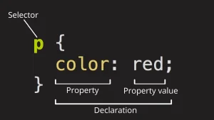
The basic structure of CSS consists of selectors, properties, and values. Here’s how it works:
-
selector { property: value; }Selector: This targets the HTML element you want to style (e.g., p, .class-name, #id-name).
- Property: This is the specific style you’re applying (e.g., color, font-size, margin).
- Value: The value you assign to the property (e.g., red, 16px, 10px).
For example, to change the text color of all paragraph elements:
p {

  color: red;

}
Selectors
Selectors are used to target HTML elements and apply styles to them. There are different types of selectors:
- Element Selector: Targets all instances of a specific HTML element (e.g., h1, p).
- Class Selector: Targets elements with a specific class (e.g., .my-class).
- ID Selector: Targets elements with a unique ID (e.g., #my-id).
- Universal Selector: Targets all elements on the page (*).
- Group Selector: Allows multiple elements to be selected at once (e.g., h1, h2, p).
/* Example */

h1 {

  font-size: 24px;

}

.my-class {

  background-color: blue;

}

#unique-element {

  color: white;

}
Properties
CSS properties define what aspect of an element you want to modify. Common properties include:
- color: Text color
- font-size: Size of the text
- background-color: Background color of an element
- margin: Space outside an element
- padding: Space inside an element
- border: Border around an element
Example:
div {

  margin: 20px;

  padding: 10px;

  background-color: lightgray;

}
Values
Each property has a corresponding value, determining the look or behavior of the element. Values can be units (e.g., px, %, em), color names (red, blue), or more specific identifiers (e.g., bold for font weight). Here are a few examples:
- px: Pixels (fixed size)
- %: Percentage (relative size)
- em: Relative to the element’s font size
- rem: Relative to the root element’s font size
- keywords: solid, none, bold
Example:
h2 {

  font-size: 2em;   /* Size is 2 times the current font size */

  color: green;     /* Text color */

}
Inline, Internal, and External CSS
There are three main ways to apply CSS to an HTML document:
Inline CSS: Styles applied directly within HTML elements using the style attribute. This method is typically used for quick, specific adjustments.
<h1 style="color: red;">Hello, World!</h1>Internal CSS: Styles written within the <style> tag in the <head> section of the HTML document. This method is useful for styling a single document.
<head>

  <style>

    body {

      font-family: Arial, sans-serif;

    }

  </style>

</head>
External CSS: Styles written in a separate .css file linked to the HTML document using the <link> tag. This is the most efficient method for larger websites, allowing styles to be reused across multiple pages.
<link rel=”stylesheet” href=”styles.css”>
Commenting in CSS
They are useful for leaving notes or temporarily disabling code without deleting it. Comments are added between /* and */.
/* This is a comment */

p {

  color: blue;  /* Change text color */

}
Comments don’t affect how the styles are applied to the page, making them perfect for documentation and collaboration.
Selectors: Targeting Elements with CSS
Basic Selectors: Element, Class, ID
Selectors are the foundation of CSS, allowing you to target specific HTML elements to apply styles. Below are the three most common types of selectors:
1. Element Selector
The element selector targets all instances of a specific HTML element on the page. For example, if you want to style all <p> (paragraph) elements:
p {

  color: blue;

}
This will make all paragraphs on the page have blue text.
2. Class Selector
The class selector targets elements with a specific class attribute. You can apply the same class to multiple elements, making it a flexible way to style groups of elements. Use a period (.) before the class name:
.my-class {

  background-color: yellow;

}
<p class="my-class">This is a paragraph with a yellow background.</p>
<div class="my-class">This div also has a yellow background.</div>3. ID Selector
The ID selector targets a unique element with a specific ID. Since IDs are unique within a document, this selector is used for single, specific elements. Use a hash (#) before the ID name:
#unique-id {

  font-size: 20px;

}
<h1 id="unique-id">This is a unique heading</h1>Grouping and Combining Selectors
You can group selectors to apply the same style to multiple elements. This helps reduce repetition in your CSS code.
Grouping Selectors
To group selectors, separate them with commas. For example, to apply the same color to both <h1> and <h2> elements:
h1, h2 {

  color: green;

}
Combining Selectors
You can also combine selectors to be more specific about which elements are targeted. For example, to target a <p> element with a class of .highlight:
p.highlight {

  background-color: lightgreen;

}
You can also combine selectors with descendant or child relationships. For example, to target only <p> elements that are inside a <div> with the class .container:
.container p {

  color: red;

}
This will only style the paragraphs inside .container divs, leaving other paragraphs untouched.
Pseudo-classes and Pseudo-elements
Pseudo-classes
A pseudo-class targets an element based on its state or position in the document, rather than a specific attribute. Some common pseudo-classes include:
:hover: Targets an element when it is hovered over by the user.
a:hover {

  color: red;

}:first-child: Targets the first child element of a parent.
p:first-child {

  font-weight: bold;

}:nth-child(n): Targets elements based on their position in a parent.
li:nth-child(2) {

  color: blue;

}
Pseudo-elements
A pseudo-element allows you to style a specific part of an element, such as the first letter or line. Common pseudo-elements include:
::before: Inserts content before an element’s actual content.
p::before {

  content: "Note: ";

  font-weight: bold;

}::after: Inserts content after an element’s actual content.
p::after {

  content: " (end of paragraph)";

}::first-letter: Targets the first letter of a block of text.
p::first-letter {

  font-size: 2em;

  color: orange;

}::first-line: Targets the first line of text in a block-level element.
p::first-line {

  font-style: italic;

}
Styling Text and Fonts
How to Change Font Size, Style, and Color
CSS provides several ways to style text and fonts, giving you control over how content appears on your page. Here are the basics:
1. Font Size
You can change the font size of text using the font-size property. Values can be in units like px (pixels), em (relative to the current font size), rem (relative to the root element), or % (relative to the parent element).
h1 {

  font-size: 36px; /* Fixed size */

}

p {

  font-size: 1.2em; /* 20% larger than the parent element's font size */

}
2. Font Style
You can change the style of the font using properties like font-style and font-weight:
font-style: Can be normal, italic, or oblique.
p {

  font-style: italic;

}font-weight: Can be normal, bold, or numeric values (100-900) for specific weight.
h2 {

  font-weight: bold;

}
3. Font Color
The color property changes the color of the text. You can use named colors (red), hexadecimal values (#FF5733), RGB (rgb(255, 0, 0)), or HSL (hsl(0, 100%, 50%)).
h1 {

  color: #ff6347; /* Tomato color */

}

p {

  color: rgb(0, 0, 255); /* Blue */

}
Using Google Fonts or Custom Fonts
You can use a wide variety of fonts by importing them from Google Fonts or using custom fonts hosted on your server.
Using Google Fonts
To use Google Fonts, first go to the Google Fonts website, choose a font, and copy the <link> tag to add to your HTML file:
<head>

  <link href="https://fonts.googleapis.com/css2?family=Roboto:wght@400;700&display=swap" rel="stylesheet">

</head>
Then, apply the font in your CSS:
body {

  font-family: 'Roboto', sans-serif;

}
Using Custom Fonts
You can also host your own fonts using the @font-face rule. This allows you to specify the location of the font file and use it across your website.
@font-face {

  font-family: 'MyCustomFont';

  src: url('fonts/myfont.woff2') format('woff2'),

       url('fonts/myfont.woff') format('woff');

}

body {

  font-family: 'MyCustomFont', sans-serif;

}
Text Alignment, Spacing, and Decoration
1. Text Alignment
The text-align property controls the alignment of text within an element. You can align text to the left, center, right, or justify it:
h1 {

  text-align: center; /* Center the text */

}

p {

  text-align: justify; /* Justify the text */

}
2. Text Spacing
There are several properties that allow you to control the spacing of text:
letter-spacing: Adjusts the space between letters.
p {

  letter-spacing: 1px; /* Adds space between letters */

}line-height: Controls the space between lines of text.
p {

  line-height: 1.5; /* 1.5 times the font size */

}word-spacing: Adjusts the space between words.
p {

  word-spacing: 3px; /* Adds space between words */

}
3. Text Decoration
The text-decoration property allows you to add styles like underlining, overlining, or striking through text:
a {

  text-decoration: underline; /* Underlines links */

}

p {

  text-decoration: line-through; /* Strikes through text */

}
You can also use text-decoration-color to specify the color of the decoration.
a {

  text-decoration: underline;

  text-decoration-color: red; /* Red underline */

}
Working with Colors and Backgrounds
Color Values: Hex, RGB, HSL
CSS provides several ways to define colors for text, backgrounds, borders, and other elements. The most common color values are Hex, RGB, and HSL. Each has its own advantages depending on the situation.
1. Hex (Hexadecimal) Colors
Hexadecimal color values are six-digit codes that represent colors in base 16. These values are a combination of three pairs of digits (from 00 to FF), where each pair represents the amount of Red, Green, and Blue (RGB) in the color.
- Format: #RRGGBB
- Example: #FF5733 (a shade of red-orange)
p {

  color: #FF5733; /* Red-orange color */

}
2. RGB (Red, Green, Blue)
RGB color values are based on the amount of Red, Green, and Blue light used to create a color. Each value ranges from 0 to 255.
- Format: rgb(red, green, blue)
- Example: rgb(255, 87, 51) (same red-orange color)
p {

  color: rgb(255, 87, 51); /* Red-orange color */

}
3. HSL (Hue, Saturation, Lightness)
HSL is another method to define colors. It uses three components:
- Hue: The color itself (measured in degrees from 0 to 360).
- Saturation: The intensity of the color (0% to 100%).
- Lightness: The lightness of the color (0% to 100%).
- Format: hsl(hue, saturation%, lightness%)
- Example: hsl(9, 100%, 60%) (same red-orange color)
p {

  color: hsl(9, 100%, 60%); /* Red-orange color */

}
Background Properties: Color, Image, Repeat, Position, Size
CSS allows you to customize the background of elements using several properties. Here’s how you can manipulate the background of an element:
1. Background Color
You can set a solid background color using the background-color property. This works with all color values (Hex, RGB, HSL).
div {

  background-color: #f0f0f0; /* Light gray background */

}
2. Background Image
The background-image property allows you to add an image as the background of an element. You can specify the image URL.
div {

  background-image: url('background.jpg');

}
3. Background Repeat
By default, background images repeat to fill the entire background of an element. You can control this behavior using the background-repeat property.
- repeat: The image repeats both horizontally and vertically (default).
- no-repeat: The image does not repeat.
- repeat-x: The image repeats only horizontally.
- repeat-y: The image repeats only vertically.
div {

  background-image: url('background.jpg');

  background-repeat: no-repeat; /* No repetition */

}
4. Background Position
You can position a background image within an element using the background-position property. It specifies the starting position of the background image.
- Values can be in pixels, percentages, or keywords (e.g., top, bottom, left, right, center).
div {

  background-image: url('background.jpg');

  background-position: center top; /* Image is centered horizontally, aligned to the top */

}
5. Background Size
The background-size property defines the size of the background image. You can use specific values like width x height, or keywords like cover (scale the image to cover the entire element) or contain (scale the image to fit within the element).
- cover: The image covers the entire background, possibly cropping parts of it.
- contain: The image fits entirely within the element, without cropping.
div {

  background-image: url('background.jpg');

  background-size: cover; /* Image scales to cover the entire element */

}
With these properties, you can effectively manage the colors and backgrounds of your web elements, adding rich design elements to your site. By combining color and background techniques, you can create visually appealing pages that enhance the user experience. Ready to turn these design skills into a professional career? Join our software development bootcamp in Kenya and learn front-end development through real-world, hands-on projects.
Layout with CSS
Understanding how layout works in CSS is essential for building well-structured, responsive, and visually balanced web pages. This section covers the Box Model, spacing, display types, and positioning.
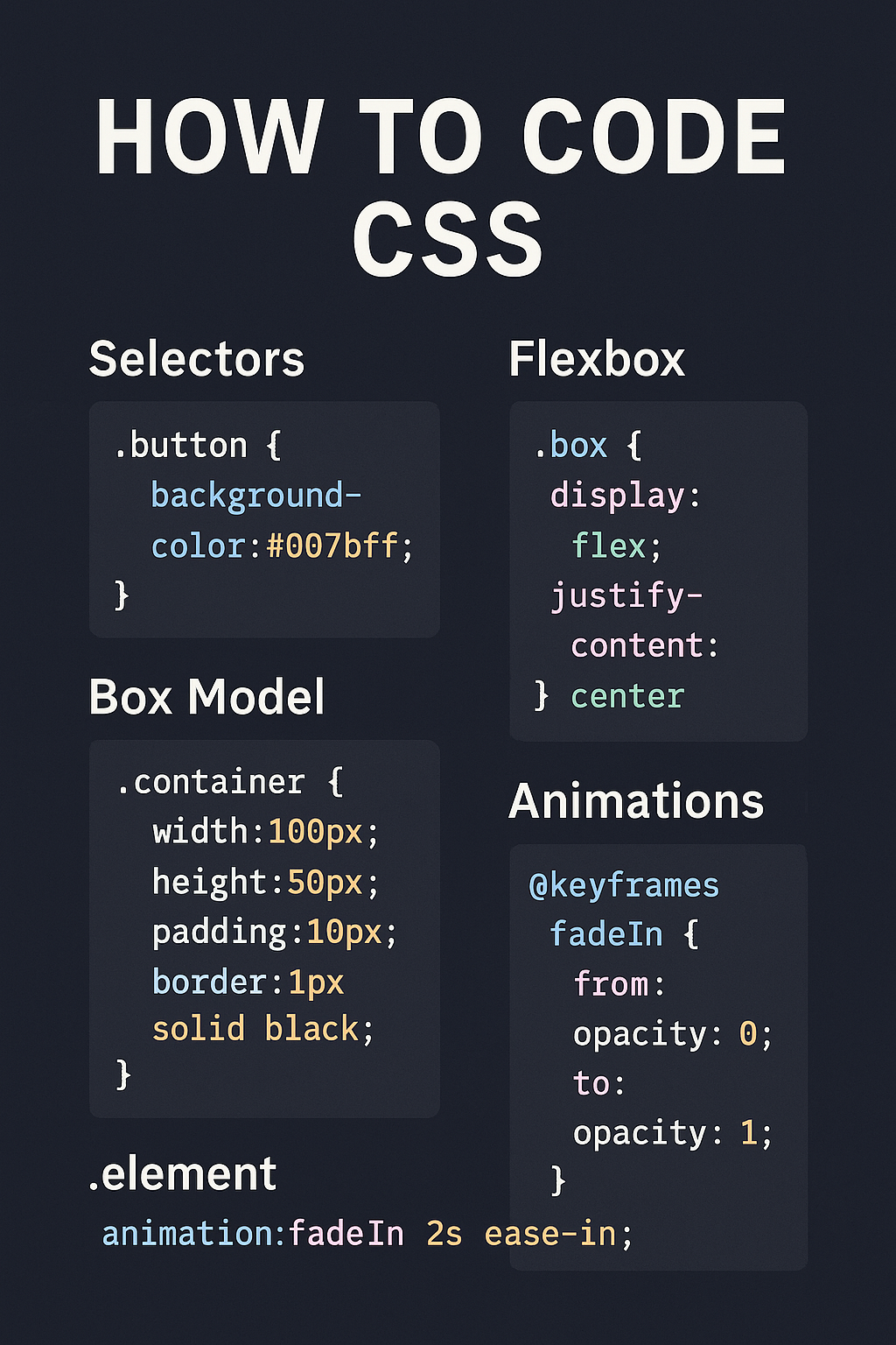
1. Box Model Explanation
Every HTML element on a webpage is essentially a rectangular box, and CSS controls how these boxes are styled and arranged using the Box Model. The Box Model consists of:
- Content – The actual text or media inside the element.
- Padding – Space between the content and the border.
- Border – The edge around the padding.
- Margin – Space outside the border, separating the element from others.
Example visualization:
|<– Margin –>|<– Border –>|<– Padding –>| Content |<– Padding –>|<– Border –>|<– Margin –>|
div {

  margin: 20px;

  padding: 10px;

  border: 2px solid black;

}
2. Margin, Padding, Border
Margin
Controls the space outside the element. Can be used to push elements away from each other.
p {

  margin: 20px;

}
Padding
Controls the space inside the element, between the content and its border.
p {

  padding: 15px;

}
Border
Defines the outline of an element. You can control its width, style, and color.
p {

  border: 2px dashed blue;

}
You can also use shorthand:
p {

  margin: 10px 20px;      /* Top-bottom: 10px, Left-right: 20px */

  padding: 10px 15px 5px; /* Top: 10px, Left-right: 15px, Bottom: 5px */

}
3. Display Properties: block, inline, inline-block, none
The display property controls how an element is rendered in the document flow.
Block
Takes up the full width available and starts on a new line.
div {

  display: block;

}
inline
Takes only as much width as needed and does not start on a new line.
span {

  display: inline;

}
inline-block
Like inline, but allows setting width and height.
img {

  display: inline-block;

  width: 100px;

  height: auto;

}
none
Completely removes the element from the layout (not visible and doesn’t take up space).
button {

  display: none;

}
4. Positioning: static, relative, absolute, fixed, sticky
The position property defines how an element is positioned in the document.
static (default)
The element is positioned according to the normal flow of the document.
div {

  position: static;

}
relative
The element is positioned relative to its normal position. Use top, left, right, or bottom to move it.
div {

  position: relative;

  top: 20px; /* Moves 20px down from its normal position */

}
absolute
The element is removed from the normal flow and positioned relative to the nearest positioned ancestor (anything except static).
div {

  position: absolute;

  top: 50px;

  left: 100px;

}
fixed
The element is fixed in place relative to the viewport. It stays visible when scrolling.
header {

  position: fixed;

  top: 0;

  width: 100%;

}
sticky
The element toggles between relative and fixed depending on the scroll position. It “sticks” to a position when you scroll past it.
nav {

  position: sticky;

  top: 0;

}
With these tools, you can build complex layouts, create space between elements, and position components exactly where you want them. Once you’re comfortable with these, you can move on to Flexbox and Grid for even more powerful layout techniques.
Advanced CSS Techniques
1. Flexbox: Overview and Examples
Flexible Box Layout(Flexbox) is a powerful layout tool in CSS that makes it easier to align and distribute space among elements in a container, even when the size of the items is unknown or dynamic. Flexbox is perfect for building one-dimensional layouts (either in rows or columns).
How Flexbox Works:
Flexbox uses two key concepts:
- Flex Container: The parent element that contains the flex items.
- Flex Items: The child elements inside the flex container.
Flexbox Properties for the Container:
- display: flex;: Activates flexbox on the container.
- flex-direction: Defines the direction of the flex items (row, column, row-reverse, column-reverse).
- justify-content: Aligns items horizontally (in the main axis).
- align-items: Aligns items vertically (in the cross axis).
- align-self: Aligns individual flex items vertically.
Example 1: Basic Flexbox Layout
.container {

  display: flex;

  justify-content: space-between; /* Distributes space between items */

  align-items: center; /* Centers items vertically */

}

.item {

  width: 100px;

  height: 100px;

  background-color: lightblue;

}

<div class="container">

  <div class="item">Item 1</div>

  <div class="item">Item 2</div>

  <div class="item">Item 3</div>

</div>
This example creates a flex container with three items evenly spaced and vertically centered.
Example 2: Changing Flex Direction
.container {

  display: flex;

  flex-direction: column; /* Items stack vertically */

  align-items: flex-start; /* Aligns items to the left */

}
2. CSS Grid: Basics and When to Use It
CSS Grid is a two-dimensional layout system that allows you to create complex web layouts easily, with both rows and columns. It provides more control over placement and alignment compared to Flexbox.
CSS Grid uses a grid container and grid items. The grid container defines the rows and columns, while the grid items are placed within those rows and columns.
Grid Properties for the Container:
- display: grid;: Activates CSS Grid.
- grid-template-columns: Defines the number of columns and their width.
- grid-template-rows: Defines the number of rows and their height.
- grid-gap: Defines the space between grid items.
Example 1: Basic Grid Layout
.container {

  display: grid;

  grid-template-columns: repeat(3, 1fr); /* 3 equal-width columns */

  gap: 20px; /* Space between items */

}

.item {

  background-color: lightcoral;

  padding: 20px;

}

<div class="container">

  <div class="item">Item 1</div>

  <div class="item">Item 2</div>

  <div class="item">Item 3</div>

  <div class="item">Item 4</div>

  <div class="item">Item 5</div>

  <div class="item">Item 6</div>

</div>
In this example, the container is split into three equal columns, and there is a 20px gap between the items.
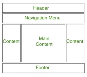
Example 2: Grid with Named Areas
.container {

  display: grid;

  grid-template-areas:

    "header header header"

    "main main sidebar"

    "footer footer footer";

  gap: 20px;

}

.header {

  grid-area: header;

}

.main {

  grid-area: main;

}

.sidebar {

  grid-area: sidebar;

}

.footer {

  grid-area: footer;

}
This layout splits the page into a header, main content, sidebar, and footer using named grid areas.
3. Media Queries for Responsive Design
Media queries are an essential tool for creating responsive designs that adapt to different screen sizes and devices. They allow you to apply specific styles based on device characteristics such as screen width, height, orientation, and resolution.
How Media Queries Work:
Media queries consist of a condition (e.g., screen width) and styles that should be applied when the condition is met. Common use cases include adjusting layouts for smaller screens (mobile devices) and larger screens (desktop).
Basic Syntax:
@media (condition) {

  /* CSS styles to be applied when the condition is true */

}
Example 1: Basic Media Query for Small Screens
@media (max-width: 768px) {

  body {

    background-color: lightgray;

  }

  .container {

    display: block; /* Stack elements vertically */

  }

}
In this example, when the screen width is 768px or less (usually for tablets or smaller devices), the background color changes, and the container switches to a block layout.
Example 2: Multiple Media Queries
@media (max-width: 1024px) {

  .container {

    grid-template-columns: 1fr 1fr; /* Two-column layout */

  }

}

@media (max-width: 768px) {

  .container {

    grid-template-columns: 1fr; /* Single-column layout */

  }

}
In this example:
- For screen widths of 1024px or less, the container will display a two-column layout.
- For screen widths of 768px or less, it switches to a one-column layout.
Example 3: Media Query for Orientation
@media (orientation: landscape) {

  body {

    background-color: lightblue;

  }

}

@media (orientation: portrait) {

  body {

    background-color: lightgreen;

  }

}
This example changes the background color based on whether the device is in landscape or portrait orientation.
With Flexbox, CSS Grid, and Media Queries, you can build complex, responsive layouts that adapt to different screen sizes and improve the user experience across various devices.
In conclusion, learning how to code CSS is a foundational step in becoming a skilled web developer. Remember, the key to mastering CSS is consistent practice. Try building small projects, experimenting with different styles, and challenging yourself with new layout techniques. So don’t wait, start coding CSS today and bring your web design ideas to life!