How to Create a Navigation Bar with CSS
I. Understanding the Basics
Before styling your navigation bar with CSS, it’s important to understand its HTML foundation. A clean structure helps ensure your nav bar is accessible, easy to style, and adaptable to different layouts.
1. HTML Structure for a Navigation Bar
A typical navigation bar is made up of the following elements:
<nav>

  <ul>

    <li><a href="#">Home</a></li>

    <li><a href="#">About</a></li>

    <li><a href="#">Services</a></li>

    <li><a href="#">Contact</a></li>

  </ul>

</nav>
Explanation of the structure:
- <nav>: A semantic tag that represents a section of navigation links.
- <ul> (unordered list): Groups the navigation links in a list format.
- <li> (list item): Wraps each navigation link inside the list.
- <a> (anchor tag): Contains the actual clickable link to another page or section.
This layout keeps your code organized and screen-reader friendly, which improves accessibility.
2. Semantic vs. Non-Semantic Tags
Semantic tags clearly describe their meaning in both code and human terms. In the context of a navigation bar:
- Semantic: <nav>, <ul>, <li>, <a>
- Non-semantic: <div>, <span>, used without clear purpose
Why it matters:
Using semantic tags improves accessibility, SEO, and code readability. For example, screen readers can recognize a <nav> section and announce it as a navigation region to visually impaired users.
3. Inline vs. Block-Level Elements in a Nav Bar
Understanding how elements behave by default helps you control layout effectively:
- <a> is an inline element by default. This means it won’t accept width, height, or margin/padding as expected unless you change its display property.
- <ul> and <li> are block-level elements, meaning they stack vertically by default.
Best practice:
Use CSS to change the display of inline elements when needed. For example:
nav a {

  display: block;

  padding: 10px;

}
This ensures consistent spacing and makes the clickable area larger, improving usability on
II. Setting Up the HTML
To build a functional and well-structured navigation bar, you’ll first need to set up the HTML correctly. This forms the backbone of your navigation and makes it easy to style with CSS later.
Here’s a simple and clean example of the HTML markup:
<nav>

  <ul>

    <li><a href="#">Home</a></li>

    <li><a href="#">About</a></li>

    <li><a href="#">Services</a></li>

    <li><a href="#">Contact</a></li>

  </ul>

</nav>
Explanation of Each Tag and Its Role
- <nav>
This is a semantic tag that indicates a block of navigation links. It helps browsers and assistive technologies identify the section as a menu. - <ul> (Unordered List)
This creates a list container to group the navigation items. Using a list is a common and accessible way to structure multiple links. - <li> (List Item)
Each list item wraps around one navigation link. This maintains a consistent structure and makes it easier to apply spacing and layout styles. - <a href=”#”> (Anchor Tag)
The anchor tag is what makes the item clickable. The href=”#” is a placeholder; in a real project, you would replace it with actual page URLs (e.g., href=”/about.html”).
Why this structure works:
- It’s semantic and accessible.
- It separates content (HTML) from presentation (CSS).
- It’s easy to adapt for horizontal, vertical, or responsive layouts.
This simple markup is all you need to get started before moving on to styling with CSS.
III. Styling the Navigation Bar with CSS
Once your HTML structure is ready, it’s time to style your navigation bar to make it visually appealing and user-friendly. This section covers essential CSS techniques like Flexbox, spacing, hover effects, and more.
1. Resetting Default Browser Styles
Browsers apply default styles to elements like lists and links. To avoid inconsistencies, start by resetting or overriding them:
nav ul {

  list-style: none;   /* Removes bullet points */

  margin: 0;

  padding: 0;

}
This ensures a clean foundation for layout and styling.
2. Making Items Horizontal with Flexbox
By default, list items stack vertically. To align them in a row, use Flexbox:
nav ul {

  display: flex;       /* Places list items in a row */

  background-color: #333;

}
Flexbox is ideal for layout because it’s responsive and easy to control.
3. Styling Links (Text, Hover, Active States)
Customize your link appearance to improve readability and interactivity:
nav a {

  display: block;                  /* Makes links easier to click */

  padding: 14px 20px;             /* Adds space around the text */

  color: white;                   /* Text color */

  text-decoration: none;         /* Removes underline */

}

nav a:hover {

  background-color: #555;         /* Changes background on hover */

}
Optional: You can also style the active link (current page) using a class:
nav a.active {

  background-color: #007BFF;

}
4. Adding Background Color and Spacing
The background-color: #333; on the nav ul gives the bar a dark theme. The padding on <a> elements ensures the clickable area is comfortable and uniform.
Optional spacing between items:
nav li {

  margin-right: 10px;

}
Full Example Code
nav ul {

  display: flex;

  list-style: none;

  background-color: #333;

  padding: 0;

  margin: 0;

}

nav li {

  margin: 0;

}

nav a {

  display: block;

  padding: 14px 20px;

  color: white;

  text-decoration: none;

}

nav a:hover {

  background-color: #555;

}
With this CSS applied to the earlier HTML structure, you now have a clean, horizontal navigation bar that’s ready for customization or responsiveness.
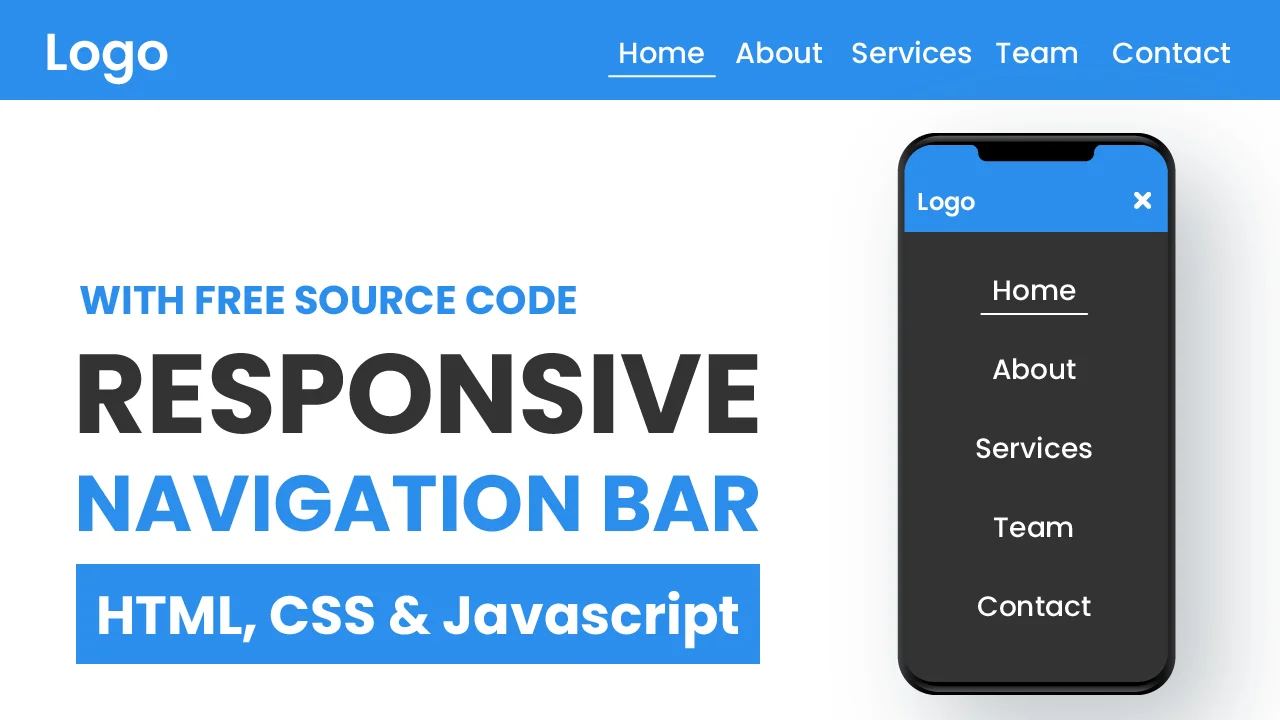
IV. Responsive Design
In today’s multi-device world, your navigation bar must work seamlessly across desktops, tablets, and smartphones. A responsive nav bar adjusts to different screen sizes for better usability and performance.
1. How to Make the Navigation Bar Mobile-Friendly
The goal is to ensure that navigation links remain accessible without breaking the layout on smaller screens. There are two main approaches:
- Stack links vertically on small screens
- Hide links behind a toggleable hamburger menu
Let’s start with a simple solution, stacking links vertically using media queries.
2. Media Queries to Adjust Layout
You can use a media query to modify the navigation bar’s layout when the screen width is below a certain threshold (e.g., 768px):
@media (max-width: 768px) {

  nav ul {

    flex-direction: column;

    align-items: flex-start;

  }

  nav a {

    padding: 12px;

    width: 100%;

  }

}
What this does:
- flex-direction: column; stacks the menu items vertically
- width: 100%; makes each link span the full container width for easier tapping
- Adjusts spacing for smaller screens
This keeps your nav usable without overwhelming the user with tiny horizontal links on mobile devices.
3. Introduction to Hamburger Menu (Optional Preview)
For a more advanced mobile navigation experience, many websites use a hamburger menu a small icon (☰) that toggles the display of nav links.
Basic concept:
- Hide the menu links by default on small screens
- Show a menu icon
- When clicked, display the nav links
Here’s a basic idea of how it works (without full code):
<button class="menu-toggle">☰</button>

<nav class="mobile-nav">

  <!-- nav links here -->

</nav>
.menu-toggle {
display: none;
}
@media (max-width: 768px) {
.menu-toggle {
display: block;
}
.mobile-nav {
display: none;
}
.mobile-nav.active {
display: flex;
flex-direction: column;
}
}To fully implement this, you’d use JavaScript to toggle the .active class on the nav when the button is clicked.
V. Common Navigation Bar Layouts
Navigation bars can be styled and positioned in various ways depending on your site’s design goals. Here are three of the most common and useful navigation bar layouts:
1. Horizontal Top Navigation Bar
This is the most traditional layout. Links are aligned in a single row across the top of the page.
Best for: Standard websites, blogs, portfolios, business sites.
CSS Example:
nav ul {

  display: flex;

  justify-content: space-around;

  background-color: #333;

}

nav a {

  padding: 14px 20px;

  color: white;

  text-decoration: none;

}
Layout Result:
- A simple horizontal nav bar at the top
- Easily enhanced with dropdowns or responsive tweaks
2. Sticky or Fixed Navigation Bar
A sticky nav bar stays at the top of the screen while scrolling, improving usability and access to key links.
Fixed Example:
nav {

  position: fixed;

  top: 0;

  width: 100%;

  z-index: 1000;

  background-color: #333;

}
Sticky Example (modern browsers):
nav {

  position: sticky;

  top: 0;

  background-color: #333;

}
Tip: Add padding or margin to the top of your content to prevent it from being hidden behind the fixed bar.
3. Vertical Side Navigation Bar
This layout places links down the side (left or right), often used in admin dashboards or portfolio sites.
HTML Example:
<nav class="sidebar">

  <ul>

    <li><a href="#">Dashboard</a></li>

    <li><a href="#">Profile</a></li>

    <li><a href="#">Settings</a></li>

  </ul>

</nav>
CSS Example:
.sidebar {

  width: 200px;

  height: 100vh;

  background-color: #222;

  position: fixed;

  top: 0;

  left: 0;

}

.sidebar ul {

  display: flex;

  flex-direction: column;

  padding: 0;

  list-style: none;

}

.sidebar a {

  padding: 15px;

  color: white;

  text-decoration: none;

  display: block;

}

.sidebar a:hover {

  background-color: #444;

}
Benefits:
- Frees up top space
- Can support icons, collapsible menus, and nested links
Each of these navigation bar layouts can be tailored to your site’s needs. Whether you’re building a simple site or a complex app interface, choosing the right layout improves usability and flow.
VI. Accessibility Tips
Making your navigation bar accessible ensures that all users, including those with disabilities, can navigate your website effectively. Good accessibility improves usability, SEO, and compliance with web standards.
1. Using ARIA Labels
ARIA (Accessible Rich Internet Applications) labels provide extra context for assistive technologies like screen readers.
Example:
<nav aria-label="Main Navigation">

  <ul>

    <li><a href="#">Home</a></li>

    <li><a href="#">About</a></li>

    <li><a href="#">Services</a></li>

    <li><a href="#">Contact</a></li>

  </ul>

</nav>- aria-label=”Main Navigation” tells screen readers what the <nav> contains.
- Avoid using ARIA when semantic HTML alone is sufficient but use it to clarify or supplement navigation context when needed.
2. Keyboard Navigation Considerations
Your nav bar should be fully navigable using the Tab key. This means:
- All links must be focusable.
- Link order should follow the visual flow.
- Avoid hiding interactive elements with display: none; without providing an accessible toggle.
Pro tip: Use focus to style active elements for keyboard users.
nav a:focus {

  outline: 2px dashed #fff;

  background-color: #444;

}
You can also improve accessibility with skip links:
<a href="#main-content" class="skip-link">Skip to main content</a>.skip-link {
position: absolute;
left: -999px;
}
.skip-link:focus {
left: 0;
background: #000;
color: #fff;
padding: 8px;
}This helps users bypass repetitive navigation.
3. High-Contrast Focus Styles
Many users with low vision rely on high-contrast colors. Always ensure:
- Focused links have a visible outline or highlight
- Color contrast meets WCAG AA/AAA standards (use tools like WebAIM Contrast Checker)
Example:
nav a:focus,

nav a:hover {

  background-color: #f0f0f0;

  color: #000;

}
Avoid removing outlines unless you replace them with another clear focus indicator.
VII. Troubleshooting & Best Practices
Building a clean, responsive navigation bar can come with layout quirks or unexpected behavior. This section will help you fix common issues and keep your CSS codebase scalable and maintainable.
1. Dealing with Spacing and Alignment Issues
Navigation bar layout problems usually involve uneven spacing, misaligned links, or elements not appearing where expected.
Tips to fix them:
- Use Flexbox or Grid for consistent layout control.
Reset margins and paddings:
* {

  margin: 0;

  padding: 0;

  box-sizing: border-box;

}
Ensure nav items have equal padding and alignment:
nav a {

  padding: 14px 20px;

  text-align: center;

}- Use DevTools to inspect and test alignment in real time.
2. Avoiding Inline Styles
Inline styles (e.g., <a style=”color: red;”>) make your code harder to maintain and override, especially on larger projects.
Why avoid them:
- They break the separation of concerns (HTML vs. CSS).
- They’re harder to reuse and scale.
- They override external styles, creating debugging headaches.
Best practice:
- Keep all your styling in a separate .css file or inside <style> tags.
Use classes to apply styles:
<a class="nav-link" href="#">Home</a> .nav-link {
color: white;
text-decoration: none;
}3. Keeping CSS Modular and Maintainable
As your project grows, modular CSS becomes essential.
Tips:
- Group related styles together (e.g., all .nav styles in one section).
- Use clear, consistent naming conventions (e.g., .nav-link, .nav-item).
- Break large stylesheets into components using SCSS, BEM naming, or utility classes (e.g., Tailwind CSS).
Use comments to organize:
/* Navigation Bar Styles */

nav { ... }
Optional: Use CSS variables for theme consistency:
:root {

  --nav-bg: #333;

  --nav-text: #fff;

}
Then apply:
nav {

  background-color: var(--nav-bg);

}

nav a {

  color: var(--nav-text);

}
Following these best practices helps ensure your navigation bar is reliable, consistent, and easy to update or expand as your site evolves. For a university-level deep dive into responsive design principles covering media queries, flexible layouts, and scalable navigation patterns, check out Stanford’s “Responsive Web Design” lecture notes: Stanford CS 142 Responsive Web Design PDF.
VIII. Real-World Examples & Inspiration
Once you’ve mastered the basics, it’s time to look at how creative and functional navigation bars are used in real-world websites. These examples can spark inspiration and show you what’s possible beyond a static layout.
1. Links to Live Sites or CodePen Examples
Here are some practical examples of navigation bars you can explore and modify:
- Simple Flexbox Navbar
CodePen Example – Simple Nav Bar
A clean, horizontal nav bar using Flexbox and hover effects. - Responsive Hamburger Menu
CodePen – Responsive Hamburger Menu
A responsive nav with a toggleable mobile menu using CSS and JavaScript. - Sticky Navigation on Scroll
CodePen – Sticky Navigation
Shows how a nav bar can stick to the top while scrolling. - Side Navigation Bar
CodePen – Vertical Sidebar Nav
A stylish vertical nav bar suitable for dashboards or admin panels.
2. Ideas for Creative Nav Bar Styles
Once your functionality is in place, you can make your navigation bar stand out with custom designs:
Transparent Navigation Bars:
Overlay a transparent nav bar on top of a hero image or video banner. Add a blur effect with backdrop-filter for extra flair.
nav {

  background-color: rgba(0, 0, 0, 0.5);

  backdrop-filter: blur(5px);

}
Animated Underlines on Hover:
Animate the underline effect using ::after and transition.
nav a::after {

  content: "";

  display: block;

  height: 2px;

  background: white;

  transform: scaleX(0);

  transition: transform 0.3s ease;

}

nav a:hover::after {

  transform: scaleX(1);

}- Dark Mode Toggle in the Nav Bar:
Add a theme toggle button right inside your nav bar to switch between light and dark modes dynamically. - Scroll Highlight (ScrollSpy):
Highlight the active link as users scroll through sections. This can be done with JavaScript or libraries like ScrollSpy.js. - Floating or Slide-In Nav Bars:
Use transitions to create nav bars that slide in from the top or side on scroll or menu toggle.
To conclude, a well-crafted navigation bar is essential for guiding users through your website and enhancing their overall experience. Whether you’re building a simple horizontal menu or a responsive, mobile-friendly nav with animations, mastering the fundamentals of HTML and CSS gives you full control over design and functionality.
If you’re ready to build real websites and take your skills to the next level, our software development courses in Kenya are the perfect place to start.
Now that you know how to build a responsive and accessible navigation bar, you’re ready to apply these techniques to real websites and elevate your front-end development skills.