HTML forms are a core component of modern websites, enabling users to enter and submit information whether it’s logging in, signing up, making a purchase, or contacting support. They serve as the primary way websites gather data from visitors, making them crucial for both functionality and user interaction. However, creating accessible HTML forms is just as important as their functionality. Accessible HTML forms ensure that all users, regardless of ability, can interact with and submit data easily. In this article, we will explore how to create HTML forms that are not only functional but also inclusive, ensuring a seamless experience for everyone.
However, not all users experience the web in the same way. For people with disabilities such as visual impairments, motor limitations, or cognitive challenges poorly designed forms can be confusing or even impossible to use. That’s why accessibility in web development is not just a best practice but a necessity. It ensures that every user can interact with your content, regardless of ability.
In this article, we’ll explore how to create accessible HTML forms by following key principles and best practices. From using semantic markup and proper labels to handling error messages and keyboard navigation, you’ll learn how to design forms that are usable, inclusive, and compliant with accessibility standards.
Dreaming of becoming a full-stack software developer and building real-world applications from the ground up?
Our immersive Software Engineering Course in Kenya is designed to be your launchpad into the tech industry. With expert-led training and hands-on, project-based learning, you’ll gain mastery in front-end and back-end development, APIs, databases, and more.
By the end of the course, you won’t just have the technical skills to build complete software solutions—you’ll also have the confidence, experience, and a professional portfolio to set yourself apart in today’s competitive job market.
Why Accessibility Matters in HTML Forms
Creating accessible HTML forms is essential for ensuring that all users, regardless of ability, can interact with your website effectively. Accessibility in this context goes beyond convenience; it’s about digital inclusivity.
Digital Inclusivity
Millions of people rely on assistive technologies like screen readers, voice input, or keyboard navigation to access the web. When HTML forms are not built with accessibility in mind, these users are often excluded from completing basic tasks like submitting a contact form or completing a checkout process. Inclusive design ensures that everyone, including users with visual, auditory, motor, or cognitive impairments, can use your forms with ease.
Legal and Ethical Responsibility
Accessibility isn’t just a courtesy, it’s often a legal requirement. Laws such as the Americans with Disabilities Act (ADA) in the United States and the Web Content Accessibility Guidelines (WCAG) globally set standards for digital accessibility. Non-compliance can result in lawsuits, fines, and damage to brand reputation. Ethically, prioritizing accessibility aligns with the broader goal of creating a more equitable web for all.
Common Challenges of Inaccessible Forms
When HTML forms lack proper accessibility, users may face issues such as:
- Missing or unclear labels that confuse screen readers.
- Improper tab order, making navigation difficult.
- Error messages that aren’t announced to assistive technologies.
- Inaccessible CAPTCHA or visual-only cues.
These challenges can frustrate users, reduce engagement, and ultimately drive them away from your site.
Basic Structure of HTML Forms
Before diving into accessibility best practices, it’s important to understand the basic structure of HTML forms. A well-structured form not only makes development easier but also lays the foundation for accessibility and usability.
Core Form Elements
At the heart of all HTML forms is the <form> tag, which wraps around various input fields and buttons. Inside this container, you’ll commonly use the following elements:
- <label>: Describes the purpose of a form control, usually linked to an input via the for attribute.
- <input>: A versatile element used for text fields, checkboxes, radio buttons, and more.
- <textarea>: Allows users to enter multi-line text.
- <button>: Triggers form submission or other actions.
Each of these elements plays a role in collecting user input and guiding them through the form completion process.
Semantic HTML and Structure
Using semantic HTML ensures that screen readers and other assistive tools can correctly interpret and present the form content to users. For instance:
- Pairing <label> with <input> helps users understand what data is expected.
- Grouping related fields using containers or <fieldset> elements improves clarity and navigation.
- Using appropriate type attributes (e.g., email, number, date) improves input accuracy and mobile usability.
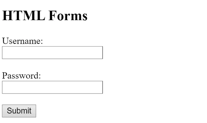
Example of a Basic HTML Form
<form action="/submit" method="POST">

  <label for="name">Name:</label>

  <input type="text" id="name" name="name" required>

  <label for="email">Email:</label>

  <input type="email" id="email" name="email" required>

  <label for="message">Message:</label>

  <textarea id="message" name="message"></textarea>

  <button type="submit">Submit</button>

</form>
This simple structure demonstrates the essentials of building clean, semantic, and accessible HTML forms. As we move forward, we’ll build on this foundation to make forms even more inclusive for all users.
Use Semantic and Descriptive Labels
One of the most critical aspects of accessible HTML forms is ensuring that every input field has a clear, descriptive label. Labels guide users especially those using screen readers through form fields and help them understand what information is required.
Using <label> with the for Attribute
Each form field should have a corresponding <label> element connected by the for attribute, which matches the id of the input. This explicit connection ensures that assistive technologies announce the correct label when a user focuses on a form field.
Example:
<label for="email">Email Address:</label>

<input type="email" id="email" name="email">
This method makes your HTML forms both accessible and user-friendly, allowing screen readers to communicate exactly what input is expected.
Avoid Placeholder-Only Fields
Relying solely on placeholders (e.g., placeholder=”Enter email”) instead of visible labels is a common mistake. Placeholders can disappear as users type, aren’t always read by screen readers, and can be hard to see due to low contrast. Always use a proper label, and reserve placeholders for supplementary hints not as a replacement for labels.
Using aria-label and aria-labelledby
In some complex or visually styled HTML forms, you may need to use ARIA (Accessible Rich Internet Applications) attributes to ensure clarity:
- aria-label: Directly defines an accessible name when a visible label is not used.
- aria-labelledby: References another element that acts as a label for the form control.
Example with aria-label:
<input type="text" aria-label="Phone Number">Example with aria-labelledby:
<p id="phoneLabel">Phone Number</p>

<input type="text" aria-labelledby="phoneLabel">
Use these attributes carefully and only when a standard <label> cannot be used effectively. Overuse or misuse can cause more confusion than clarity.
By providing clear, descriptive labels and avoiding ambiguous or invisible instructions, your HTML forms become significantly more accessible to everyone.
Ensure Keyboard Navigation and Focus Management
A truly accessible experience means users can navigate and complete HTML forms without needing a mouse. Keyboard accessibility is essential for users with motor impairments, screen readers, and power users who prefer keyboard navigation.
Tab Order and Logical Form Layout
Form fields should follow a natural, logical order that matches how they appear visually on the page. This ensures users can tab through the form in a predictable sequence from top to bottom and left to right. HTML automatically follows the DOM (document order) for tabbing, so structure your HTML forms accordingly to maintain intuitive navigation.
Avoid breaking this flow by placing inputs in visually styled but structurally confusing layouts (e.g., using CSS to position fields in a different order than they appear in the HTML).
Using tabindex Wisely
The tabindex attribute allows you to control the order in which elements receive focus. However, misuse can lead to confusing navigation. Best practices include:
- Avoid using tabindex unless necessary.
- Use tabindex=”0″ to include custom elements (like interactive divs) in the natural tab order.
- Avoid tabindex values greater than 0 they override the natural flow and can create accessibility issues.
In most HTML forms, properly structured markup will handle tabbing without requiring tabindex.
Providing Visual Focus Indicators
Focus indicators like an outline or underline help users see where they are in the form while navigating with the keyboard. Never remove these outlines unless you’re replacing them with a clear and visible custom style.
Example CSS for a custom focus style:
input:focus,

textarea:focus,

button:focus {

  outline: 2px solid #007acc;

  background-color: #f0f8ff;

}
This small enhancement makes your HTML forms more accessible and visually user-friendly for everyone navigating without a mouse.
Form Validation with Accessibility in Mind
Form validation is essential for ensuring accurate user input, but it must be implemented in a way that is accessible to everyone. When done right, validation enhances the usability of HTML forms; when done poorly, it can exclude users who rely on assistive technologies.
Accessible Error Messages
Users need to be clearly informed when they make a mistake while filling out a form. Error messages should be:
- Clear and specific, describing what went wrong and how to fix it.
- Placed near the problematic input field, so the user can quickly associate the error with the field.
- Announced to screen readers using ARIA live regions, such as aria-live=”polite” or aria-live=”assertive”.
Example using an ARIA live region:
<div id="error-message" aria-live="polite">Email is required.</div>

<input type="email" aria-describedby="error-message">
This allows the screen reader to alert the user in real-time when an error occurs, improving the accessibility of your HTML forms.
Using aria-invalid and aria-describedby
The aria-invalid=”true” attribute marks an input as invalid, signaling to screen readers that there’s an issue.
The aria-describedby attribute can link the input to an element that provides additional context or an error message.
Example:
<label for="email">Email:</label>

<input type="email" id="email" name="email" aria-invalid="true" aria-describedby="email-error">

<span id="email-error">Please enter a valid email address.</span>
Together, these attributes ensure that users—regardless of their abilities—receive the information they need to correct errors efficiently.
Avoiding JavaScript-Only Validation
Many developers rely solely on JavaScript for form validation, but this can be problematic. If a user has JavaScript disabled or if your script fails to load, the form might not validate at all. Instead:
- Use native HTML5 validation attributes like required, pattern, min, and type.
- Supplement with JavaScript for enhanced feedback—but never depend on it exclusively.
By combining semantic HTML with ARIA attributes and graceful fallback techniques, your HTML forms will provide a much more inclusive and error-friendly experience.
Accessible Fieldsets and Legends
When dealing with more complex HTML forms, especially those with grouped inputs like radio buttons or checkboxes, it’s important to provide clear context. This is where the <fieldset> and <legend> elements come into play they help structure your form and improve accessibility.
Grouping Related Form Fields Using <fieldset> and <legend>
The <fieldset> element is used to group related fields, while <legend> provides a caption or title for that group. Screen readers recognize this relationship, helping users understand how inputs are connected and what the group represents.
Example:
<fieldset>

  <legend>Preferred Contact Method</legend>

  <input type="radio" id="email" name="contact" value="email">

  <label for="email">Email</label>

  <input type="radio" id="phone" name="contact" value="phone">

  <label for="phone">Phone</label>

</fieldset>
In this example, users immediately know that the radio buttons are part of a larger question how they prefer to be contacted. This kind of clarity is crucial in accessible HTML forms.
When and How to Use Them
Use <fieldset> and <legend> when:
- Inputs are logically related (e.g., contact preferences, shipping details).
- The user needs context for a group of controls.
- You’re using grouped checkboxes or radio buttons.
Tips for best practice:
- Keep your <legend> short but descriptive.
- Don’t use <fieldset> purely for visual styling its purpose is structural and semantic.
- Avoid nesting <fieldset> elements unless absolutely necessary.
By using these semantic tools effectively, you improve both usability and accessibility, making your HTML forms clearer and easier to navigate especially for those using assistive technologies.
Testing HTML Forms for Accessibility
Building accessible HTML forms is only part of the job testing them is essential to ensure they work as intended for all users. Accessibility testing helps uncover issues that may not be obvious during development, especially for people using assistive technologies.
Manual Testing Techniques
Manual testing gives you firsthand insight into the user experience, especially when using non-traditional input methods.
- Keyboard-Only Navigation: Try completing your form using only the Tab, Shift+Tab, Enter, and arrow keys. Ensure that every field is reachable, in the correct order, and visually indicates focus.
- Screen Reader Testing: Use screen readers like NVDA (Windows), VoiceOver (macOS), or TalkBack (Android) to hear how your form is announced. Pay attention to labels, field grouping, error messages, and overall navigation.
These tests simulate real-world use and help identify gaps in how your HTML forms communicate with assistive devices.
Automated Tools
There are several tools that can quickly flag common accessibility issues in forms:
- Axe (by Deque Systems): A browser extension that highlights accessibility issues directly in the browser.
- WAVE (by WebAIM): Visualizes accessibility features and problems on your page.
- Lighthouse (by Google): Built into Chrome DevTools, this tool provides an accessibility score and detailed suggestions.
While these tools can’t catch everything, they’re a fast way to ensure your HTML forms meet basic accessibility guidelines.
Involving Users with Disabilities
Nothing replaces real-world feedback. Whenever possible, involve people with disabilities in your testing process. Their insights can reveal usability issues that automated tools and developer testing might miss like unclear instructions, confusing layouts, or misleading validation messages.
By combining manual testing, automated checks, and real user feedback, you can confidently ensure your HTML forms are accessible, inclusive, and user-friendly.
Common Accessibility Mistakes in HTML Forms
Even well-intentioned developers can unintentionally introduce barriers when creating HTML forms. Recognizing and avoiding common accessibility mistakes is key to building inclusive user experiences.
1. Using Placeholder as Label
One of the most frequent errors is relying on placeholders as a substitute for visible labels. Placeholders are meant for hints or examples not instructions. They disappear when users start typing, making them useless for people who need to refer back, and they’re often unreadable for screen reader users or those with visual impairments.
Avoid this:
<input type="text" placeholder="Enter your email">Use this instead:
<label for="email">Email:</label>

<input type="email" id="email" name="email" placeholder="e.g., name@example.com">
2. Missing Form Control Associations
Each input must be explicitly associated with its label using the for and id attributes. Without this connection, screen readers may not convey the field’s purpose clearly, frustrating users and increasing error rates.
Incorrect:
<label>Email:</label>

<input type="email">
Correct:
<label for="email">Email:</label>

<input type="email" id="email">
In HTML forms, these associations aren’t optional—they’re essential.
3. Over-Reliance on Color to Convey Meaning
Using only color to indicate required fields, errors, or status messages excludes users with visual impairments or color blindness. Always pair color with text or icons to ensure the message is accessible to all.
Poor example:
<span style="color: red;">This field is required</span>Improved version:
<span style="color: red;" aria-live="polite">This field is required</span>Better still, use visual cues like asterisks and accessible error messaging strategies discussed earlier in your HTML forms.
Avoiding these mistakes helps ensure your forms are not only functional but also welcoming to every user.
To conclude, creating accessible HTML forms is an essential aspect of web development that benefits both users and developers. By following best practices such as using proper labels, ensuring keyboard navigation, providing clear error messages, and testing with both manual techniques and automated tools you can create forms that are usable for everyone, including people with disabilities.
Remember, accessibility isn’t just about compliance with legal standards like WCAG and ADA; it’s about fostering an inclusive digital experience where all users can interact with your content seamlessly. Whether you’re building a simple contact form or a complex user registration process, prioritizing accessibility from the start ensures your forms are effective, inclusive, and user-friendly.
By avoiding common mistakes such as using placeholders as labels or relying solely on color to convey meaning, you’ll be one step closer to making your HTML forms more accessible and welcoming to all.
New to HTML and ready to launch your web development journey?
Our beginner-friendly Web Development Course is designed to take you from absolute basics to building fully responsive, scalable websites and web applications from the ground up. In less than 3 months, you’ll develop practical, job-ready skills through real-world projects, guided every step of the way by experienced instructors.