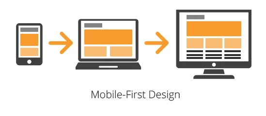
Mobile-First CSS Design Principles refer to the approach of designing and coding websites starting with the smallest screen sizes (mobile devices) first, then progressively enhancing the layout and functionality for larger screens using CSS media queries. This ensures the core experience works well on mobile devices before scaling up.
With users increasingly browsing on smartphones and tablets, mobile-first design ensures websites are accessible, fast, and user-friendly on the devices people use most. It prioritizes essential content, simplifies navigation, and promotes better performance, which leads to improved engagement and lower bounce rates.
Ready to start designing websites that look amazing on any screen? Join our practical, beginner-friendly software development course in Kenya and learn how to create responsive, mobile-first websites that users (and employers) love. Start learning today and land a well-paying job in 10-12 months.
What is Mobile-First CSS Design?
Mobile-First CSS Design is a development strategy where you begin designing and coding your website for the smallest screens (typically smartphones) first, and then progressively enhance the layout and features for tablets, laptops, and desktops using CSS media queries.
Definition of Mobile-First Design Philosophy
The mobile-first philosophy puts the needs of mobile users at the core of web design. It starts with a basic, fast, and content-focused experience for smaller devices, then adds more complex layouts and enhancements for larger screens. This approach embraces progressive enhancement, ensuring core functionality works well regardless of device.
Contrast with Desktop-First Approach
In a desktop-first approach, developers build a full-featured site for large screens and then try to scale it down for mobile, often resulting in broken layouts, hidden content, and performance issues.
In contrast, mobile-first design starts simple and lightweight, avoiding unnecessary complexity and ensuring a clean user experience from the beginning.
| Mobile-First | Desktop-First |
| Starts with mobile styles | Starts with desktop styles |
| Uses min-width media queries | Uses max-width media queries |
| Prioritizes performance | Often requires optimization later |
| Easier to scale up | Harder to scale down |
Benefits of Designing for Mobile Devices First
- Improved Performance: Mobile-first sites are lightweight and load faster.
- Better UX: Focused content and simplified UI boost usability.
- Future-Proof: Adapts well to any screen size or new device types.
- SEO Advantage: Google prioritizes mobile-first indexing.
- Streamlined Development: Encourages cleaner code and modular design.
By putting mobile users first, you ensure that your website works for everyone regardless of device size or connection speed. This is supported by Queen’s University’s responsive design guidance in their “Mobile First / Responsive Design” resource, which explains the benefits and best practices of mobile-first development.
Core Mobile-First CSS Design Principles
Designing with a mobile-first mindset requires a strategic approach to layout, styling, and user interaction. Below are the key principles that guide effective mobile-first CSS design:
1. Start with the Smallest Screen First
Begin by designing for the narrowest viewports, typically smartphones. This means creating a clean, functional layout that works on limited screen real estate.
- Focus on essential content and features.
- Use CSS media queries with min-width to progressively enhance the layout for tablets, laptops, and desktops.
/* Base: Mobile-first */

body {

  font-size: 16px;

}

/* Larger screens */

@media (min-width: 768px) {

  body {

    font-size: 18px;

  }

}
2. Use Responsive Units
Avoid fixed pixel values that break layouts on different screens. Instead, use flexible, scalable units:
- em / rem for typography and spacing
- %, vw, and vh for widths, heights, and positioning
These units make your layout adapt naturally to various devices.
3. Progressive Enhancement
Design for the lowest common denominator (mobile) and then build up:
- Ensure essential content and functions are accessible on all devices.
- Add animations, grid layouts, and enhanced UI only for devices that can handle them.
This ensures your site remains usable and fast for everyone.
4. Simplified Navigation for Mobile
Mobile-first navigation should be intuitive and minimal:
- Use hamburger menus, slide-out drawers, or collapsible sections.
- Keep tap targets large and easy to access.
- Avoid overloading the header or nav with too many links.
5. Optimize Performance
Mobile users often have slower connections, so performance is crucial:
- Minify CSS and reduce file sizes.
- Use compressed images and lazy loading where possible.
- Load non-essential resources conditionally or after initial rendering.
Fast-loading mobile-first websites not only improve UX but also boost SEO and conversion rates.
How to Write Mobile-First CSS
Writing Mobile-First CSS means you start by defining the default styles for small screens, then use media queries to progressively enhance the layout for larger screens. This approach keeps your styles lean and ensures optimal performance on mobile devices.
Example of Mobile-First Media Queries
Here’s a simple example showing how to increase the base font size as the screen size grows:
/* Mobile-first base styles */

body {

  font-size: 16px;

  padding: 1rem;

  line-height: 1.5;

}

/* Tablet and up */

@media (min-width: 768px) {

  body {

    font-size: 18px;

  }

}

/* Desktop and up */

@media (min-width: 1024px) {

  body {

    font-size: 20px;

  }

}- Notice the use of min-width, this is key to the mobile-first approach.
- Styles are layered on top of the mobile base as screen width increases.
Organizing Your CSS
To maintain clarity and efficiency in your stylesheets:
- Start with global base styles for mobile.
- Group media queries by component (recommended for modular CSS), or
- Group media queries by breakpoint (good for quick scanning).
Example by component:
/* Button styles */

.button {

  padding: 10px;

}

@media (min-width: 768px) {

  .button {

    padding: 15px;

  }

}
Tips for Structuring Your Stylesheet for Scalability
- Use consistent naming conventions (e.g., BEM or utility classes).
- Keep mobile styles as the default – treat them as the base layer.
- Comment your breakpoints to stay organized.
- Modularize your CSS using partials (if using SCSS or CSS modules).
- Avoid code repetition, use responsive units and shared utility classes.
By following this structure, your CSS remains manageable, scalable, and optimized for all screen sizes, starting with mobile, where it matters most.
Tools and Frameworks That Support Mobile-First CSS Design Principles
Building with a mobile-first approach is easier when you use the right tools. From frameworks to testing environments, the following resources can help you implement and test mobile-first CSS efficiently.
1. CSS Frameworks
Several popular CSS frameworks are designed with mobile-first principles in mind, making it faster to build responsive layouts:
Bootstrap (v4 and above)
Bootstrap switched to a mobile-first grid system starting from version 4. It uses min-width media queries by default and provides a responsive utility class system to adapt layouts across screen sizes.
Tailwind CSS
Tailwind is a utility-first CSS framework that embraces a mobile-first philosophy. Styles are applied to the base (mobile) layout and then enhanced using responsive prefixes like md:, lg:, xl:, etc.
<div class="text-base md:text-lg lg:text-xl">

  Responsive text with Tailwind

</div>
2. Developer Tools for Responsive Testing
Testing is crucial in mobile-first development to ensure your site performs well on all screen sizes:
- Chrome DevTools
Includes a powerful device toolbar to test your design on various screen resolutions and simulate touch interactions. You can also throttle network speeds for mobile performance testing. - Responsively App
An open-source browser built specifically for responsive design. It displays your site across multiple screen sizes side by side in real time. - Firefox Developer Tools
Offers responsive design mode with customizable device presets and live CSS editing.
3. Online Code Editors and Playgrounds
- CodePen
Ideal for testing small mobile-first components and layouts. You can use it to quickly prototype and share responsive designs. - JSFiddle / StackBlitz / CodeSandbox
Useful for experimenting with mobile-first CSS and JavaScript together, especially in component-based or framework-driven projects.
Using these tools and frameworks streamlines the mobile-first workflow, from development to testing and deployment, ensuring a better user experience across devices.
Common Mistakes to Avoid in Mobile-First CSS Design
While adopting a mobile-first approach improves usability and performance, developers can still fall into some common traps. Avoiding these mistakes will help you create clean, responsive, and efficient designs.
1. Designing Desktop-First Then Trying to “Shrink” It Down
One of the biggest missteps is building a complex desktop layout first and then attempting to adapt it for mobile. This often leads to:
- Broken or cluttered mobile views
- Excessive overrides and media query hacks
- A poor user experience on smaller devices
Solution: Start with a simple mobile layout and add enhancements for larger screens using min-width media queries.
2. Using Fixed Widths and Heights
Using fixed px values for widths, containers, or typography can break your design on different screen sizes. It limits responsiveness and leads to horizontal scrolling or content overflow.
Solution: Use responsive units like %, em, rem, vw, and vh to allow layouts to adapt fluidly.
3. Overcomplicating Layouts on Mobile
Trying to cram in too many elements or complex grids on mobile can overwhelm users and ruin usability.
Solution: Keep mobile layouts simple, focused, and content-first. Prioritize readability, tap-friendly elements, and vertical stacking over intricate designs.
4. Neglecting Performance for Mobile Users
Mobile users often have slower connections and limited data plans. Ignoring performance can cause long load times and high bounce rates.
Solution:
- Minimize CSS and JavaScript
- Compress images
- Use lazy loading and conditional loading for non-critical assets
Avoiding these mistakes ensures your mobile-first design remains efficient, user-friendly, and scalable as your site grows.
Benefits of Adopting Mobile-First CSS Design Principles
Designing with a mobile-first mindset offers more than just responsive layouts; it brings long-term advantages in user experience, performance, and development workflow. Here are the key benefits:
1. Better UX Across Devices
Starting with mobile ensures that content and functionality are accessible on small screens, then enhanced for larger ones. This results in:
- Clean, uncluttered layouts
- Simplified navigation
- Seamless experience regardless of device
2. Improved Performance and SEO
Mobile-first designs tend to be lighter and faster by default, which leads to:
- Faster page load times, especially on mobile networks
- Higher search engine rankings due to Google’s mobile-first indexing
- Lower bounce rates and better engagement metrics
3. Easier Maintenance with Scalable Code
Writing CSS mobile-first means fewer overrides and cleaner code. This makes your project:
- Easier to debug and maintain
- More modular and reusable
- Better structured for collaboration in teams
4. Prepares Sites for Future Device Diversity
With the increasing variety of screen sizes from smartwatches to large monitors, a mobile-first strategy ensures your design:
- It is adaptable and future-proof
- Responds well to unknown or custom screen sizes
- Embraces flexibility instead of rigid layouts
Adopting Mobile-First CSS Design Principles sets the foundation for building modern, responsive, and sustainable websites that grow with your users and their devices. By focusing on core CSS properties from the start, developers can create flexible layouts that scale gracefully across screen sizes.
Real-World Examples of Mobile-First CSS Design
To see the power of mobile-first design in action, let’s explore how popular websites apply these principles to deliver seamless user experiences across devices.
1. Airbnb
Why it works:
- Clean, minimalist mobile layout with large touch-friendly buttons
- Key content, like search and location, is prioritized at the top
- Uses responsive imagery and scalable typography
Mobile-first strategy:
- Built from the ground up with mobile in mind, using progressive enhancement to improve desktop views
2. BBC News
Why it works:
- Efficient use of vertical scrolling and stacking content
- Navigation is condensed into a simple, collapsible menu
- Loads quickly even on slow connections due to optimized assets
Mobile-first strategy:
- Delivers essential news first, then adds multimedia and layout enhancements for larger screens
3. Shopify
Why it works:
- Prioritizes product visibility and calls to action on mobile
- Responsive checkout experience with smooth transitions
- Reflows content gracefully using a grid-based system
Mobile-first strategy:
- Designed for store owners and buyers who use mobiles frequently
Before/After Comparisons
If you’re showcasing your own redesign or conducting an audit, consider using side-by-side screenshots like:
| Before (Desktop-First) | After (Mobile-First) |
| Cramped layout on phones | Clean, vertically stacked layout |
| Hidden navigation items | Simplified hamburger menu |
| Slow image loading | Optimized and lazy-loaded assets |
To conclude, adopting Mobile-First CSS Design Principles is no longer optional; it’s essential for creating modern, responsive, and user-friendly websites. By starting with the smallest screen first, you ensure your design focuses on what truly matters: accessibility, performance, and user experience. This approach not only streamlines development and improves maintainability but also positions your site for better SEO and future scalability across all devices.
If you’re ready to master responsive design and build professional websites from scratch, our hands-on software development courses in Kenya will give you the skills you need to succeed. Join our bootcamp and start building your future today.
Whether you’re building a personal blog, an e-commerce store, or a large-scale application, mobile-first CSS ensures your content reaches users wherever they are, on whatever device they use. Start small, scale smart, and design with mobile in mind from the very beginning.