CSS (Cascading Style Sheets) is a styling language used to describe the appearance and layout of HTML elements on a web page. While HTML provides the structure and content, CSS is what makes a website visually appealing, controlling everything from fonts and colors to spacing and positioning.
CSS plays a critical role in modern web development. It allows developers to create responsive, attractive, and user-friendly websites. With CSS, you can style multiple pages consistently, adapt layouts for different devices, and enhance the overall user experience. Without CSS, all web pages would look plain and unformatted.
This article is designed to help beginners understand how CSS works through real-world examples. By the end, you’ll be familiar with how to write CSS code and apply it to HTML elements, giving you a strong foundation to start building stylish and functional web pages.
Want to turn your CSS skills into a professional career? Join our hands-on software engineering course in kenya and learn how to build real-world web layouts, applications, and responsive designs from the ground up. Enroll today and take the first step toward becoming a job-ready developer in just 10–12 months.
What is CSS Code?
CSS code (Cascading Style Sheets) is the language used to style and visually format HTML elements on a web page. It tells the browser how elements should look including their colors, fonts, sizes, spacing, layouts, and more.
A CSS code snippet usually includes:
- A selector (which HTML element to style)
- A property (what you want to change)
- A value (how you want it to look)
Example of CSS Code:
p {

  color: blue;

  font-size: 16px;

}
This code styles all <p> elements, making the text blue and setting the font size to 16 pixels.
Types of CSS
CSS can be applied to HTML documents in three main ways: Inline, Internal, and External. Each has its use cases, pros, and cons.
1. Inline CSS
Inline CSS is used to apply a unique style directly to a single HTML element. The CSS code is written within the style attribute of the HTML tag.
CSS Code With Example:
<!DOCTYPE html>

<html>

  <body>

    <h1 style="color: red; font-size: 30px;">This is an Inline CSS Example</h1>

  </body>

</html>
2. Internal CSS
Internal CSS is written inside a <style> tag within the <head> section of the HTML document. It applies styles to all matching elements in that page.
Example:
<!DOCTYPE html>

<html>

  <head>

    <style>

      h1 {

        color: green;

        text-align: center;

      }

    </style>

  </head>

  <body>

    <h1>This is an Internal CSS Example</h1>

  </body>

</html>
3. External CSS
External CSS is written in a separate .css file and linked to the HTML document using the <link> tag. This is the most efficient and scalable method, especially for styling multiple web pages.
Example:
HTML File (index.html):
<!DOCTYPE html>

<html>

  <head>

    <link rel="stylesheet" href="styles.css">

  </head>

  <body>

    <h1>This is an External CSS Example</h1>

  </body>

</html>
CSS File (styles.css):
h1 {

  color: blue;

  font-family: Arial, sans-serif;

}
CSS Syntax Explained
Understanding the basic syntax of CSS is essential to start styling your web pages effectively. CSS follows a simple structure made up of selectors, properties, and values.
Basic Structure of CSS Code
A typical CSS rule looks like this:
selector {

  property: value;

}- Selector: Targets the HTML element you want to style.
- Property: The specific style you want to apply (e.g., color, font-size).
- Value: The setting you want to assign to the property (e.g., red, 16px).
CSS Code With Example: Changing Text Color, Font Size, and More
<!DOCTYPE html>

<html>

  <head>

    <style>

      p {

        color: purple;          /* Changes text color */

        font-size: 18px;        /* Changes font size */

        font-family: Arial;     /* Sets the font style */

        line-height: 1.5;       /* Adds space between lines */

      }

    </style>

  </head>

  <body>

    <p>This paragraph is styled using CSS syntax. It has a custom color, font size, and font family.</p>

  </body>

</html>
Explanation of the Code:
- p is the selector targeting the <p> tag.
- color, font-size, font-family, and line-height are properties.
- Each property is followed by a value (like purple or 18px) and a semicolon.
Common CSS Properties
CSS offers a wide range of properties to control the appearance of HTML elements. Here are some of the most commonly used categories, along with examples:
1. Text Styling
These properties control how text appears on the page, including its color, size, and font.
Example:
<!DOCTYPE html>

<html>

  <head>

    <style>

      h2 {

        color: darkblue;

        font-family: 'Verdana', sans-serif;

        font-size: 24px;

      }

    </style>

  </head>

  <body>

    <h2>This is styled text using CSS</h2>

  </body>

</html>
2. Background Styling
Control background colors and images to enhance the visual appeal of elements.
Example:
<!DOCTYPE html>

<html>

  <head>

    <style>

      div {

        background-color: lightgray;

        background-image: url('https://via.placeholder.com/150');

        background-repeat: no-repeat;

        background-position: right top;

        padding: 20px;

      }

    </style>

  </head>

  <body>

    <div>This div has a background color and image.</div>

  </body>

</html>
3. Box Model
The CSS box model includes margin, border, padding, and the content itself. It defines how space is used around and within elements.
Example:
<!DOCTYPE html>

<html>

  <head>

    <style>

      .box {

        margin: 20px;

        padding: 15px;

        border: 2px solid #333;

        background-color: #f0f0f0;

      }

    </style>

  </head>

  <body>

    <div class="box">This box uses margin, padding, and border.</div>

  </body>

</html>
4. Layouts
CSS provides layout techniques to position elements, such as display, position, flexbox, and grid.
Example (Flexbox & Grid):
<!DOCTYPE html>

<html>

  <head>

    <style>

      .flex-container {

        display: flex;

        gap: 10px;

        justify-content: space-between;

      }

      .flex-item {

        background-color: #87ceeb;

        padding: 20px;

        flex: 1;

        text-align: center;

      }

      .grid-container {

        display: grid;

        grid-template-columns: repeat(3, 1fr);

        gap: 10px;

        margin-top: 20px;

      }

      .grid-item {

        background-color: #ffcccb;

        padding: 20px;

        text-align: center;

      }

    </style>

  </head>

  <body>

    <div class="flex-container">

      <div class="flex-item">Flex 1</div>

      <div class="flex-item">Flex 2</div>

      <div class="flex-item">Flex 3</div>

    </div>

    <div class="grid-container">

      <div class="grid-item">Grid 1</div>

      <div class="grid-item">Grid 2</div>

      <div class="grid-item">Grid 3</div>

    </div>

  </body>

</html>
CSS Selectors
CSS selectors are patterns used to target specific HTML elements so you can apply styles to them. There are basic selectors for general targeting and more advanced ones for precise control.
1. Basic Selectors
These are the most commonly used selectors.
- Element Selector – targets all elements of a given type
- Class Selector – targets elements with a specific class (uses .)
- ID Selector – targets a single element with a specific ID (uses #)
Example:
<!DOCTYPE html>

<html>

  <head>

    <style>

      /* Element selector */

      h3 {

        color: darkgreen;

      }

      /* Class selector */

      .highlight {

        background-color: yellow;

        font-weight: bold;

      }

      /* ID selector */

      #main-title {

        font-size: 28px;

        text-transform: uppercase;

      }

    </style>

  </head>

  <body>

    <h3 id="main-title">This is the Main Title</h3>

    <p>This is a normal paragraph.</p>

    <p class="highlight">This paragraph has a class-based style.</p>

  </body>

</html>
2. Advanced Selectors
These allow more complex targeting for elements within a specific context.
- Descendant Selector (space) – targets elements inside another element
- Child Selector (>) – targets direct children only
- Pseudo-class Selector – targets elements in a specific state (like :hover, :first-child)
Example:
<!DOCTYPE html>

<html>

  <head>

    <style>

      /* Descendant selector */

      .container p {

        color: navy;

      }

      /* Child selector */

      .container > h4 {

        color: teal;

        margin-bottom: 5px;

      }

      /* Pseudo-class selector */

      a:hover {

        color: red;

        text-decoration: underline;

      }

    </style>

  </head>

  <body>

    <div class="container">

      <h4>This is a direct child (h4)</h4>

      <div>

        <p>This is a paragraph inside .container</p>

      </div>

    </div>

    <a href="#">Hover over this link</a>

  </body>

</html>
Responsive Design with CSS
Responsive design ensures that your website looks good on all devices from desktops to tablets to smartphones. CSS plays a key role in achieving this using media queries and mobile-first design principles.
If you’re ready to master responsive layouts and build professional websites that look great on any screen, our software development course in Kenya is the perfect place to start.
1. Media Queries
Media queries allow you to apply CSS rules based on the device’s screen size, resolution, orientation, and more. This helps create flexible layouts that adapt to different viewports.
2. Mobile-First Design
Mobile-first design means writing CSS for smaller screens first, then adding styles for larger screens using media queries. It’s a modern best practice since most users access websites on mobile devices.
Example:
<!DOCTYPE html>

<html>

  <head>

    <style>

      /* Base styles for mobile (default) */

      .responsive-box {

        background-color: lightblue;

        padding: 20px;

        font-size: 16px;

        text-align: center;

      }

      /* Styles for tablets and larger screens */

      @media (min-width: 768px) {

        .responsive-box {

          background-color: lightgreen;

          font-size: 18px;

        }

      }

      /* Styles for desktops */

      @media (min-width: 1024px) {

        .responsive-box {

          background-color: lightcoral;

          font-size: 20px;

        }

      }

    </style>

  </head>

  <body>

    <div class="responsive-box">

      Resize the browser window to see the background and font size change!

    </div>

  </body>

</html>
What This Does:
- On small screens (like phones), the box has a light blue background and 16px text.
- On medium screens (like tablets), it changes to light green with slightly larger text.
- On large screens (like desktops), it becomes light coral with even larger text.
CSS Best Practices
Writing clean and well-structured CSS is essential for building scalable and maintainable websites. Here are some best practices every developer should follow:
1. Keep Code Clean and Organized
Clean CSS is easier to read, debug, and update. Use consistent indentation, group related styles together, and avoid repetitive code by using reusable classes.
Example:
/* Grouped and organized styles */

.header {

  background-color: #333;

  color: #fff;

  padding: 20px;

}

.header h1 {

  font-size: 24px;

  margin: 0;

}
2. Use Comments and Naming Conventions
Comments help document your CSS, especially in large files. Clear and consistent naming (like BEM – Block Element Modifier) makes your CSS more understandable and scalable.
Example:
/* === Header Section === */

.header__title {

  font-size: 28px;

  color: #222;

}

/* === Navigation Buttons === */

.nav__button--active {

  background-color: #007bff;

  color: white;

}
3. Use External Stylesheets for Maintainability
Always separate your CSS into external .css files, especially for larger projects. This makes your HTML cleaner and allows you to reuse styles across multiple pages.
Example:
HTML:
<head>

  <link rel="stylesheet" href="styles.css">

</head>
styles.css:
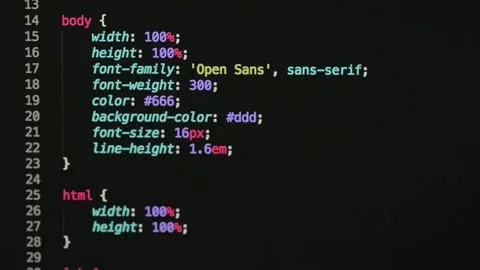
body {

  font-family: 'Segoe UI', sans-serif;

  background-color: #f9f9f9;

}
To conclude, learning CSS is a crucial step in becoming a proficient web developer. It empowers you to transform plain HTML into visually engaging and responsive websites that users love to interact with. By understanding how CSS works and practicing with different types of styles, selectors, and layout techniques, you’ll gain the confidence to design beautiful, functional web pages.
Don’t be afraid to experiment with the code examples provided, tweak colors, adjust spacing, or try different layout options to see how each change affects the design. The best way to learn is by doing!