HTML (HyperText Markup Language) is the standard language used to structure and present content on the web through various elements like <div>, <p>, and <a>. These elements define the layout and functionality of webpages, including how users interact with them. Forms are a key part of web development, allowing users to input and submit data such as names, search queries, or feedback. Input controls like text fields, checkboxes, and drop-down menus make this interaction possible. Among these, the HTML datalist stands out by providing users with a dropdown list of suggested values as they type, improving speed and accuracy. This feature enhances user experience and supports better data validation in forms.
The HTML <datalist> element is a powerful tool for enhancing user input in web forms. It provides a list of predefined options that can be suggested to the user as they type in an <input> field. The <datalist> element enables an autocomplete feature, allowing users to select from a list of options or continue typing their own input.
This functionality improves user experience by making it faster and easier to fill out forms, reducing the likelihood of errors, and making form interaction more intuitive. It’s particularly useful for fields where there are a limited number of valid options, such as selecting a country, city, or product name.
Dreaming of becoming a full-stack software developer and building real-world applications from the ground up?
Our intensive Software Engineering Course in Kenya is your gateway to a thriving tech career. You’ll master front-end and back-end development, APIs, and databases through practical, hands-on projects guided by industry experts. Gain the skills, confidence, and portfolio you need to build complete software solutions and stand out in the job market.
What is HTML Datalist?
The <datalist> element in HTML is used to provide a list of predefined options for an <input> field. This element works alongside the <input> element to offer a set of options to the user, helping them complete their input by choosing from a list or continuing to type their own value. The <datalist> element enhances user experience by enabling autocomplete functionality, making it easier and faster for users to fill out forms.
Definition of the HTML <datalist> Element
The <datalist> element is a container that holds a set of <option> elements, each representing a choice that can be selected. It is associated with an <input> element using the list attribute. The <datalist> element does not display by itself on the page. Instead, it provides a suggestion box when the user interacts with the associated input field. It helps provide a list of suggestions that the user can select from, improving form interactions.
Difference Between <datalist> and Other Form Elements (Like <select>)
While the <datalist> element offers predefined options for an <input> field, it differs from other form elements like <select> in the following ways:
- User Interaction:
- <select>: This element creates a dropdown menu with a set of options, and the user can only select one option from the list.
- <datalist>: It provides suggestions as the user types into the associated input field. The user can either choose an option from the list or enter a custom value.
- Appearance:
- <select>: Always displays a dropdown list on the page, and the user must open the dropdown to see options.
- <datalist>: Does not display until the user starts typing in the linked input field. The suggestions appear as an autocomplete list beneath the input.
- Flexibility:
- <select>: The options are fixed, and the user can only select one option.
- <datalist>: Allows the user to input a custom value if none of the predefined options are suitable.
The Role of <datalist> in Improving User Experience by Offering Predefined Options
The primary role of the <datalist> element is to improve the user experience by offering a set of predefined options that make form-filling more efficient. As users begin typing in an associated <input> field, they are presented with a list of suggestions from the <datalist>, which reduces the time spent typing and helps minimize errors. This feature is particularly useful for fields like city names, product codes, or any scenario where a user might want to choose from a small set of predefined options or just type their own.
In addition to saving time, the <datalist> element enhances accessibility, as it provides a more intuitive and user-friendly way for users to interact with forms. The autocomplete suggestions can also guide users to input the correct values, improving both the quality and accuracy of the data submitted through forms.
How to Use HTML Datalist
Using the HTML <datalist> element is straightforward, and it can enhance user interaction by offering suggestions for input fields. Below is a breakdown of how to use the <datalist> element, including its basic syntax, an example, and a step-by-step guide for implementation.
Basic Syntax of the HTML <datalist> Element
The <datalist> element is used to contain a list of <option> elements. These options will be shown as suggestions when the user interacts with an associated <input> field. Here’s the basic syntax:
<input type="text" list="example-datalist"> <datalist id="example-datalist"> <option value="Option 1"> <option value="Option 2"> <option value="Option 3"> </datalist>- The <input> field has a list attribute, which links it to the <datalist> element by referencing the id of the datalist.
- Each <option> within the <datalist> defines one suggestion.
Example: How to Create a Simple Datalist with Options
Here’s a practical example that shows how to create a datalist for a city search field, where users can either select a city from a list or type their own:
<form> <label for="city">Choose a city:</label> <input type="text" id="city" name="city" list="city-list"> <datalist id="city-list"> <option value="New York"> <option value="Los Angeles"> <option value="Chicago"> <option value="Houston"> <option value="Phoenix"> </datalist> </form>In this example:
- The user types into the input field labeled “Choose a city.”
- As they type, a list of cities will appear as suggestions.
- The list=”city-list” attribute in the <input> field connects it to the <datalist> element with the id=”city-list”.
Associating a <datalist> with an Input Field Using the List Attribute
To link an <input> field to a <datalist>, you need to use the list attribute in the <input> tag. The list attribute should point to the id of the corresponding <datalist> element. This connection allows the input field to display suggestions from the datalist as the user types.
Here’s the syntax for associating a datalist with an input:
<input type="text" list="datalist-id">And the <datalist> element will look like this:
<datalist id="datalist-id"> <option value="Option 1"> <option value="Option 2"> <option value="Option 3"> </datalist>Step-by-Step Guide to Using <datalist> in a Form
- Create the Input Field: First, create an <input> field where users will type their information. Use the type=”text” attribute for simple text inputs.
- Create the Datalist: Next, create a <datalist> element to hold the options that you want to suggest to users. Inside the <datalist>, use <option> elements to define the suggestions.
- Link the Datalist to the Input Field: In the <input> field, use the list attribute to reference the id of the <datalist>. This links the two elements.
- Style the Form (Optional): While you can’t directly style the <datalist>, you can style the <input> element itself, and the suggestions will follow the browser’s default styling.
Here’s the step-by-step code to implement a datalist in a form:
<form> <!-- Step 1: Create the Input Field --> <label for="fruit">Choose a fruit:</label> <input type="text" id="fruit" name="fruit" list="fruit-list"> <!-- Step 2: Create the Datalist --> <datalist id="fruit-list"> <option value="Apple"> <option value="Banana"> <option value="Cherry"> <option value="Date"> <option value="Grapes"> </datalist> </form>In this form:
- The input field labeled “Choose a fruit” is linked to the <datalist> with the ID fruit-list.
- As the user types in the input, they will see suggestions like “Apple,” “Banana,” etc.
- If the user prefers to type a custom fruit name, they can do so without restrictions.
By following these steps, you can easily incorporate the <datalist> element into your forms to provide users with helpful suggestions, making their interaction with the form more efficient and user-friendly.
HTML Datalist Attributes
The <datalist> element has a few important attributes that help link it to an <input> field and define how the suggestions work. Understanding these attributes is key to using <datalist> effectively in your forms.
Overview of the id Attribute for Linking to the <input> Element
The id attribute is used to uniquely identify the <datalist> element. This id is important because the <input> field must reference it using the list attribute to associate the two elements.
- The id of the <datalist> must match the value of the list attribute in the <input> field.
- When the user types in the input field, the browser uses this link to show suggestions from the datalist.
Here’s how the id attribute works:
<input type="text" list="fruit-list"> <datalist id="fruit-list"> <option value="Apple"> <option value="Banana"> <option value="Cherry"> </datalist>In this example:
- The <input> element has the list=”fruit-list” attribute, which links it to the <datalist> with the id=”fruit-list”.
- As the user types in the input field, the browser will suggest options from the <datalist> element.
The value Attribute in Input Fields and How It Works with Datalist
The value attribute in an <input> field represents the initial value or the user-entered value. When used with a <datalist>, it works as follows:
- If the user selects an option from the datalist, the value of the <input> field is updated to the selected option’s value.
- If the user types a custom value that does not match any options in the datalist, the value attribute stores the user-inputted text.
Example:
<form> <label for="fruit">Choose a fruit:</label> <input type="text" id="fruit" name="fruit" list="fruit-list" value="Banana"> <datalist id="fruit-list"> <option value="Apple"> <option value="Banana"> <option value="Cherry"> </datalist> </form>In this example:
- The input field is pre-filled with “Banana” as the default value.
- The user can select from the available options in the datalist or type their own input.
- If the user selects “Cherry,” the value attribute in the <input> will be updated to “Cherry.”
Understanding the Options Inside the <datalist>
The <datalist> element contains one or more <option> elements. Each <option> represents a potential suggestion for the input field. The user can select one of these options, or they can continue typing their own input.
Here’s a breakdown of how to define the options inside the <datalist>:
- Each <option> element within the <datalist> provides a possible value that will appear in the input’s suggestion list.
- The value attribute inside each <option> defines the suggestion that will be displayed.
- The user can select one of these options, and the <input> field will be updated accordingly.
Example:
<form> <label for="city">Choose a city:</label> <input type="text" id="city" name="city" list="city-list"> <datalist id="city-list"> <option value="New York"> <option value="Los Angeles"> <option value="Chicago"> <option value="Houston"> <option value="Phoenix"> </datalist> </form>In this example:
- The <datalist> has five options for cities.
- As the user types in the input field, they will see suggestions like “New York,” “Los Angeles,” etc.
- The user can select one of the options, and the <input> will be populated with the selected city.
Key Points to Remember:
- id Attribute: The id of the <datalist> links to the list attribute in the <input> field, creating the connection between them.
- value Attribute: The value attribute in the <input> element represents the current or default value of the field. It is updated when the user selects an option from the datalist.
- <option> Elements: Each <option> within the <datalist> defines a suggestion that appears when the user interacts with the <input> field.
Understanding these attributes helps you control the behavior and functionality of the <datalist> element, making it a powerful tool for enhancing form usability and guiding user input.
Benefits of Using HTML Datalist
The HTML <datalist> element provides a variety of benefits that improve both user experience and form usability. Here are some key advantages:
1. Enhanced User Experience Through Auto-Suggestions
One of the main benefits of using the <datalist> element is the auto-suggestion feature. As users begin typing in an input field, the browser can show a list of suggestions from the associated <datalist>. This autocomplete functionality makes form filling faster and more intuitive, as users can quickly choose an option from the list rather than typing everything out manually.
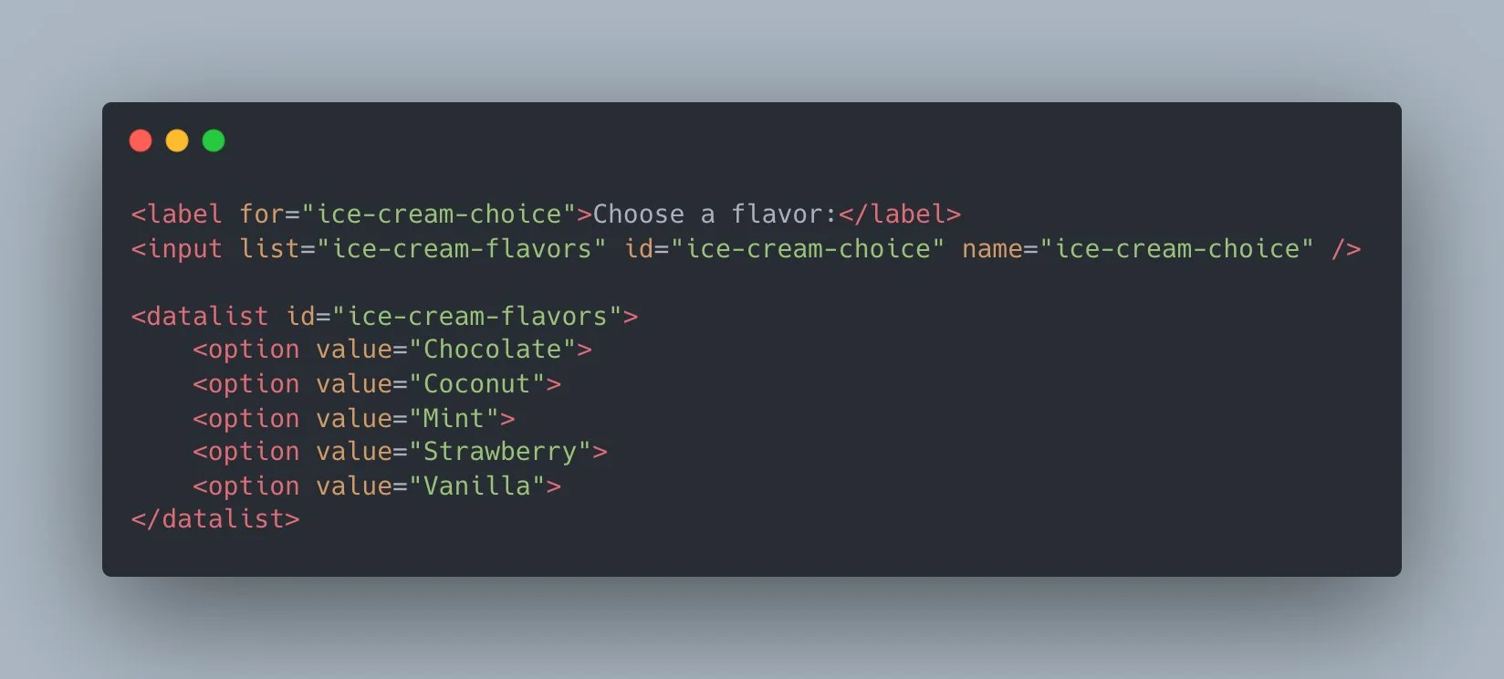
- Example: If a user is entering a country name, as soon as they start typing “Uni”, the browser can suggest options like “United States” or “United Kingdom,” saving them time and improving overall efficiency.
2. Simplifying Form Data Entry
The <datalist> element simplifies data entry by offering predefined options for the user to choose from. Instead of forcing users to recall or type exact data, the list of suggestions allows them to pick the most appropriate entry quickly. This is particularly helpful for forms that require standard, predefined information, like country names, product codes, or cities.
- Example: In a form where users need to enter a city, showing a list of cities from a <datalist> allows them to quickly select their city instead of typing it out fully.
3. Reducing Input Errors and Speeding Up Data Entry
By offering predefined options, the <datalist> element can greatly reduce input errors, such as misspellings or incorrect data entry. Users are less likely to enter invalid data because they are selecting from a limited set of valid options. This can be especially useful in forms where accurate information is crucial, such as registration forms, surveys, or checkout forms.
- Example: When entering a state or country, the user is less likely to make a typo (e.g., typing “Cali” instead of “California”) because they can select from the list of options in the datalist.
4. Improving Mobile User Experience with Suggested Values
On mobile devices, typing can be cumbersome, and the user interface may be limited by smaller screens and virtual keyboards. The <datalist> element improves the mobile user experience by reducing the amount of typing required. With suggestions appearing as the user types, they can quickly select from a list instead of typing long words or phrases. This is particularly helpful for users who are entering data on touch screens, as it minimizes the need for extensive keyboard input.
- Example: On a mobile form, when a user starts typing the name of a city, the datalist might display cities like “San Francisco” or “Seattle.” The user can then tap to select one of these options, rather than typing the full name of the city.
Summary of Benefits:
- Enhanced User Experience: Auto-suggestions help users fill out forms faster and more accurately.
- Simplifying Data Entry: Predefined options make it easier for users to find and select the correct data.
- Reducing Errors: Users are less likely to make mistakes, ensuring that the submitted data is accurate.
- Improving Mobile Experience: Reduces the amount of typing on mobile devices, making forms quicker and more accessible.
The use of <datalist> ultimately leads to smoother, more efficient interactions with forms, which can improve user satisfaction and result in more accurate data collection for developers and website owners.
Best Practices for HTML Datalist
While the <datalist> element can significantly improve user experience, there are some best practices to ensure that it is used effectively and performs well. Here are some key guidelines to keep in mind when implementing <datalist> in your forms:
1. Keeping Options Relevant and Concise
The options inside a <datalist> should be carefully curated to ensure that they are relevant to the user’s input. Including too many options can overwhelm the user and make the autocomplete feature less effective.
- Keep Options Specific: Include options that are closely related to the field. For example, if the field is for selecting a country, only include country names. Avoid mixing unrelated options.
- Concise List: Limit the number of suggestions to a manageable number. Too many options can slow down the user’s decision-making process and make the list harder to navigate.
- Example:
<datalist id=”country-list”> <option value=”United States”> <option value=”Canada”> <option value=”Mexico”> </datalist>
This list is concise, relevant, and directly matches the input field’s purpose. It helps users quickly find the country they’re looking for without unnecessary options.
2. Avoiding Long Lists for Better Performance
Long <datalist> lists with hundreds or thousands of options can slow down the performance of your form, especially on mobile devices or older browsers. It can also make the dropdown list difficult for users to navigate.
- Limit List Length: Try to keep the number of options under a few dozen. If you need to present many options, consider implementing search or filtering features instead of relying solely on a long <datalist>.
- Dynamic Datalist: If your list of options is dynamic (e.g., based on user input or an external source), consider fetching the options via JavaScript and updating the <datalist> dynamically as the user types. This ensures that only relevant options are shown.
- Example:
Instead of listing all 50 U.S. states in the datalist, consider grouping them into regions or only displaying states based on the user’s earlier selections.
<input type="text" list="us-states"> <datalist id="us-states"> <option value="California"> <option value="Florida"> <option value="Texas"> </datalist>
3. Using <datalist> in Combination with Validation Techniques
While the <datalist> element can help guide users toward valid input, it doesn’t automatically ensure that the value entered by the user is valid in all cases. It’s important to combine <datalist> with other HTML validation techniques to improve form accuracy and data integrity.
- Use HTML5 Input Validation: Use attributes like required, minlength, maxlength, pattern, and type to ensure that the data entered meets the necessary criteria.
- Client-Side Validation: Combine the datalist with JavaScript validation to check if the user’s input matches the available options in the list or follows other constraints. For example, you can check if the user’s input is part of the <datalist> options before submitting the form.
- Example:
You can use the pattern attribute to restrict input to only specific characters or values. While the <datalist> suggests options, you can use a regex pattern to ensure input validity.
<form> <label for=”fruit”>Choose a fruit:</label> <input type=”text” id=”fruit” name=”fruit” list=”fruit-list” required pattern=”^(Apple|Banana|Cherry)$”> <datalist id=”fruit-list”> <option value=”Apple”> <option value=”Banana”> <option value=”Cherry”> </datalist> </form>
In this case, even if the user types something not in the list (e.g., “Orange”), the pattern validation ensures the input matches one of the allowed values.
Summary of Best Practices:
- Keep Options Relevant and Concise: Provide relevant options and limit the number of suggestions to avoid overwhelming the user.
- Avoid Long Lists for Better Performance: Use shorter lists for better performance, especially on mobile devices. Consider dynamically generating the list if necessary.
- Combine <datalist> with Validation Techniques: Enhance data integrity by using input validation (both HTML5 and JavaScript) to ensure that the user’s selection or input meets the required criteria.
By following these best practices, you can ensure that the <datalist> element enhances the user experience without compromising performance or data quality.
Limitations of HTML Datalist
While the <datalist> element provides a helpful way to offer auto-suggestions in forms, there are some limitations to keep in mind. Understanding these restrictions can help you decide when and how to use the <datalist> effectively.
1. Browser Compatibility Issues (Especially with Older Versions)
One of the key limitations of the <datalist> element is that it is not supported by all browsers, particularly older versions. While modern browsers like Chrome, Firefox, Safari, and Edge generally support <datalist>, older versions or less common browsers may not support it or may provide incomplete functionality.
- Older Versions: Internet Explorer, for example, does not support the <datalist> element at all. If you’re targeting users who might still be using older browsers, you should consider providing an alternative input method, such as a dropdown <select> element.
- Mobile Browser Compatibility: While most mobile browsers do support <datalist>, it’s important to test on a variety of devices to ensure that the autocomplete functionality works as expected. Some mobile browsers may display the suggestions in a less user-friendly manner.
- Workaround: For browsers that do not support <datalist>, you can create a custom autocomplete feature using JavaScript, which allows more flexibility and control over the user experience.
2. Lack of Advanced Customization (Styling Limitations)
Another limitation of the <datalist> element is that it comes with very limited styling options. You cannot directly style the dropdown list of options inside the datalist, which means that the visual appearance of the suggestions is controlled by the browser.
- Limited Styling Control: Unlike standard <select> elements, which offer some styling flexibility (such as controlling the background color, font, and dropdown behavior), the <datalist> element doesn’t allow you to modify the appearance of the suggestion list itself.
- Example: You cannot change the font size or the hover effect for individual options in the <datalist>. The browser determines how the suggestions appear, and this can vary from one browser to another.
- Workaround: If you need more control over the styling, you may need to build a custom autocomplete feature with JavaScript and CSS. This approach gives you the flexibility to create a fully customized UI for the suggestions list.
3. How <datalist> Behaves Differently Across Browsers
Different browsers may implement the <datalist> element in slightly different ways, which can lead to inconsistencies in user experience. Here are a few examples of how <datalist> can behave differently across browsers:
- Display of Suggestions: In some browsers, the list of suggestions may appear as a dropdown directly under the input field, while others may show the suggestions in a separate pop-up. This can lead to a visual mismatch between browsers.
- Input Field Behavior: The behavior of the <input> field linked to the <datalist> might also vary. For example, in some browsers, when you start typing, the suggestions may immediately appear, while in others, it might require a slight delay or more characters to trigger the suggestions.
- Mobile Devices: On mobile browsers, the experience can be especially inconsistent. Some mobile browsers may show suggestions in a separate list or overlay, while others may not show any suggestions at all. The scrolling behavior for long lists of options might also vary, making it more difficult to navigate the list on smaller screens.
- Customizability: As mentioned, styling of the suggestion dropdown is browser-dependent. Some browsers might allow certain aspects of the dropdown (like font size) to be modified, while others will not.
- Example: In Chrome, the <datalist> options appear in a simple dropdown, while Firefox may display them in a slightly different layout. On mobile Safari, the options could appear as a modal-like window with a different look and feel.
Summary of Limitations:
- Browser Compatibility: <datalist> is not supported by all browsers, particularly older versions (e.g., Internet Explorer), and its behavior may vary across browsers.
- Styling Limitations: The appearance of the suggestions list in the <datalist> is mostly controlled by the browser, offering limited customization options.
- Inconsistent Behavior Across Browsers: The user experience for the <datalist> element can differ in terms of how suggestions are displayed, input field behavior, and mobile responsiveness.
While the <datalist> element is a valuable tool, it’s important to understand its limitations and consider fallbacks or custom solutions when necessary. For instance, using JavaScript-based autocomplete components can provide more flexibility and consistency across different browsers and devices.
To conclude, the HTML <datalist> element is a powerful tool for improving user experience in forms by offering predefined suggestions as users type. It enhances form usability, reduces input errors, and speeds up data entry, especially on mobile devices. By keeping options relevant and concise, limiting the number of choices, and using it in combination with validation techniques, you can ensure a smooth and efficient form experience.
However, as with any web technology, <datalist> has its limitations. Browser compatibility issues, especially with older versions or less common browsers, can affect its functionality. The lack of advanced styling options may also limit design flexibility, and the behavior of <datalist> can differ across browsers, leading to inconsistencies in the user interface.
Despite these challenges, when used appropriately and with fallbacks for unsupported browsers, the <datalist> element can significantly enhance web forms. For more complex or highly customizable requirements, consider complementing <datalist> with JavaScript-based solutions for autocomplete functionality.
Just getting started with HTML and aspiring to become a skilled web developer?
Our beginner-friendly Web Development Course is designed to take you from the basics to building responsive, scalable websites and web applications completely from scratch. In less than 3 months, you’ll gain practical, job-ready skills through real-world projects and hands-on learning, all guided by experienced instructors every step of the way.